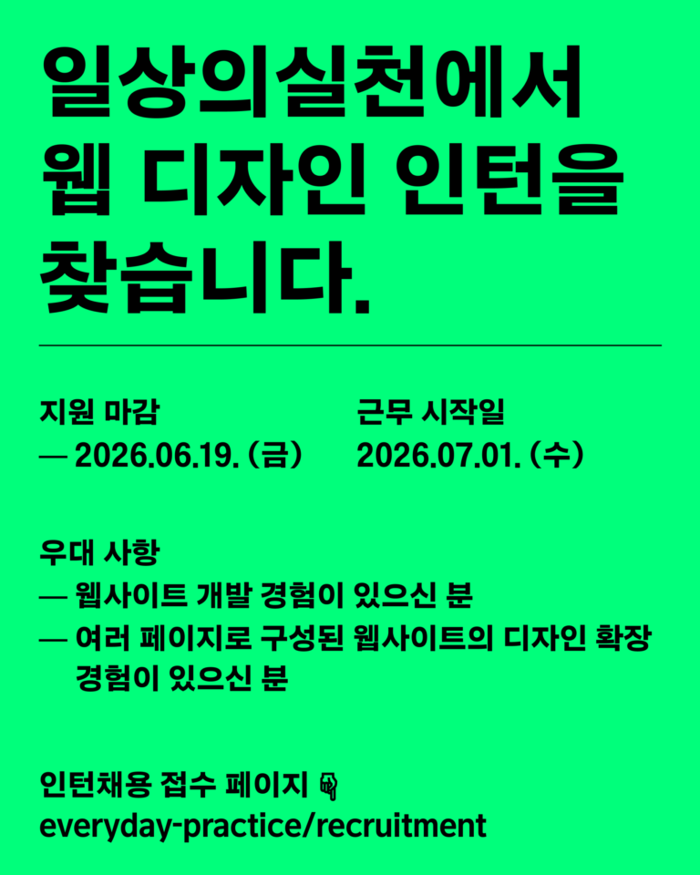
세움 아이덴티티 디자인
SEUM Identity Design
2023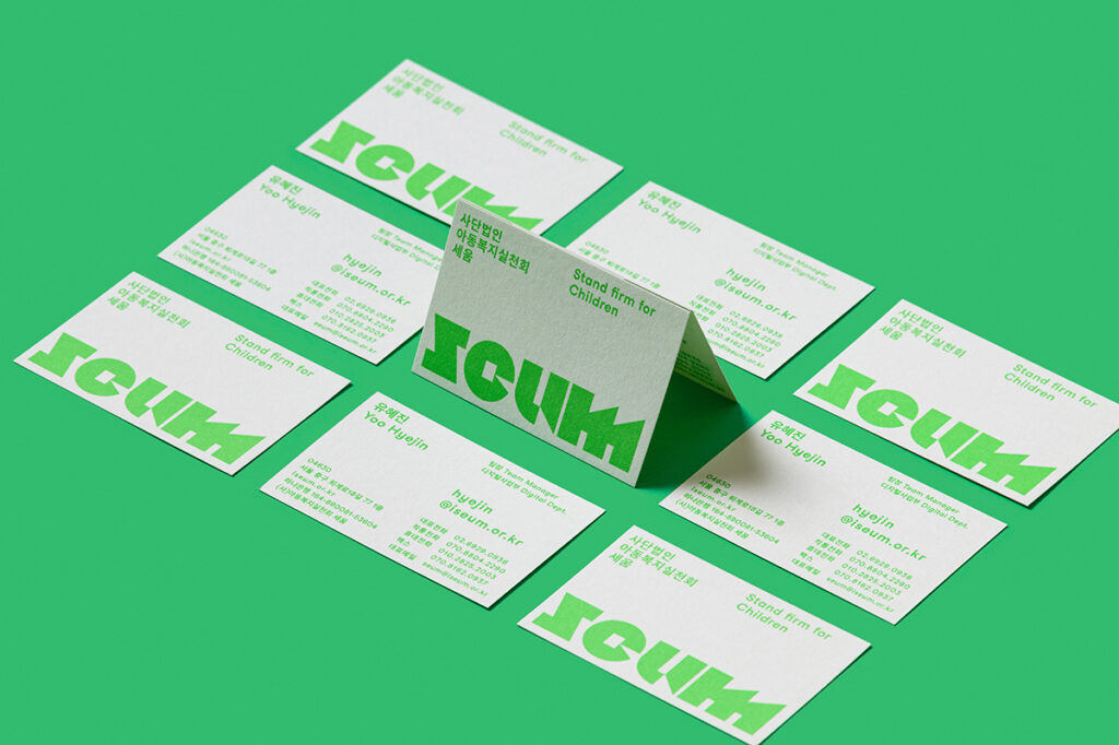
세움은 수용자 자녀와 가족을 세상의 중심에 세우고 함께 걸어가기 위해 2015년 설립된 아동복지 전문단체입니다. 세움이 아동중심의 시선으로 주목하는 곳엔 사회의 낙인과 편견으로 고통받는 아이들, 수용자자녀들이 있습니다. 수용자 자녀 역시 대한민국의 한 아동으로 당당하게 세워져 가길 바라며, 세움은 한 아동을 향한 아동중심적 접근 – 전인격적 지원, 천부인권적 관점, 일대일의 만남 – 으로 눈과 마음을 맞추며 아동을 만나고 있습니다.
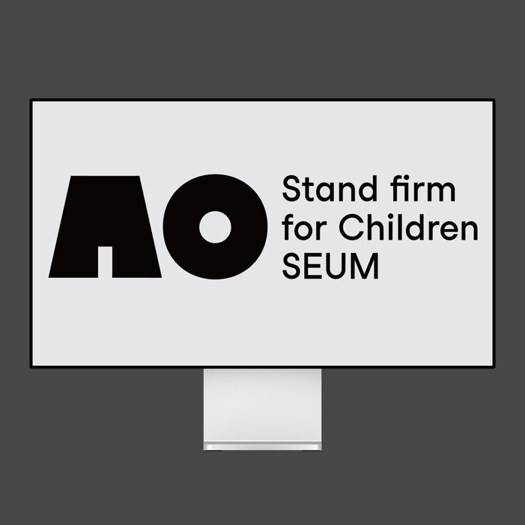
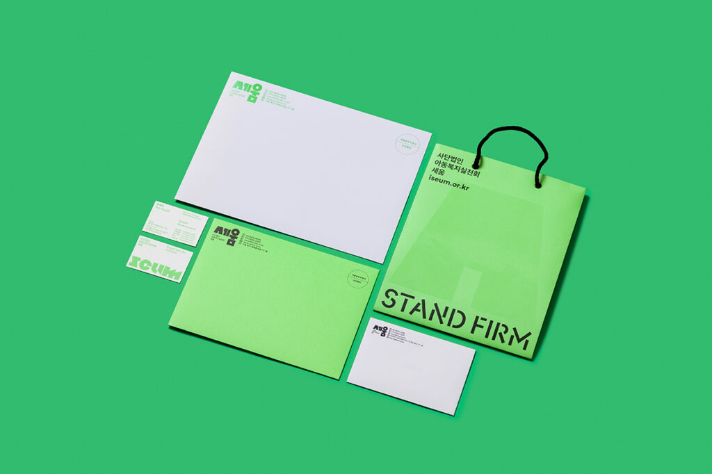
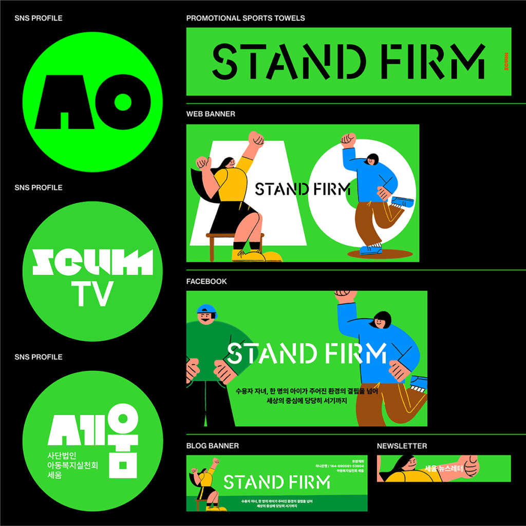
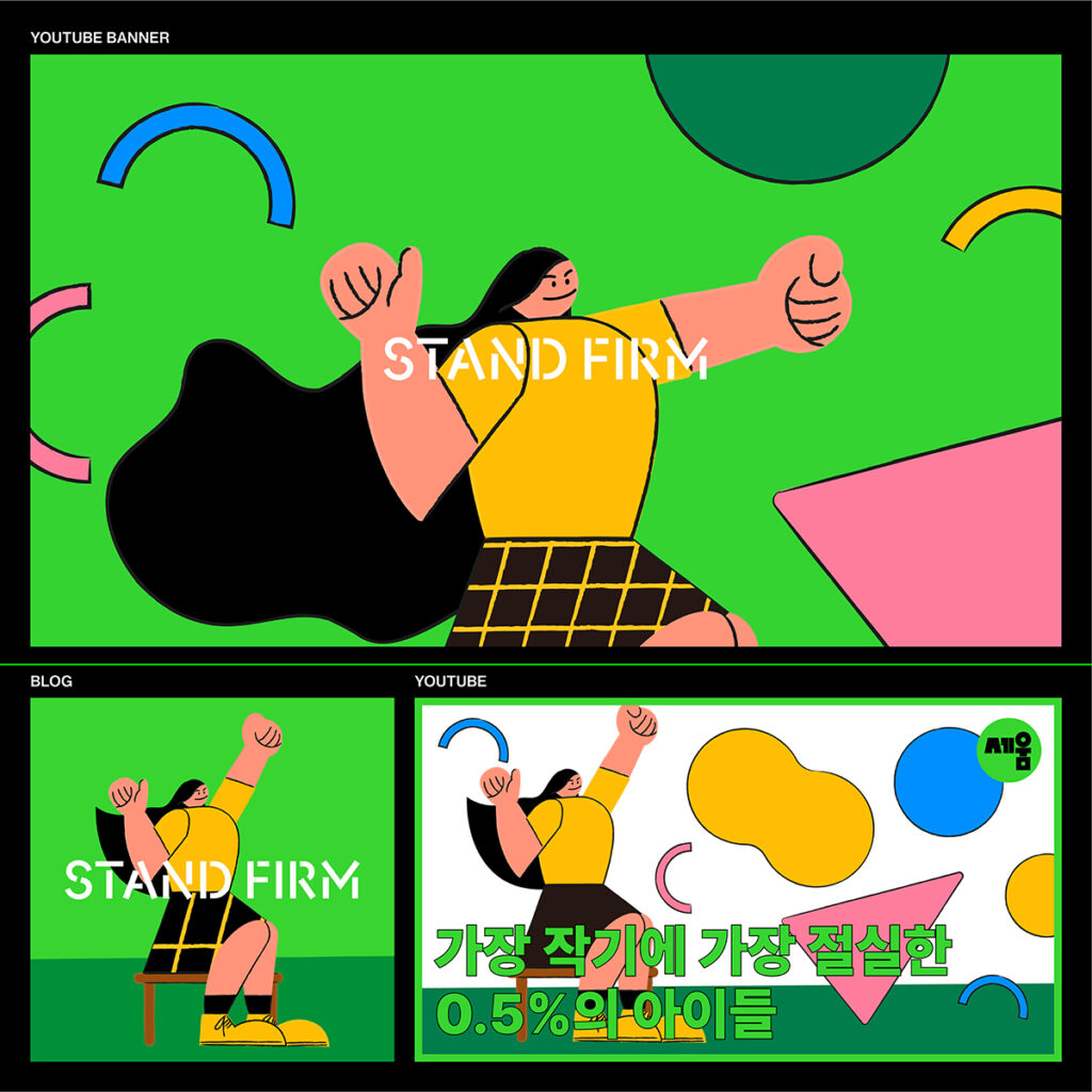
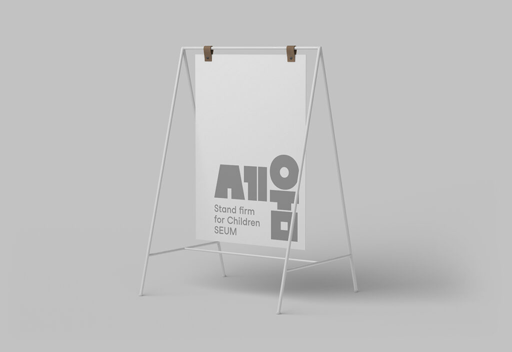
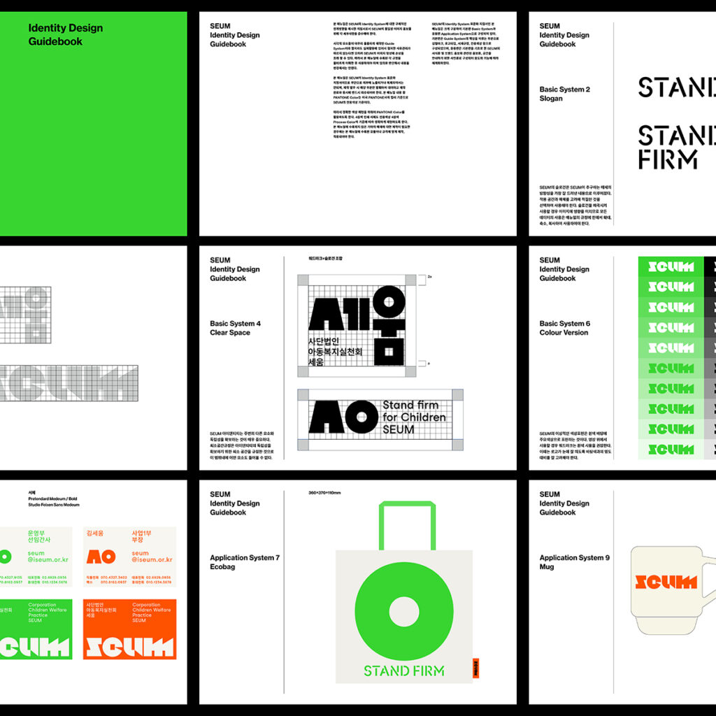
일상의실천은 아이들이 세상의 중심에 당당하게 서기를 바라는 세움의 지향점을 볼드한 획을 가진 타입페이스와 모서리가 둥근 형태의 조형을 활용하여 로고 및 아이덴티티를 제작하였습니다. 그리고 당당함이 느껴지는 청소년이 그려진 일러스트를 활용함으로 브랜드의 친근감을 표현하고자 노력했습니다.
디자인. 권준호
디자인 어플리케이션 & 일러스트. 김주애
사진. 김진솔
클라이언트. 세움
SEUM is a child welfare organization founded in 2015 to put the children and families of incarcerated parents at the center of the world and move forward together. With a child-centered perspective, SEUM focuses on the children of incarcerated parents who suffer from stigma and prejudice in society. SEUM helps the children of incarcerated parents grow up confidently as children of South Korea, and to this end, they meet the children eye to eye with a child-centered approach.
Everyday Practice created a logo and identity using a typeface with bold strokes and rounded corners to express SEUM’s desire for children to stand proudly at the center of the world. Everyday Practice also tried to express the friendliness of the brand by utilizing illustrations of a confident youth.
Design. Kwon Joonho
Design Application & illustration. Kim Juae
Photography. @jskstudio_official
Client. 세움