

세종시즌26
Sejong Season 26
2025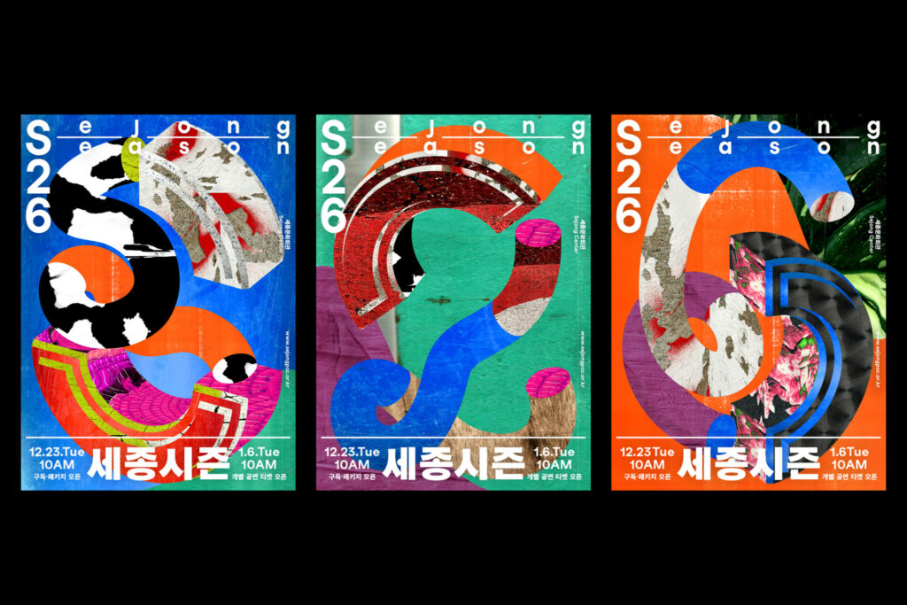
세종문화회관의 대표 공연 브랜드 ‘세종시즌’은 매해 다양한 공연 예술을 통해 관객과 소통하는 프로그램입니다.
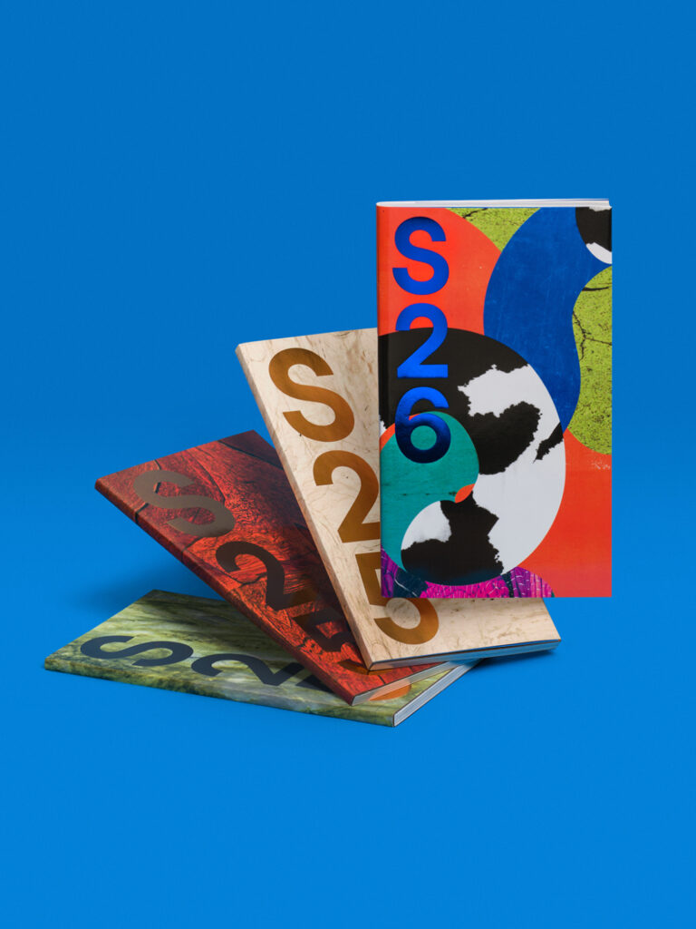
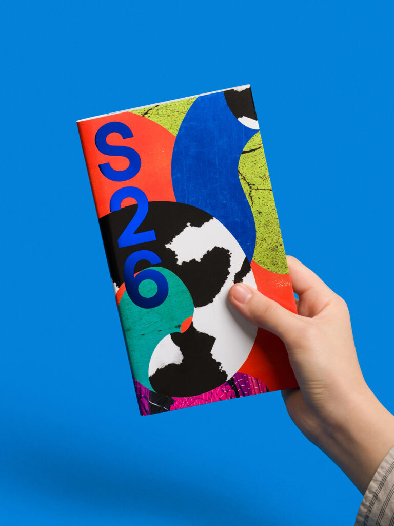
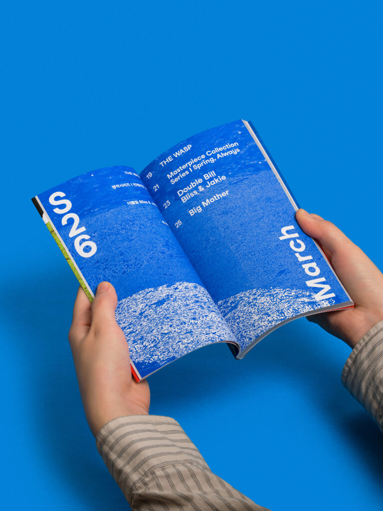
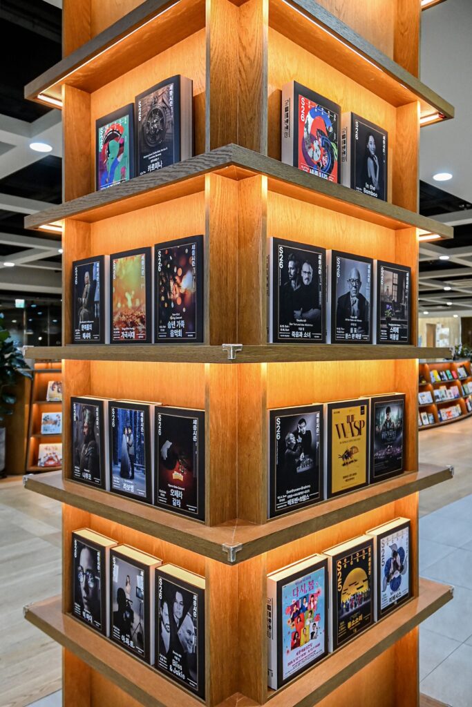
일상의실천은 작년에 이어 ‘세종시즌26’의 키비주얼과, 웹사이트, 시즌북을 디자인하여 스캔 이미지, 포스터 프레임 시스템 등의 비주얼 아이덴티티를 유지했습니다.
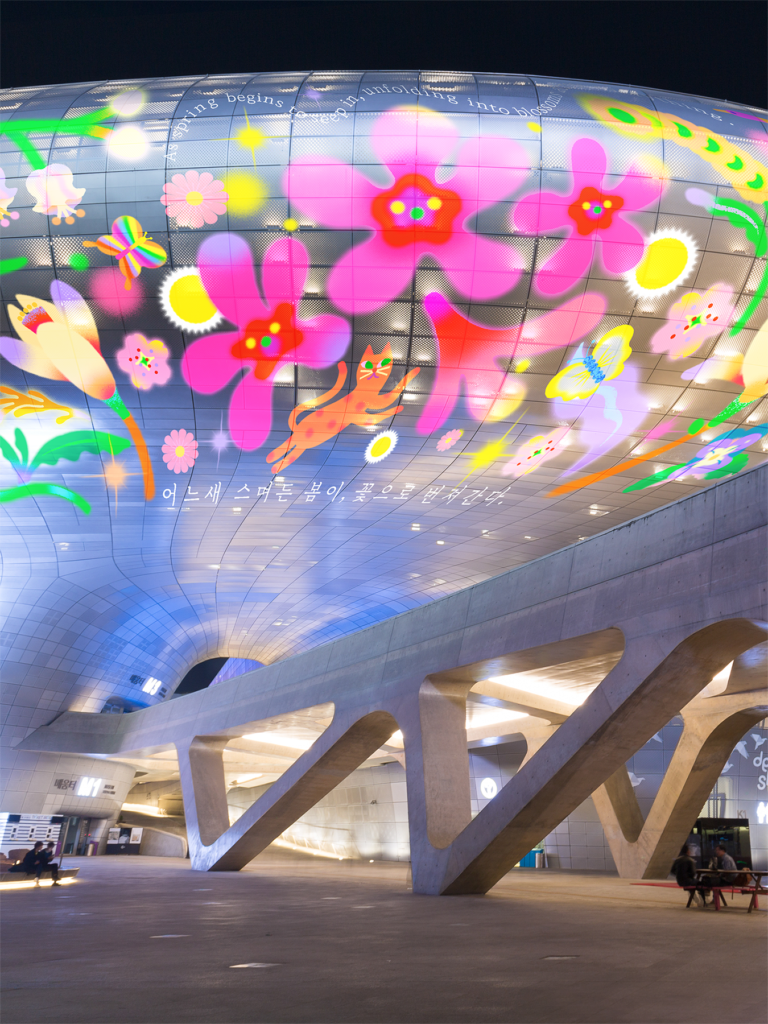
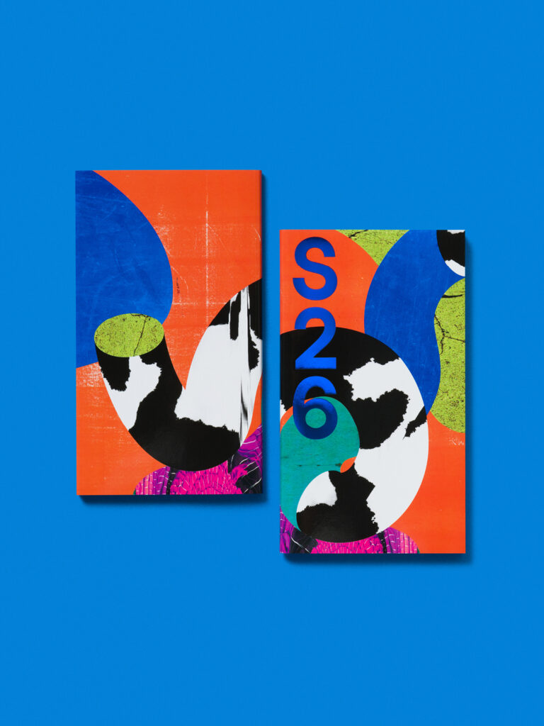
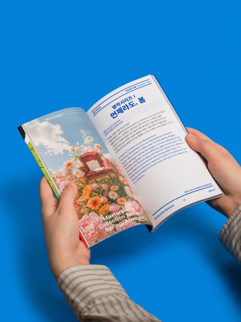
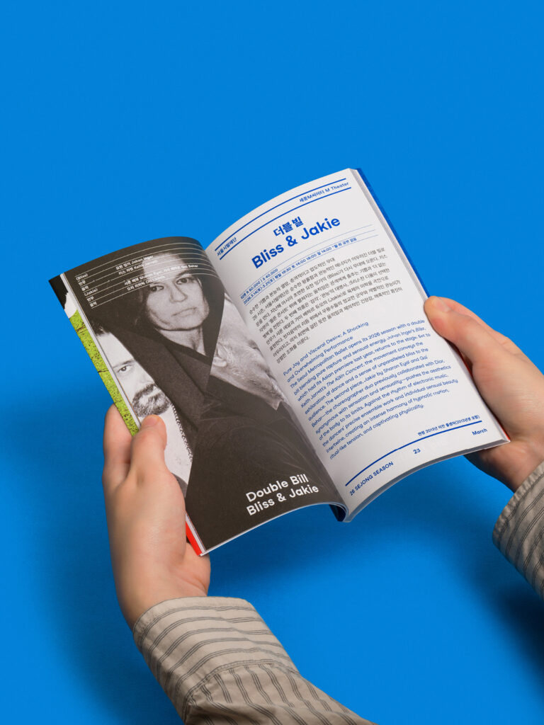
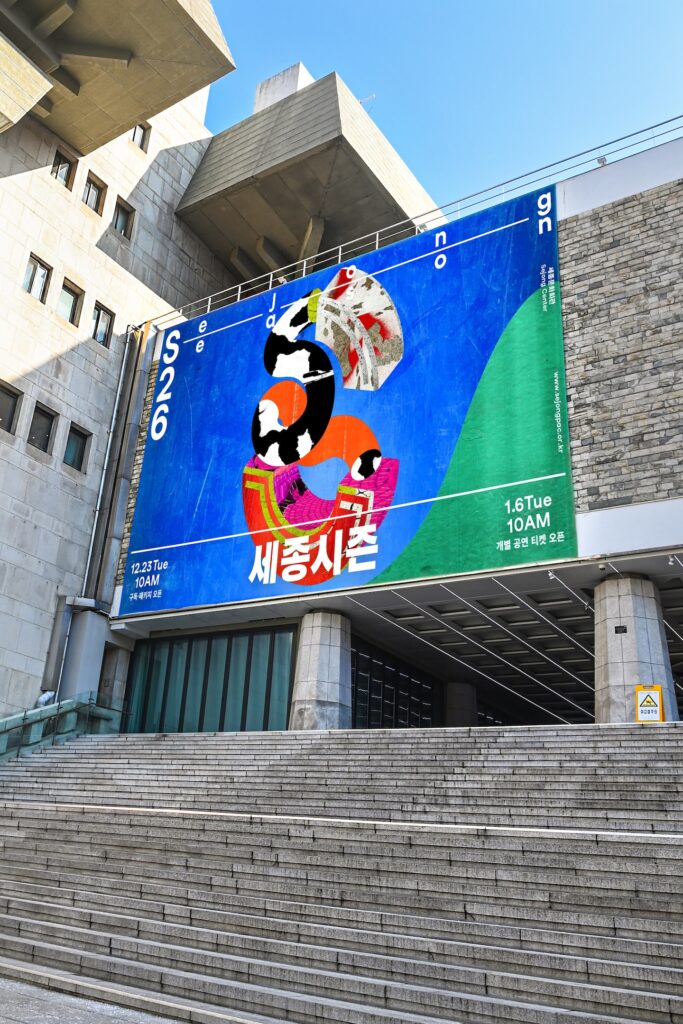
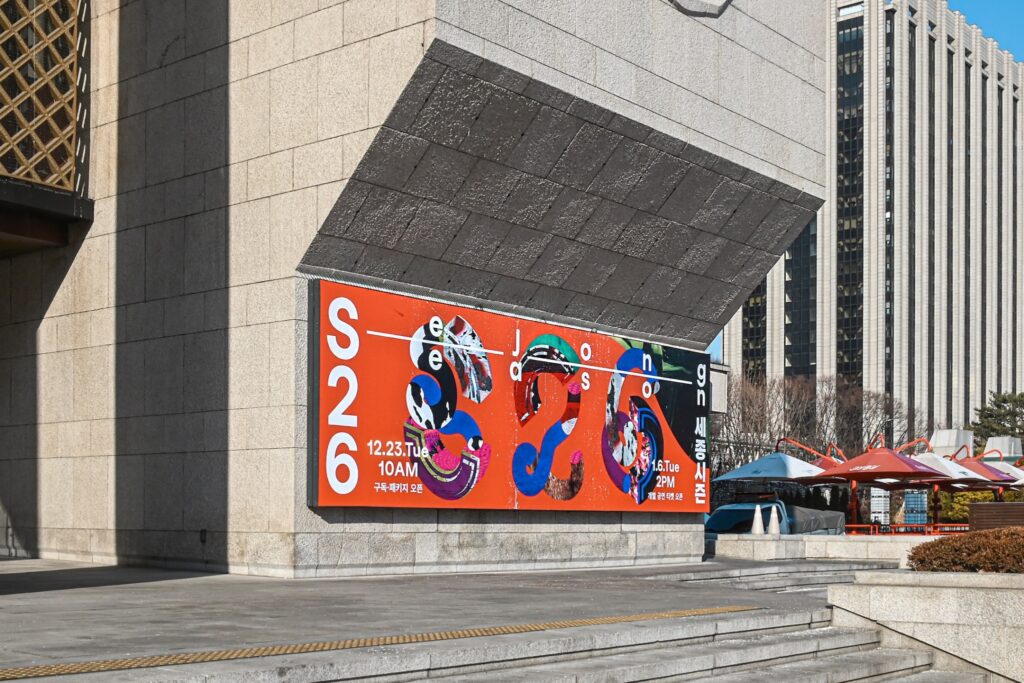
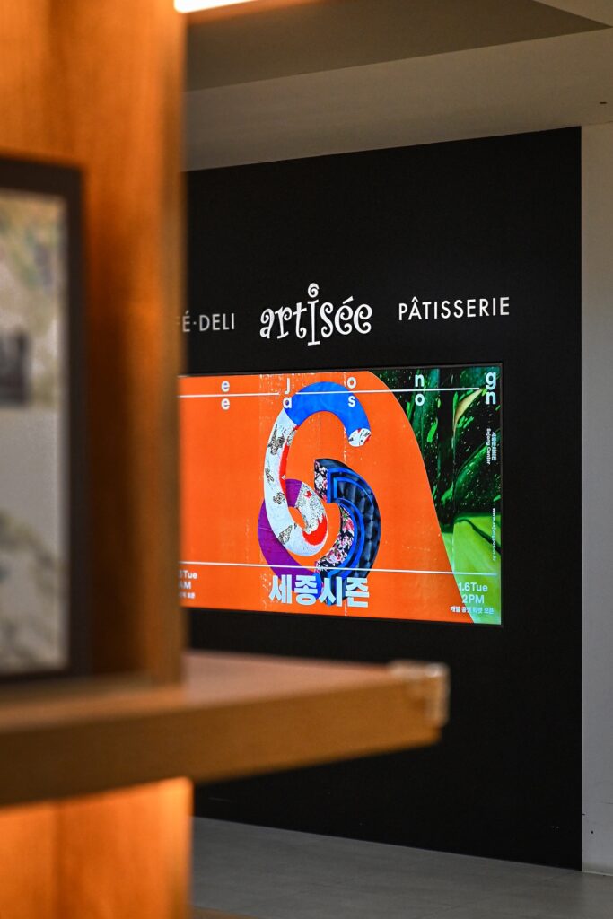
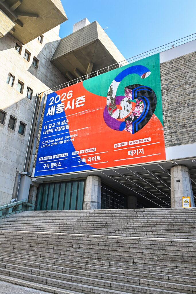
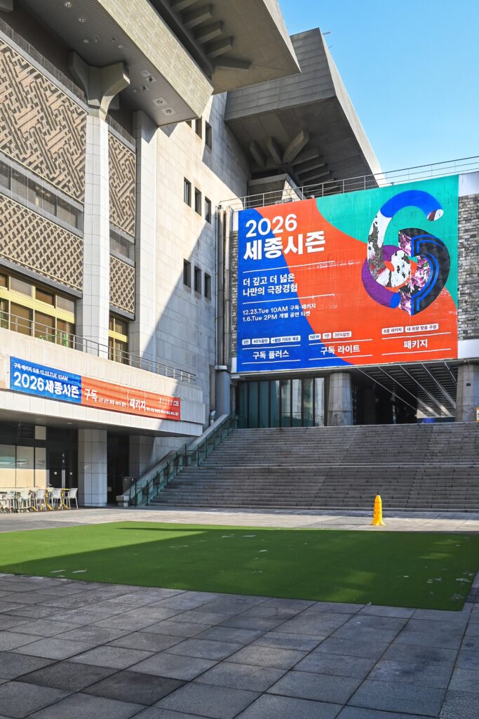
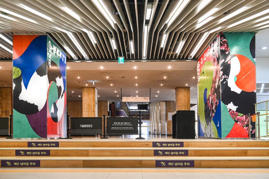
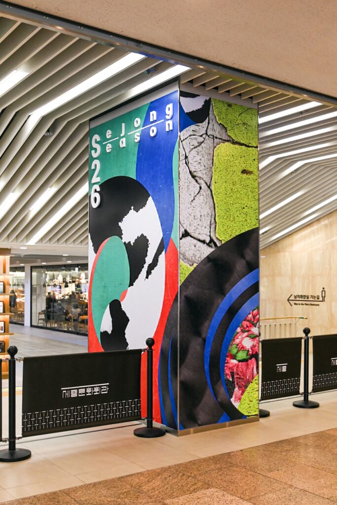
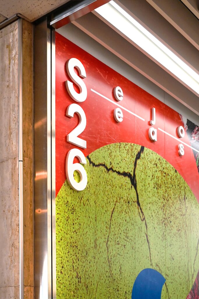
키비주얼은 시민과 가까운 공연장을 키워드로하여 도시, 의복, 자연의 이미지를 포착하고자 했습니다. 담벼락, 도로, 표지판, 옷감, 천, 식물, 땅 등 다양한 장소의 질감을 스캔하고, 건축물을 연상시키는 입체조형과 유연하게 움직이는 원기둥에 이미지를 마스킹했습니다. 또한 ‘S’, ‘2’, ‘5’ 각 글자의 조형을 재구성하는 모션디자인을 통해 단일 이미지를 넘어 풍성한 시각적 연출을 의도했습니다.
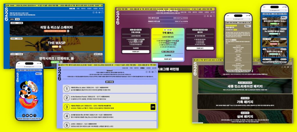
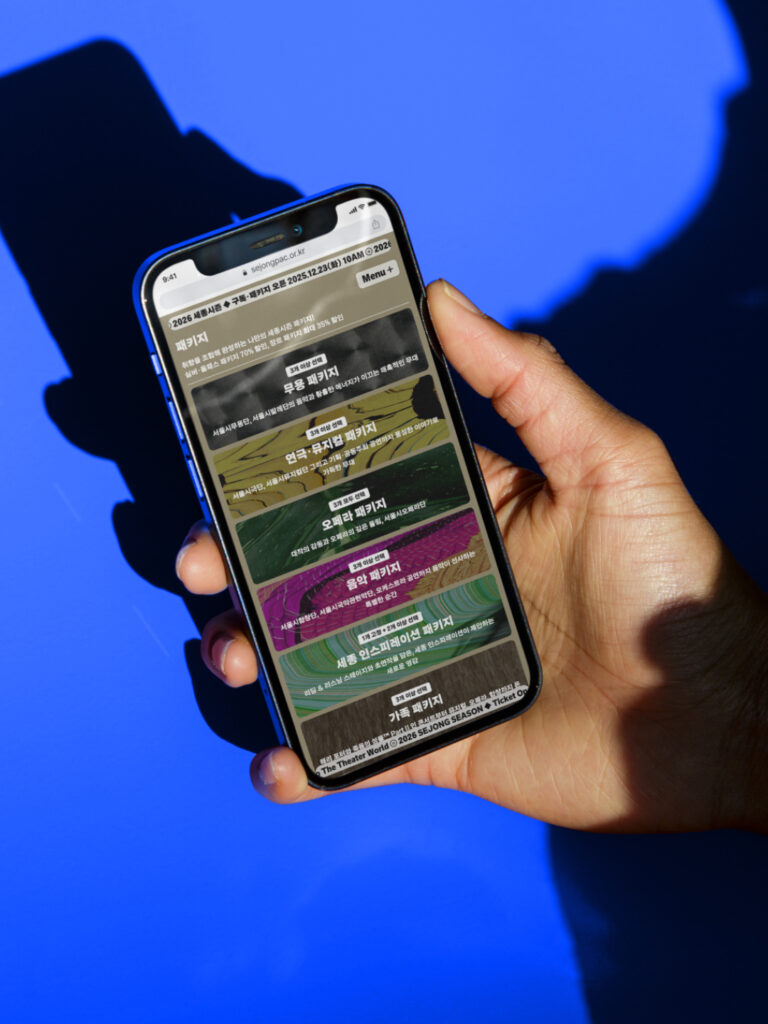
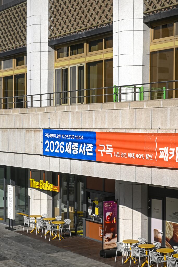
웹사이트는 포착된 여러 텍스쳐를 기반으로 하여, 다양한 매력을 지닌 공연들을 소개합니다. 메인 화면의 사용자 인터랙션을 통해 여러 질감으로 표현된 세종시즌의 키비주얼을 둘러보고, 다양한 종류의 프로그램, 구독 및 패키지 상품들을 직관적으로 소개하고자 했습니다.
크리에이티브 디렉터. 권준호
키비주얼 디자인. 안지효
편집 디자인. 안지효
디자인 도움. 강민서
웹사이트 디자인. 신지웅
모션 그래픽. 정수이
사운드. 신지웅
국문 타이틀 디자인. 김태룡, 박세희
사진. 권준호, 안지효
웹사이트 개발. 네오그라프
클라이언트. 세종문화회관
Sejong Season is Sejong Center for the Performing Arts’ annual program that connects with audiences through a wide range of performances.
Following last year’s work, Everyday Practice designed the Sejong Season 26 key visual, website, and season book, continuing the established visual identity—scanned imagery and the poster frame system.
Built around the idea of “a venue close to citizens,” the key visual captures textures from the city, clothing, and nature. Scanned surfaces—walls, roads, signboards, fabrics, plants, and soil—are masked onto architectural forms and flexible moving cylinders. Motion design reconstructs the “S,” “2,” and “5” letterforms to expand the visual experience beyond a single still.
The website uses these textures to introduce each performance, letting users explore the key visual through interaction while presenting programs, subscriptions, and packages clearly.
Creative Director. Joonho Kwon
Key Visual Design. Jihyo Ahn
Editorial Design. Jihyo Ahn
Design Assistant. Minseo Kang
Website Design. Jiwoong Shin
Motion Graphics. Sui Jeong
Sound. Jiwoong Shin
Korean Title Design. Taeryong Kim, Sehee Park
Photography. Joonho Kwon, Jihyo Ahn
Website Development. NEOGRAPH
Client. 세종문화회관