

세종시즌 25 키비주얼 디자인
Sejong Season 25 Identity Key Visual Design
2025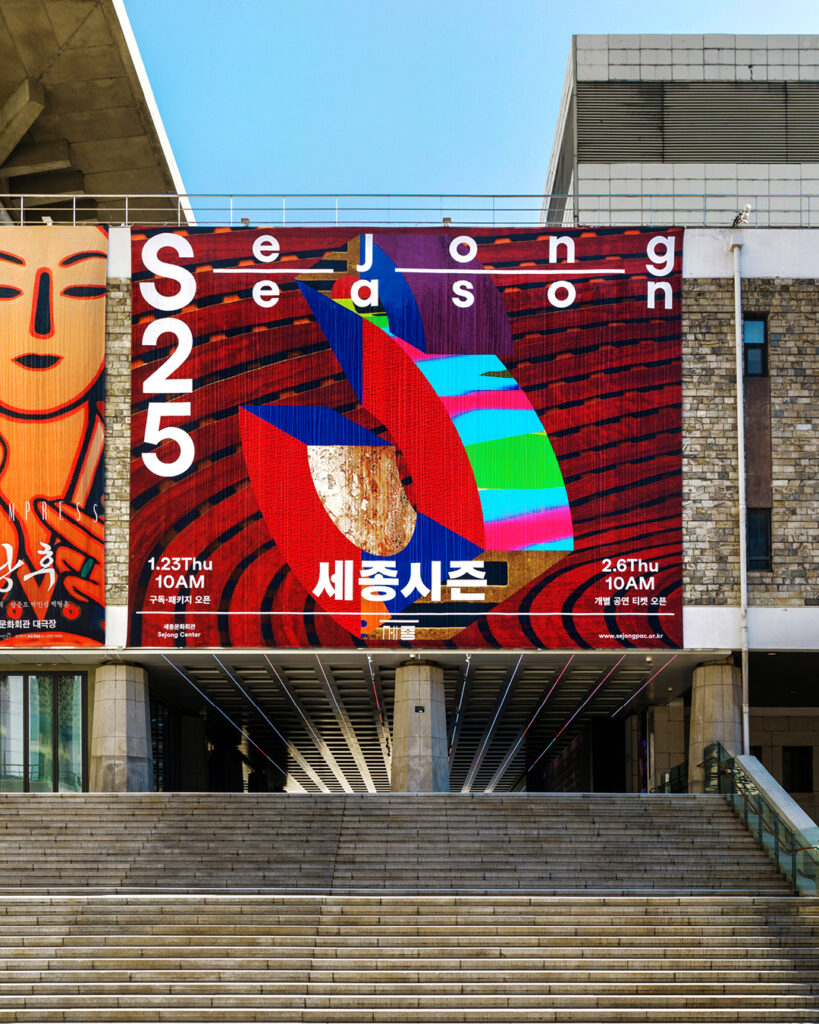

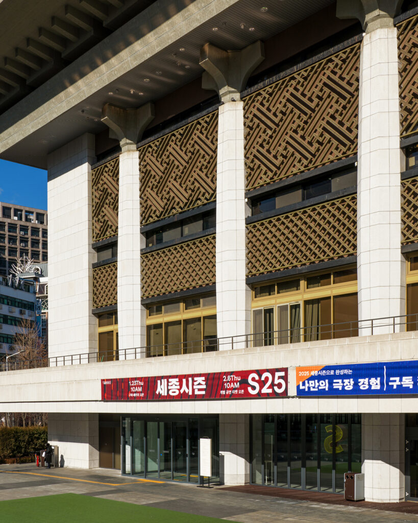
세종문화회관의 대표 공연 브랜드 ‘세종시즌’은 매해 다양한 공연 예술을 통해 관객과 소통하는 프로그램입니다.
일상의실천은 2025년을 맞아 기획된 ‘세종시즌 25’의 키비주얼을 디자인하며, 세종문화회관 고유의 정체성과 공연 예술의 현장성을 담아낸 비주얼 아이덴티티를 개발했습니다.
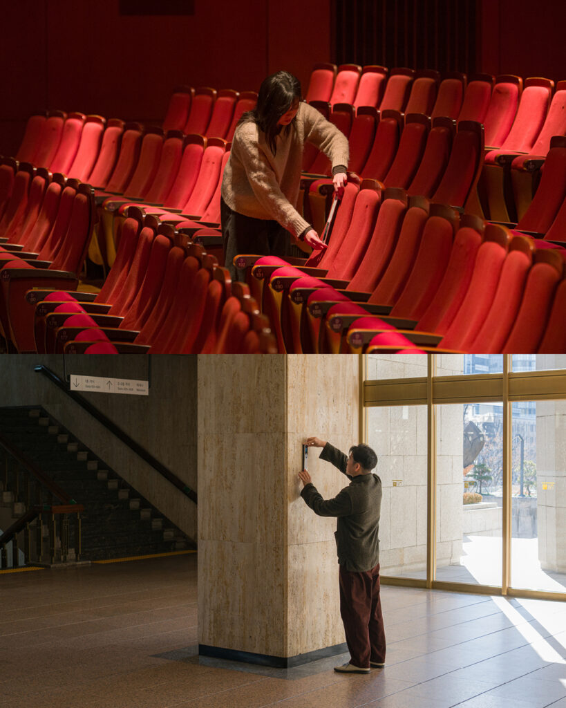
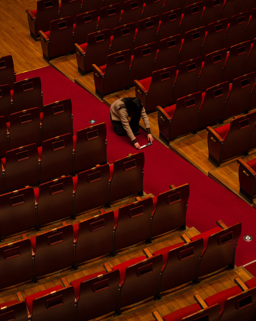
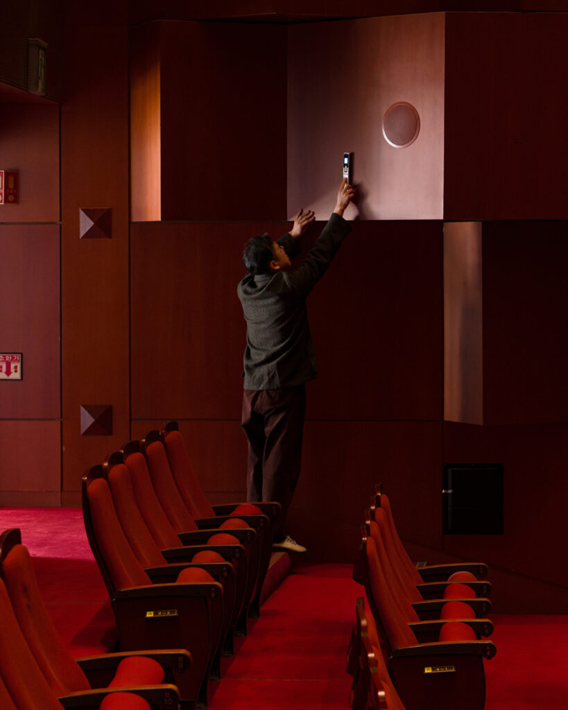
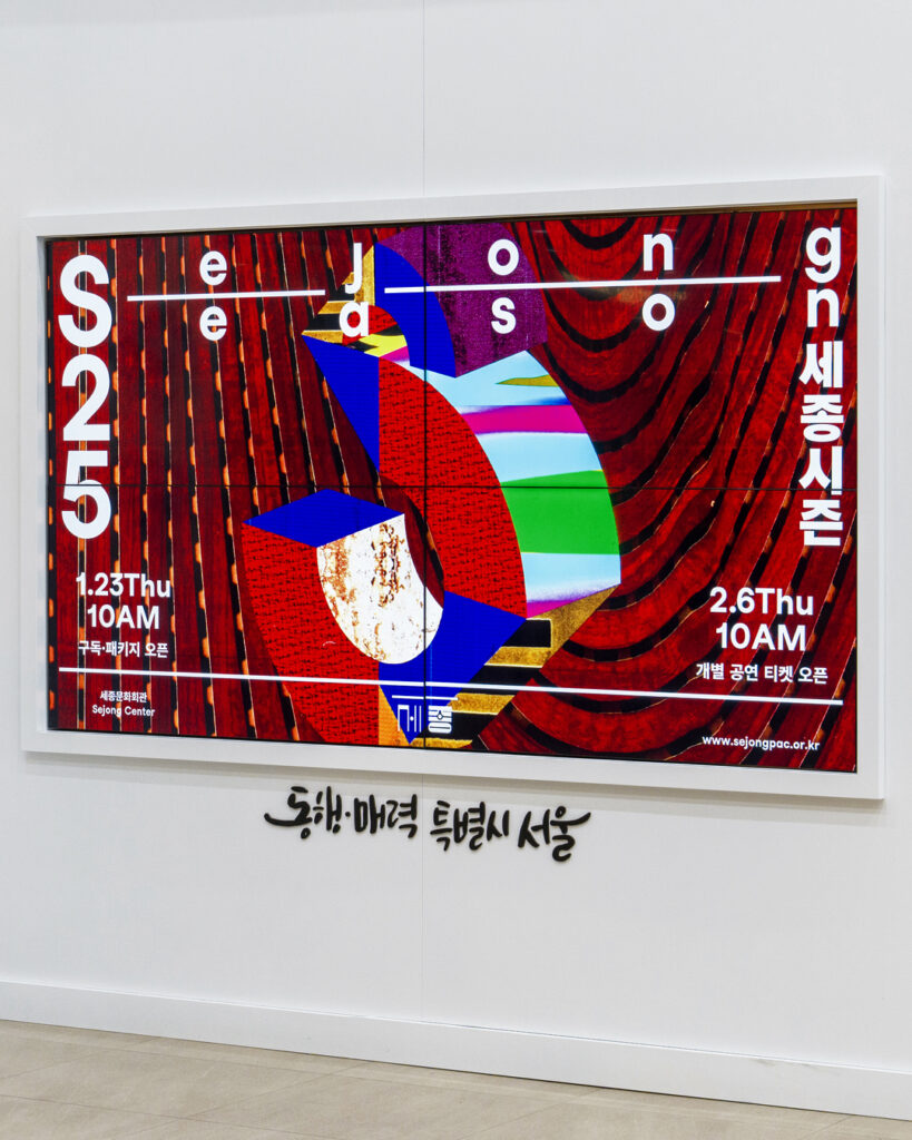
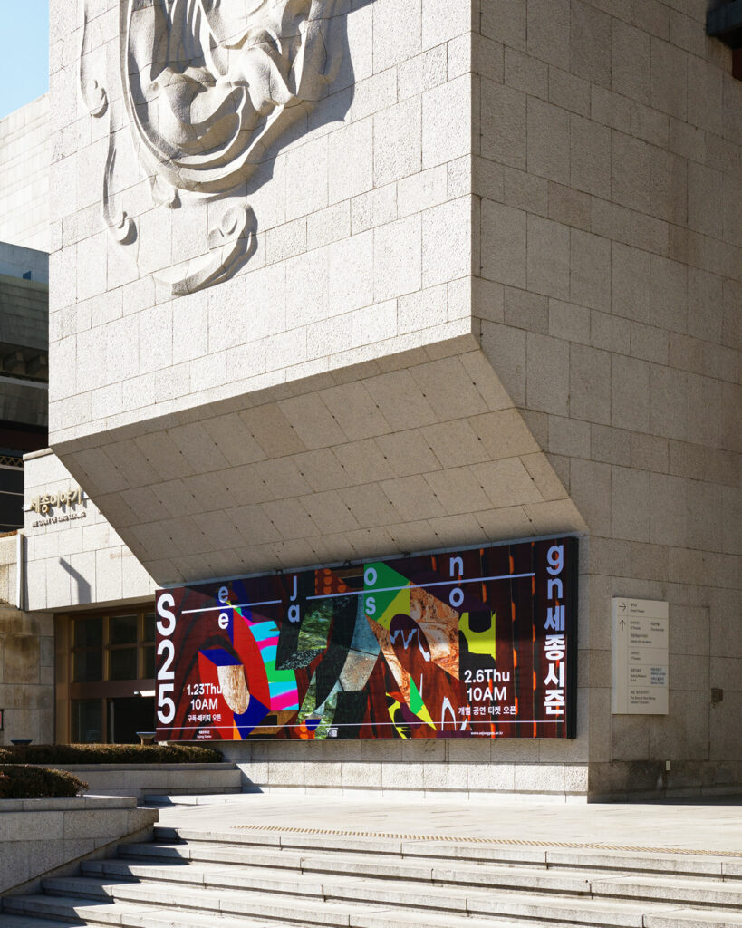
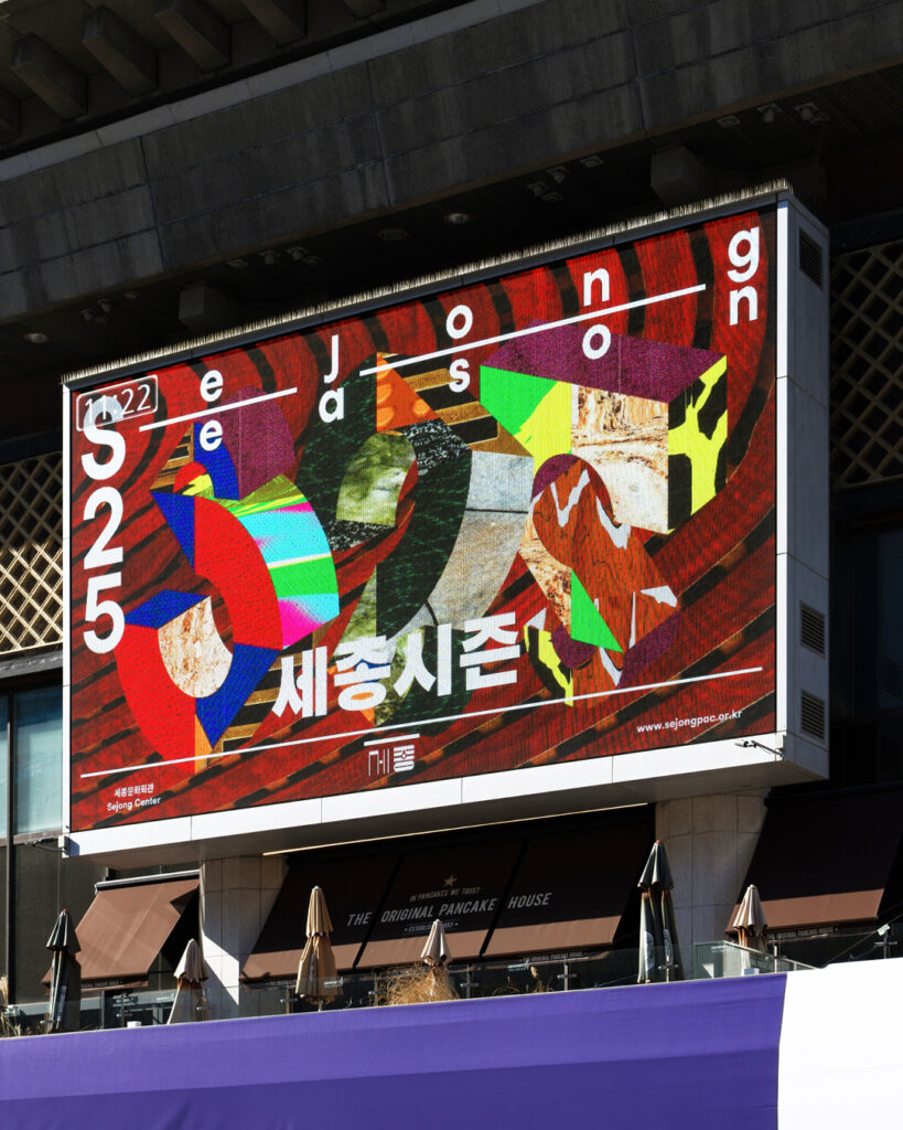
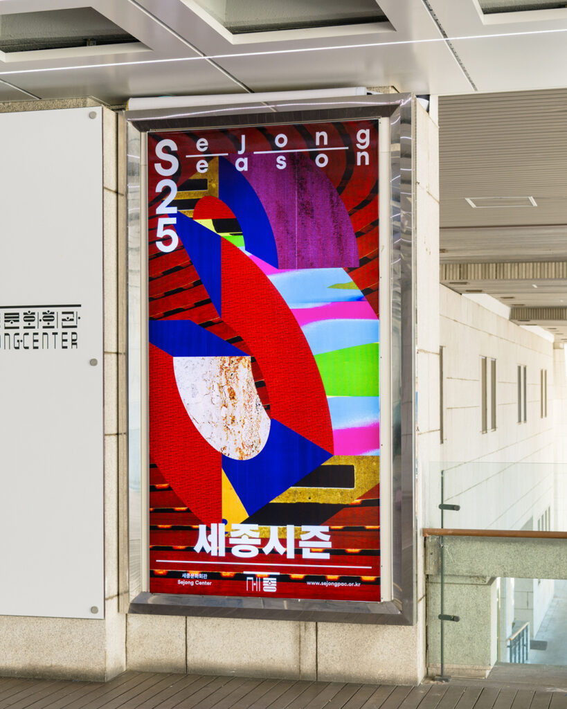
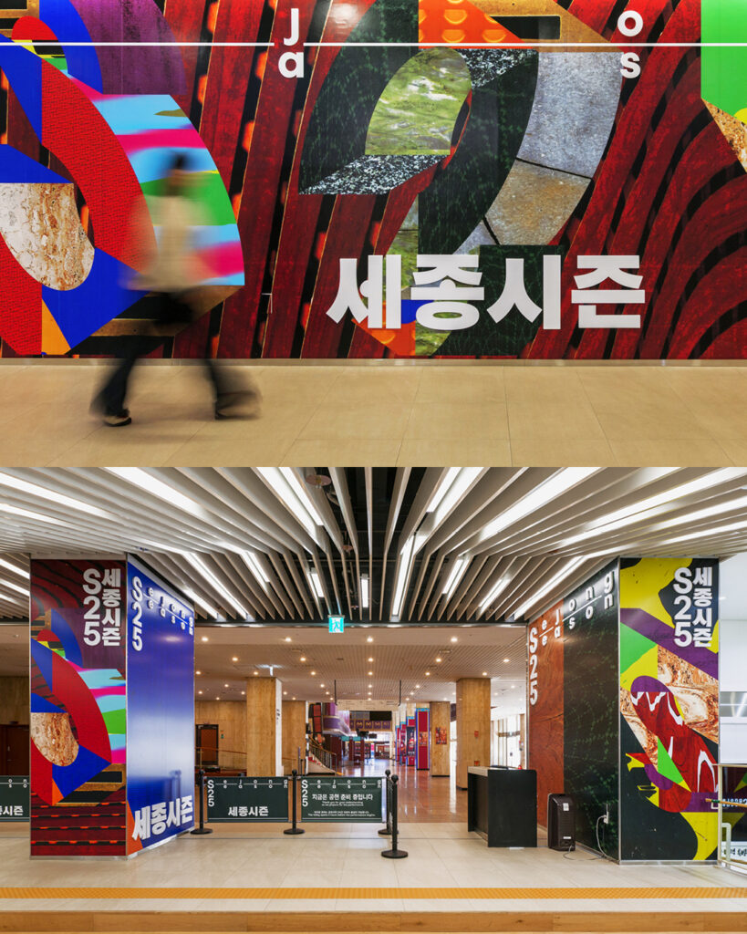
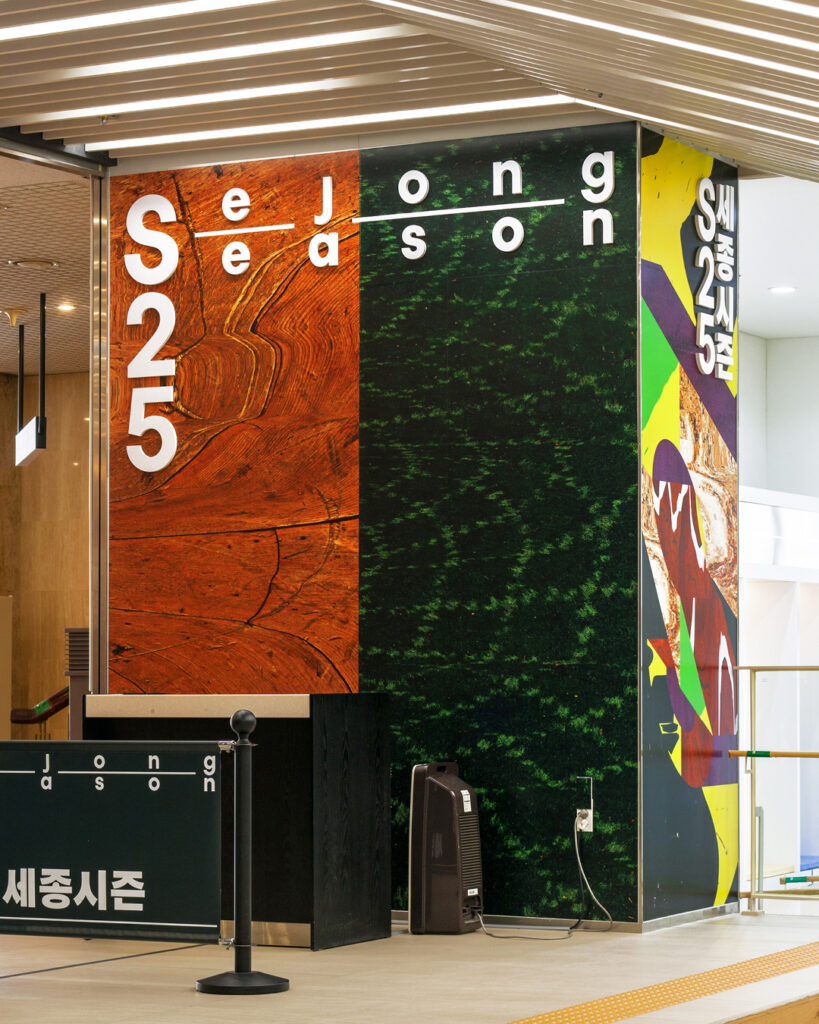
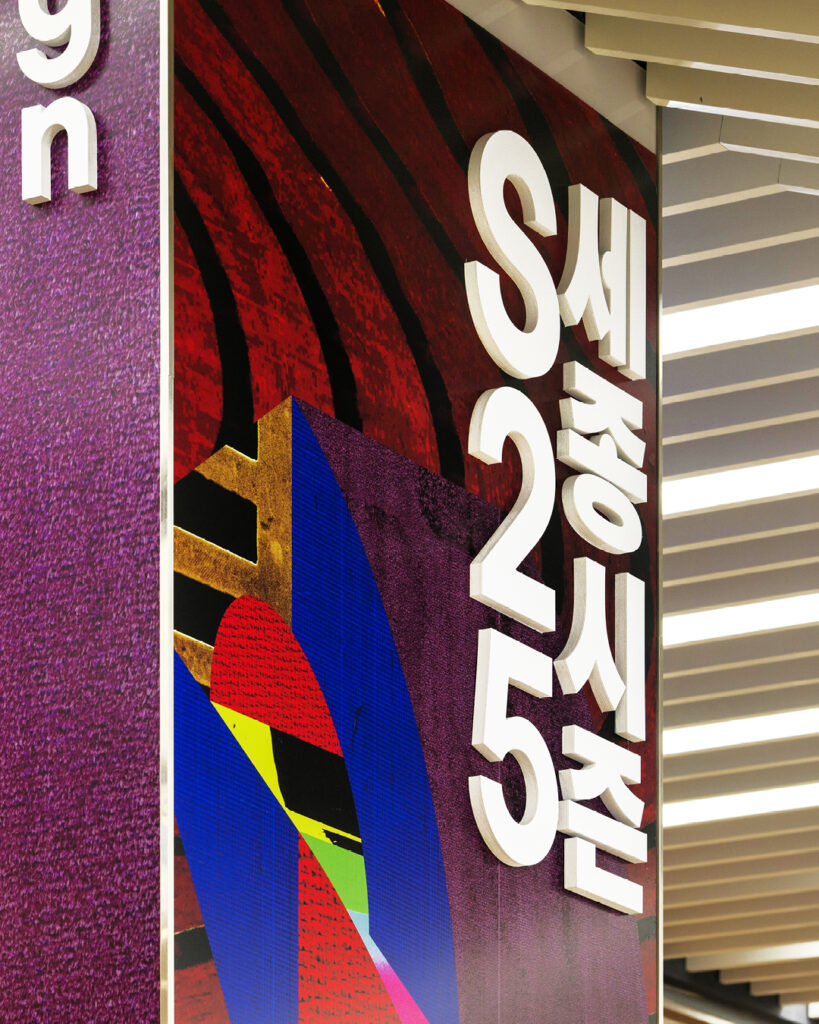
이번 프로젝트는 세종문화회관이라는 물리적 장소에 주목하여, 단순히 공연이 이루어지는 무대가 아닌, 공연이 준비되고 만들어지는 전체적인 장소 무대 뒤, 객석, 로비, 복도, 벽면, 바닥 등 그 물성과 구조, 질감을 시각적으로 포착하고자 했습니다. 이를 위해 현장을 탐색하며 다양한 장소의 질감을 스캔하고, 세종문화회관의 공간이 지닌 시간성과 경험 요소를 시각화했습니다. 공연이 만들어지는 공간의 정서를 담아낸 이러한 스캔 이미지는, 이번 시즌의 타이틀 ‘S25’를 형상화한 입체 조형에 마스킹되어 사용되었습니다. ‘S25’는 블럭 구조의 입체 조형으로 시각화되었으며, 각 면에는 서로 다른 시점과 질감을 가진 이미지들이 적용되어 다양한 조형적 변주를 가능하게 했습니다. 또한 이 입체 블럭은 하나의 형태에 머무르지 않고 ‘S’, ‘2’, ‘5’ 각 글자의 조형으로 재구성되어, 시리즈의 유연성과 확장성을 동시에 담아낼 수 있도록 기획되었습니다.
디자인 디렉터. 권준호
디자인. 안지효
텍스처 리서치 & 아카이빙. 권준호, 안지효
국문 타이틀 디자인. 김태룡, 박세희
모션 그래픽. 유환준
사운드. 신지웅
사진. 김진솔 @jskstudio_official
클라이언트. 세종문화회관
‘Sejong Season’, the signature performance brand of the Sejong Center for the Performing Arts, is an annual program that engages audiences through a wide array of performing arts.
Daily Practice designed the key visuals for ‘Sejong Season 25’, planned for 2025, developing a visual identity that reflects both the unique character of the Sejong Center and the immediacy of the performing arts.
This project focused on the physical space of the Sejong Center—not just the stage where performances take place, but the entire environment where performances are prepared and brought to life: backstage, audience seating, lobbies, corridors, walls, and floors. To visualize the materiality, structure, and texture of this space, we conducted on-site explorations, scanning a variety of surfaces and capturing the temporal and experiential qualities of the venue. These scanned images, which embody the atmosphere and emotion of the spaces where performances take shape, were integrated into a three-dimensional sculptural form representing the season’s title, “S25.” The “S25” was visualized as a modular block-like sculpture, with each face featuring a different perspective and texture, enabling a range of formal variations. To further emphasize the series’ flexibility and scalability, the block structure was also designed to be reconfigured into individual sculptural representations of the letters “S,” “2,” and “5.”
Design Director. Joonho Kwon
Design. Jihyo Ahn
Texture Research & Archiving. Joonho Kwon, ihyo Ahn
Korean title design. Taeryong Kim, Sehee Park
Motion graphics. Hwanjun Yu
Sound. Jiwoong Shin
Photography. @jskstudio_official
Client. 세종문화회관