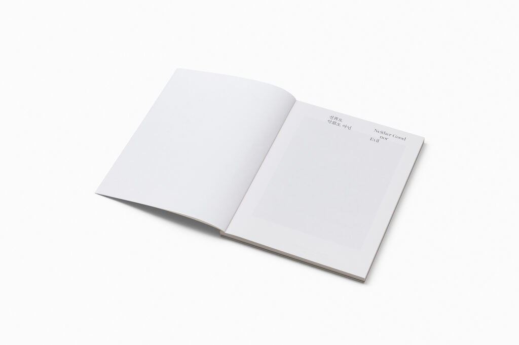
후마니타스 『우리들의 드라마』 표지 디자인
Humanitas <Our Drama> Cover Design
Editorial
2025
후마니타스
3
영등포선유도원축제
Yeongdeungpo Seonyudo Park Festival
GraphicMotion
2025
영등포문화재단
5
공공디자인 합니다
Do, Public Design
Editorial
2025
한국공예·디자인문화진흥원
4
ACC XMF
ACC XMF
GraphicIdentityMotion
2025
국립아시아문화전당재단
3
힐마 아프 클린트: 적절한 소환
Hilma af Klint: Proper Summons
EditorialGraphicMotion
2025
부산현대미술관
3
<기다림이 끝나는 날에도> 전시 디자인
Even on the day when waiting ends
EditorialGraphicWebsite
2025
경기도미술관
4
스탑메이킹센스포스터 & 굿즈
STOP MAKING SENSE Poster & MDs
Graphic
2025
찬란
3
전북도립미술관 《진격하는 B급들》
Jeonbuk Museum of Art 《B-Class Jokes》
EditorialGraphicSpace
2025
전북도립미술관
4
서울라이트 DDP 2025 여름 키비주얼 디자인
Key Visual Design for Seoul Light DDP 2025 Summer
Graphic
2025
서울디자인재단
5
2025 대한민국미술축제
2025 Korea Art Festival
GraphicIdentityMotion
2025
문화체육관광부예술경영지원센터
5
보고싶어, 니 영화! 2025
We Want Your Film! 2025
Graphic
2025
서울독립영화제
3
전기가오리 웹사이트
Philo Electro Ray Website
Website
2025
전기가오리
4
주한독일문화원 《Solitude: Loneliness and Freedom》 키비주얼 디자인
Key Visual Design for Goethe-Institut Korea’s “Solitude: Loneliness and Freedom”
GraphicIdentity
2025
주한독일문화원
3
CODE Korea
CODE Korea
GraphicIdentityMotion
2025
Pitti Immagine
4
집중호우사이
Between Heavy Showers
Graphic
2025
정태춘 박은옥
4
전기가오리 E-Book, 명함, 시각물아이덴티티디자인
Philo Electro Ray E-Book, Business Cards, Visual Identity Design
EditorialGraphicIdentity
2025
전기가오리
4
눈꺼풀 안쪽의 정원
A Quiet Garden Behind My Eyes
Graphic
2025
조아영
3
설문대할망전시관 재개관 키비주얼 디자인
Key Visual Design for the Reopening of the Seolmundaehalmang Complex
GraphicMotion
2025
설문대할망전시관
4
2025 울산현대미술제 <굿 워캔드>
GOOD WORKEND
EditorialGraphicIdentity
2025
울산광역시
4
새로움아이 아이덴티티 & 웹사이트
Saeroumi Identity & Website
IdentityMotionWebsite
2025
새로움아이
3

선善도 악惡도 아닌 도록

Neither Good nor Evil Catalogue

2023
Editorial

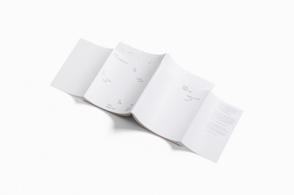
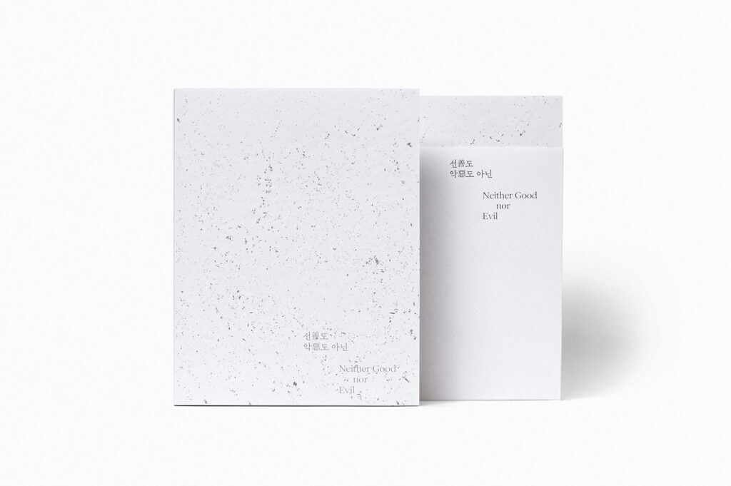
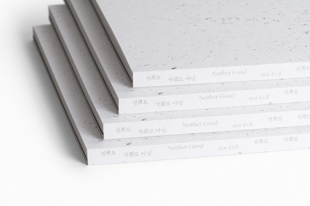
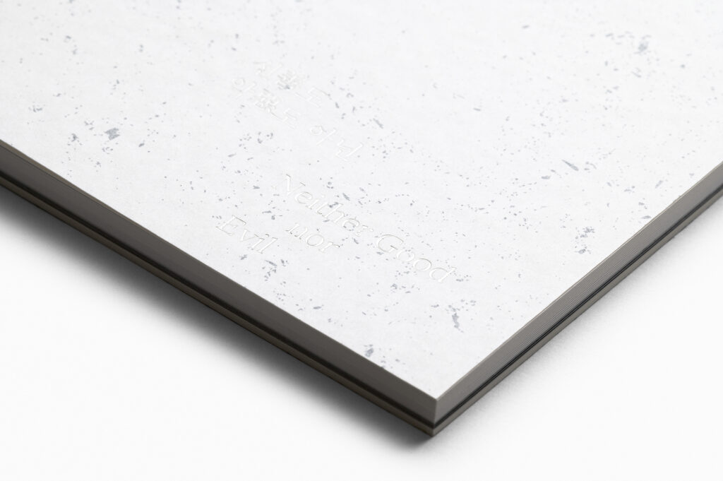
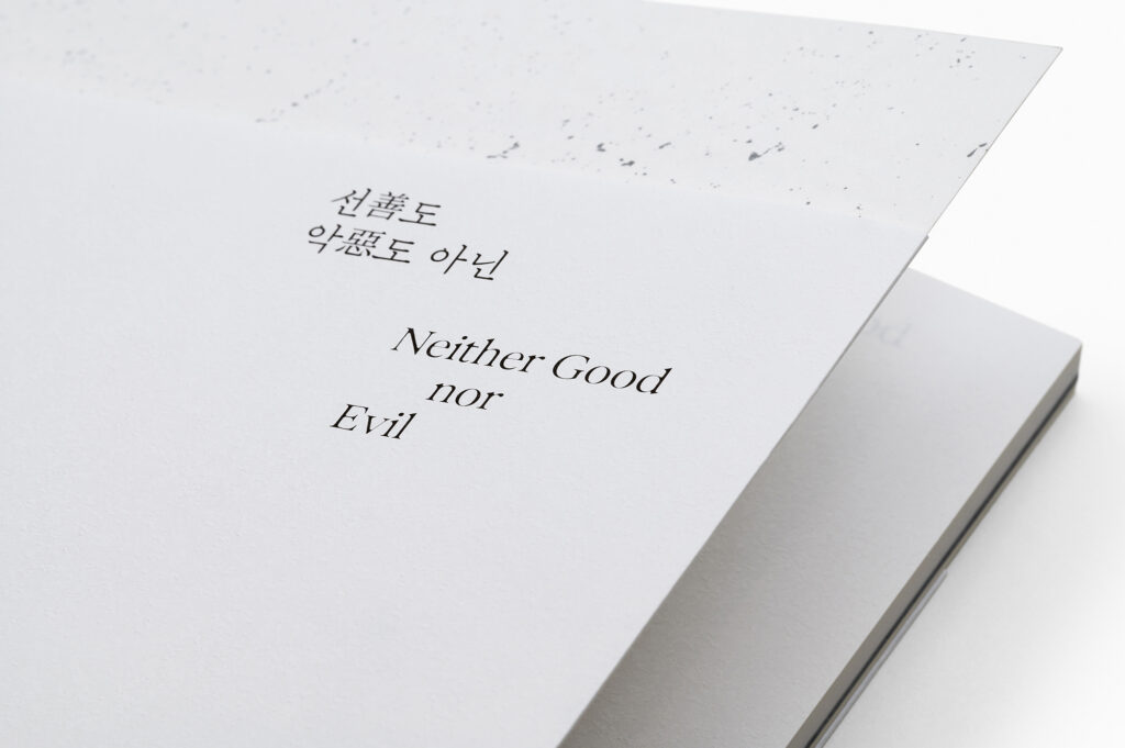
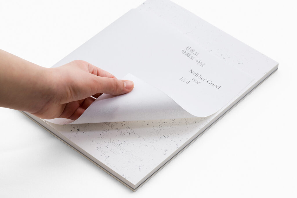
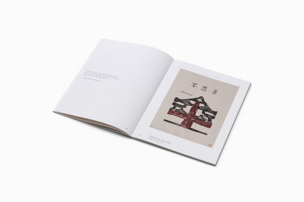
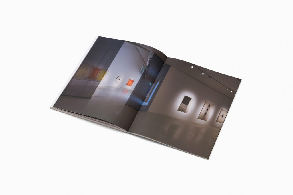
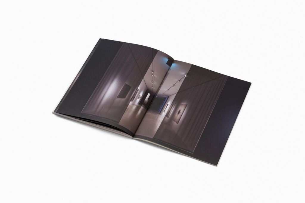
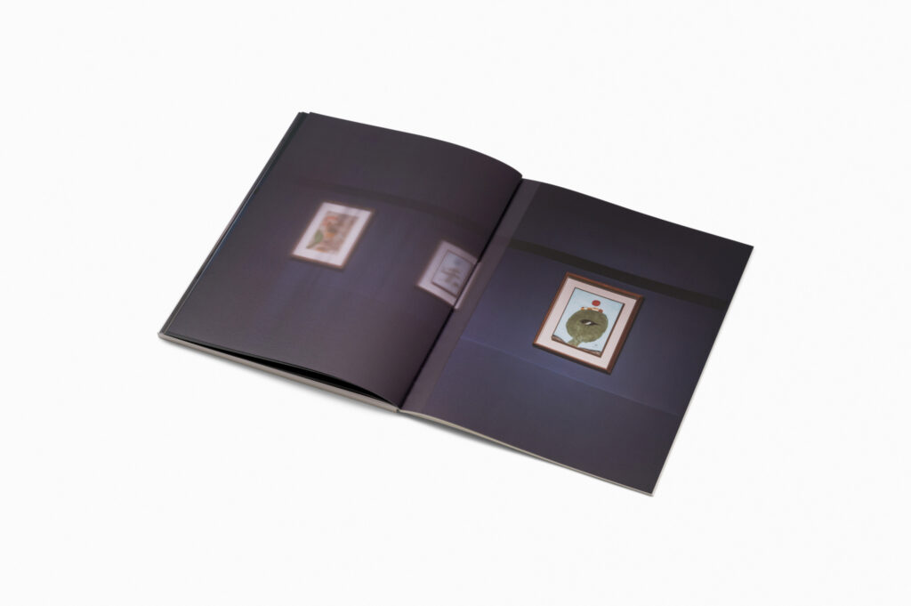
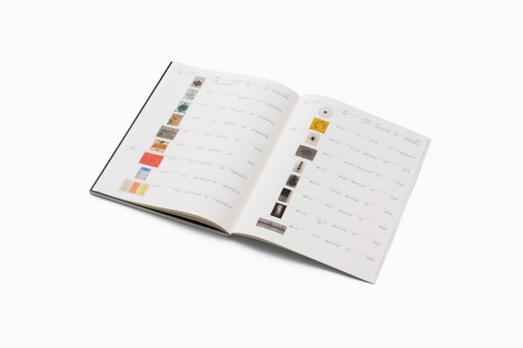
양주시립장욱진미술관에서 기획한 <선善도 악惡도 아닌>은 한국 근현대 미술의 세 거장 장욱진, 곽인식, 최상철의 작품을 재해석한 전시입니다. 소유나 집착, 지배 등의 욕망으로부터 벗어나 ‘자기비움’을 독창적인 방식으로 표현한 세 작가의 작품을 소개합니다. 이번 전시는 대상에 대한 진정성을 예술가적 태도로 해석한 작품들을 통해 나와 대상이 가지는 관계에 대해 깊이있게 생각해보자는 취지에서 기획되었습니다.일상의실천은 장욱진, 곽인식, 최상철 세 작가의 특징을 관찰하여 단순성, 물성, 신체성과 같은 시각언어를 도출하였습니다. 인위성을 버리고 대상의 본질을 탐구하는 본 전시의 미학을 단순한 입자로 표현하였고, 실제 재료를 활용하여 물성을 전달하고, 입자 굵기를 활용하여 세 작가를 상징적으로 표현하고자 하였습니다. 그리고 재료를 흐트러트리고 모으는 방법을 통해 나와 대상이 가지는 관계를 시각화하고자 노력했습니다.

디자인 디렉션. 권준호
디자인. 김주애

클라이언트. 양주시립장욱진미술관

Everyday Practice observed the characteristics of the three artists, Chang Ukchin, Quac Insik, and Choi Sang Chul and tried to reflect them in the exhibition. The aesthetic of the exhibition, which abandons artificiality and explores the essence of the subject, was expressed through simple particles and it was represented through patterns and paper properties. And we tried to represent the three artists symbolically by utilizing colors of off-white, light off-white, and white paper. Also, the act of peeling off represents ‘self-emptying’ by connecting with a large flap of the catalogue.

Design direction. Kwon Joonho
Design. Kim Juae

Client. 양주시립장욱진미술관