


나눔스퀘어 네오 웹사이트
NANUM Square Neo Website
2022
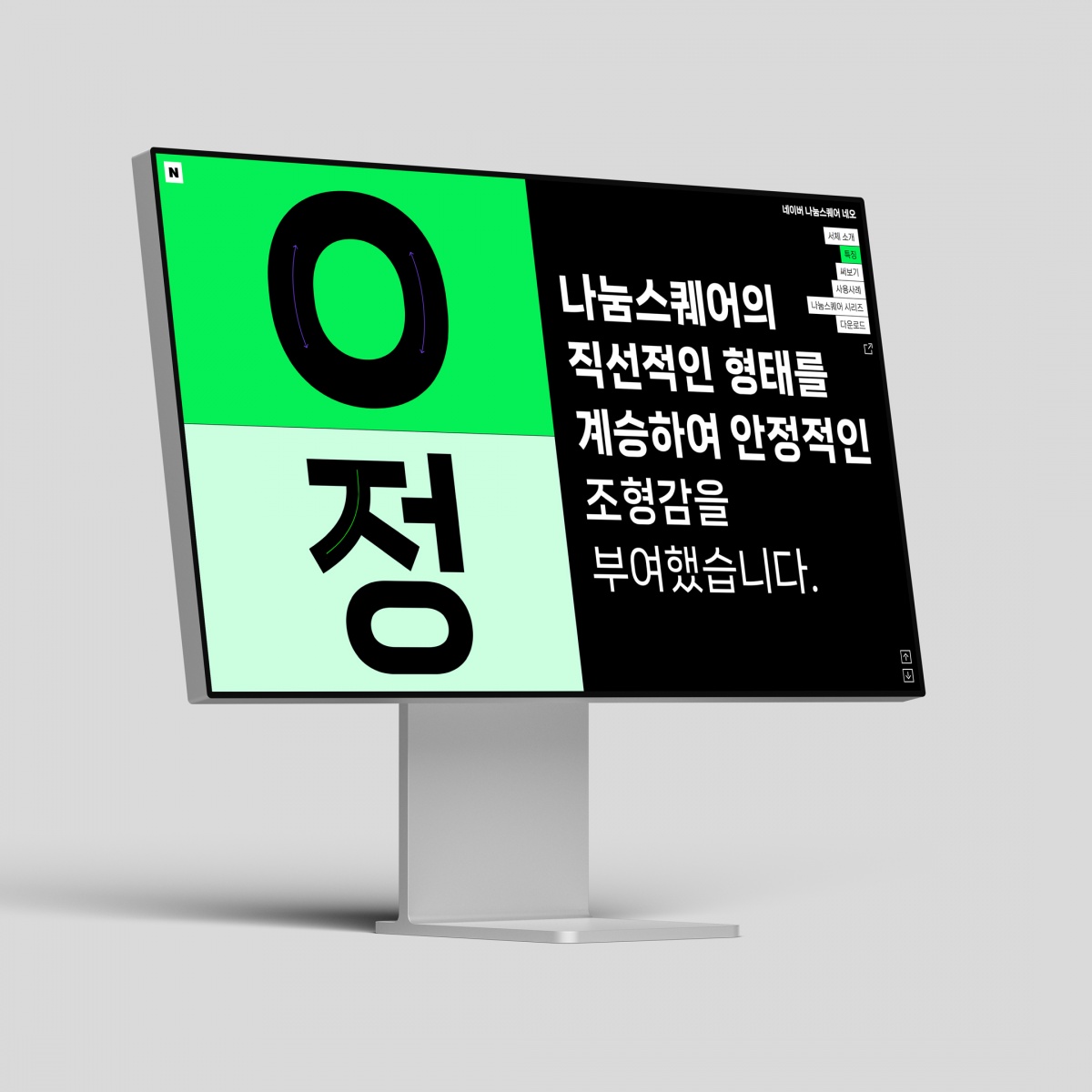

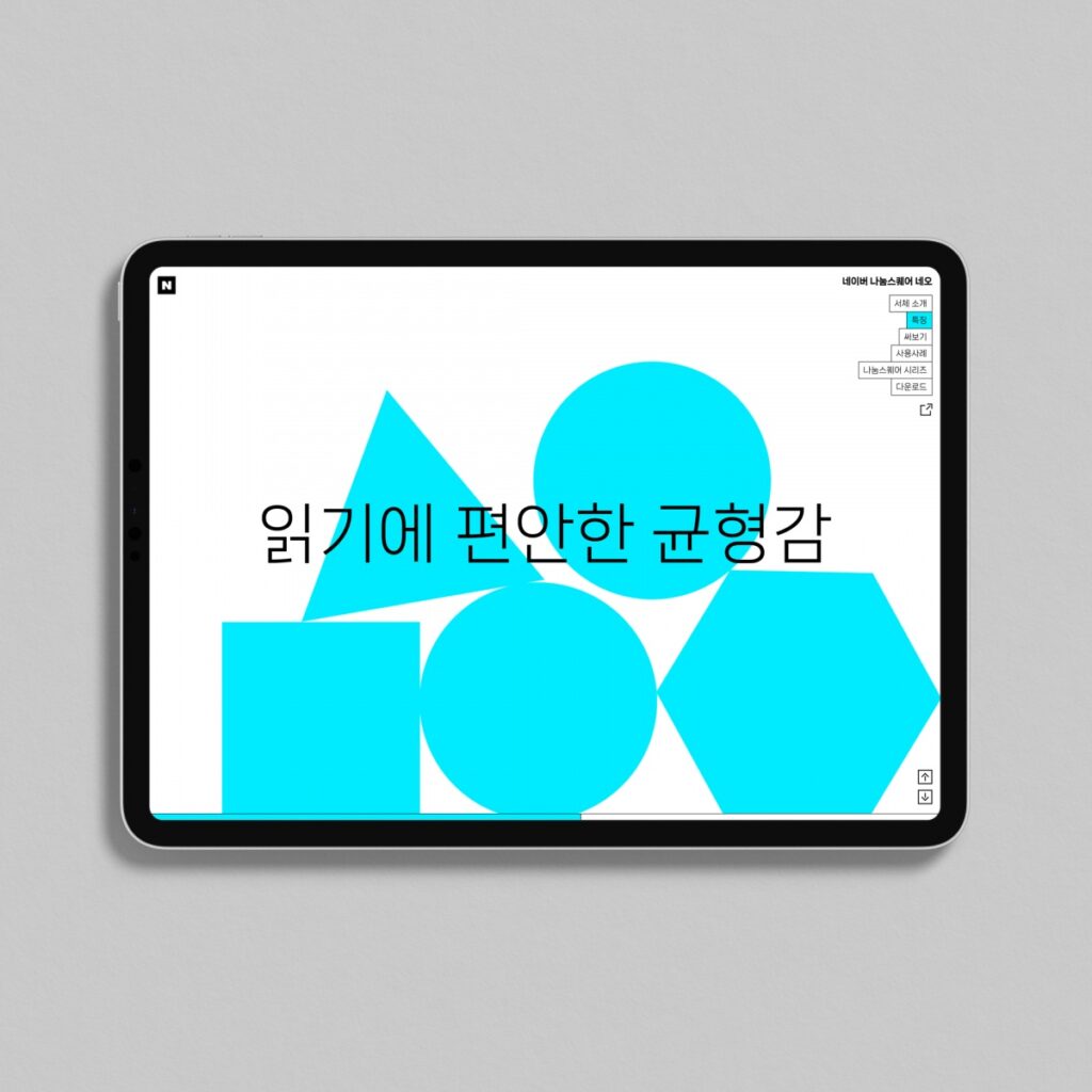
나눔스퀘어 네오는 나눔스퀘어 시리즈로 새롭게 출시된 네이버 브랜드 폰트입니다. 친근한 미감과 안정적인 글줄이 특징으로 다양한 환경에서 문장을 주목도 있게 전달하기 좋은 폰트입니다. 나눔스퀘어 네오는 베리어블 서체로 제작되어 사용자가 다양한 환경에서 필요에 따라 여러 굵기로 사용할 수 있습니다.
일상의실천은 나눔스퀘어 네오 폰트를 소개하는 웹사이트를 작업을 진행했습니다. 직선적인 형태와 필기감이 주는 친근함, 기존 나눔스퀘어와의 차이점 등 폰트의 특징을 다양한 모션그래픽으로 표현하고 폰트를 직접 사용해 볼 수 있도록 작업했습니다.
디자인. 권준호
개발. 고윤서, 김경철
모션 그래픽. 이윤호
인트로 모션 그래픽. 입자필드
폰트 디자인 및 개발. 산돌
제작. 네이버
클라이언트. NAVER
NANUM Square Neo is the brand typeface of the newly launched by NAVER. The font features a friendly aesthetic and stable writing line, making it a good font for delivering sentences with attention in various environments. The typeface is also made of a variable font, designed to be used in various thicknesses according to the user’s needs.
EVERYDAY PRCTICE designed and developed a website that introduces the NANUM Square Neo font. On this website, you can express the features of the font in various motion graphics, such as the familiarity of the straight shape, handwriting, and the difference from the existing NANUM Square, and try the font yourself.
Design. Joonho Kwon
Development. Yun-Seo Go, Kyungchul Kim
Motion Graphic. Yoonho Lee
Intro Motion Graphic. Particlefield
Font Design. Sandol
Production. NAVER
Client. NAVER