


인디스쿨 아이덴티티
Indischool Identity
2022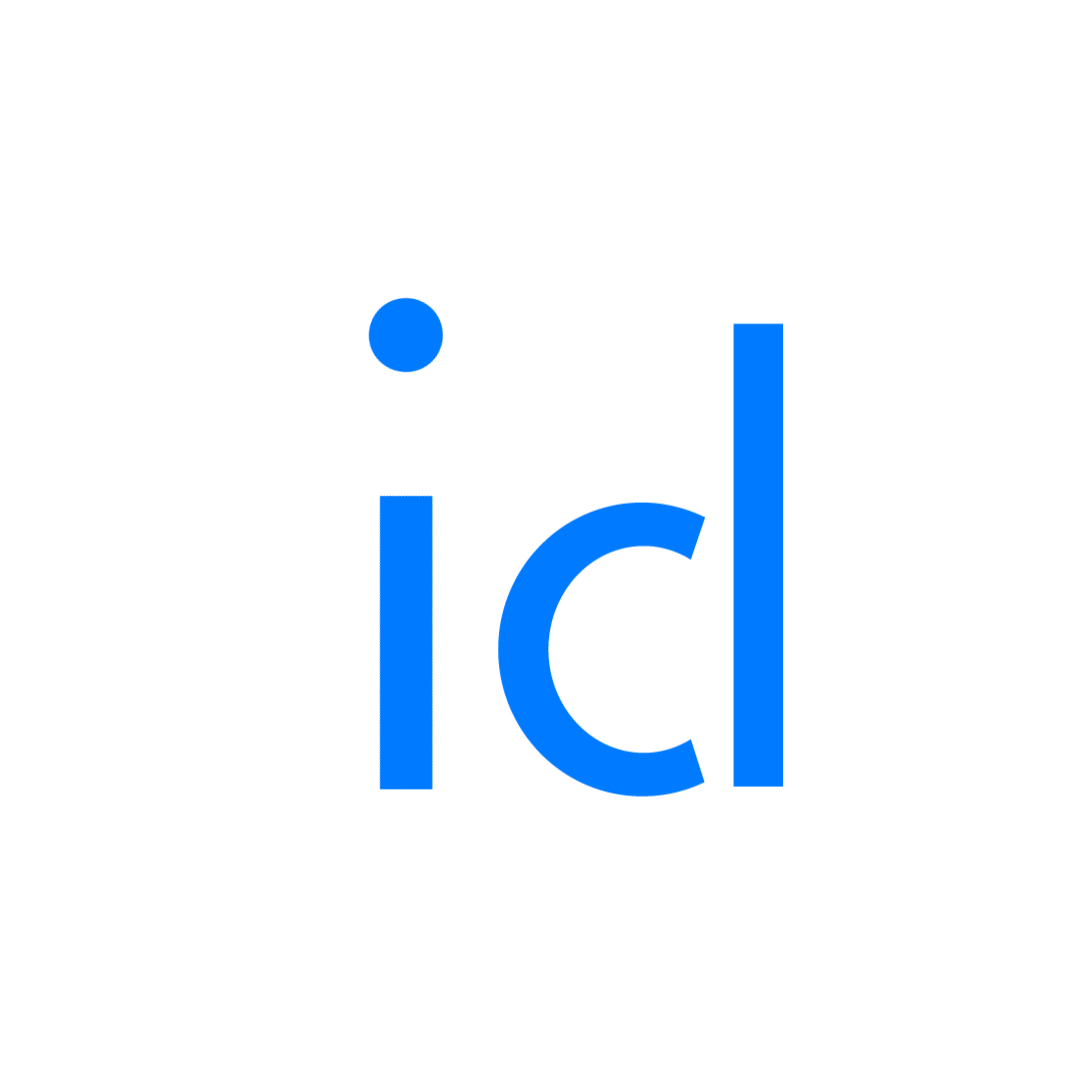

초등교사커뮤니티 인디스쿨은 전국 18만 초등교사 중 14만 명이 가입된 전국에서 가장 큰 교사 커뮤니티를 운영하고 있는 비영리단체입니다. 올해로 21주년을 맞은 인디스쿨은 초등 교육 현장의 지식과 경험을 나누는 플랫폼을 열어 ‘공간의 한계를 넘어선 지식 공유의 장’을 만들고 있습니다. 인디스쿨에서는 회원들의 자발적 참여로 실제 교실에서 사용되는 자료와 교육방법이 공유되고 있습니다. 많은 회원들이 금전적 보상이 없어도 받은 것이 고마워서 다시 나누는 마음으로 인디스쿨이라는 커뮤니티에 참여하고 있습니다.
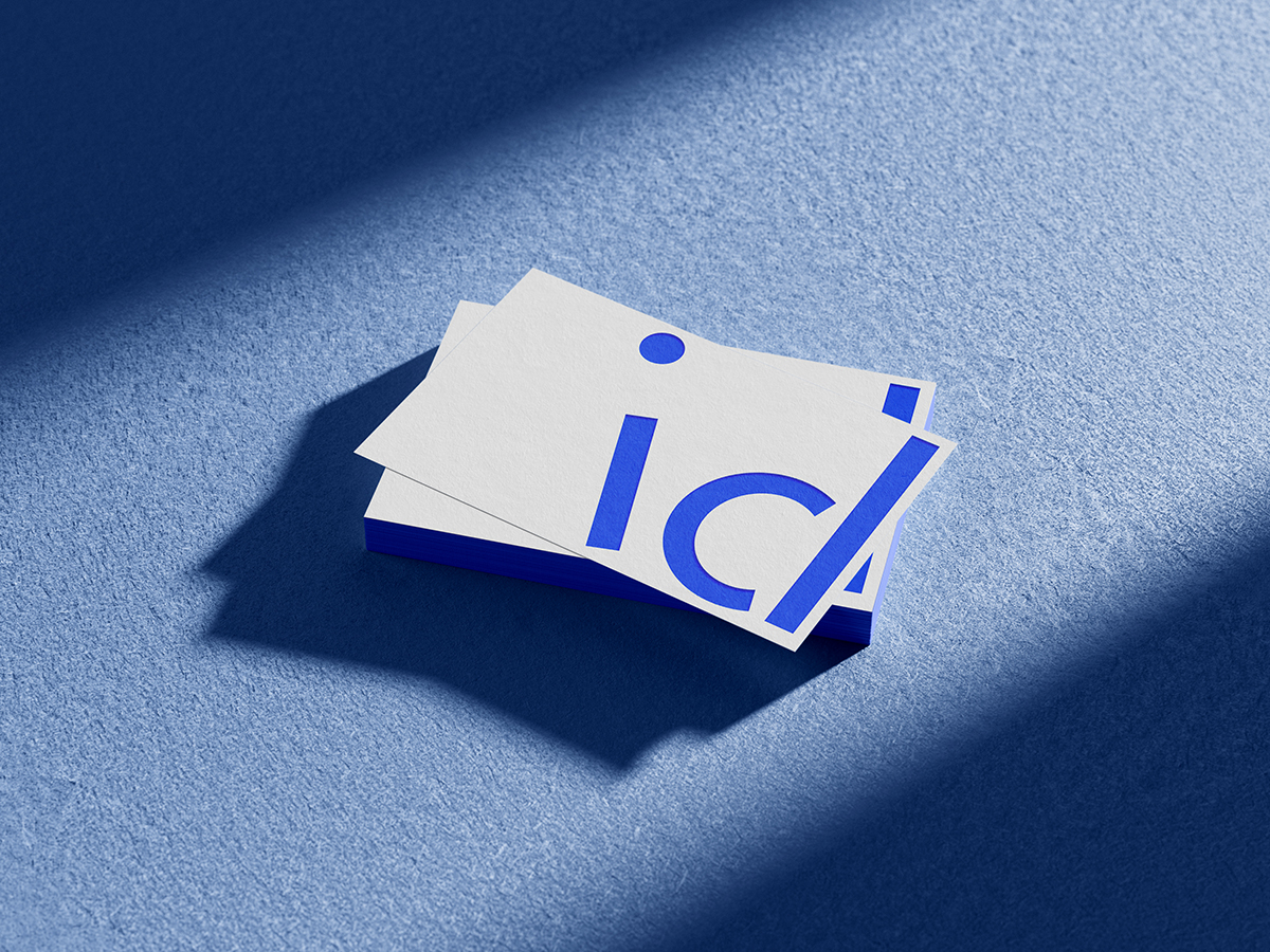
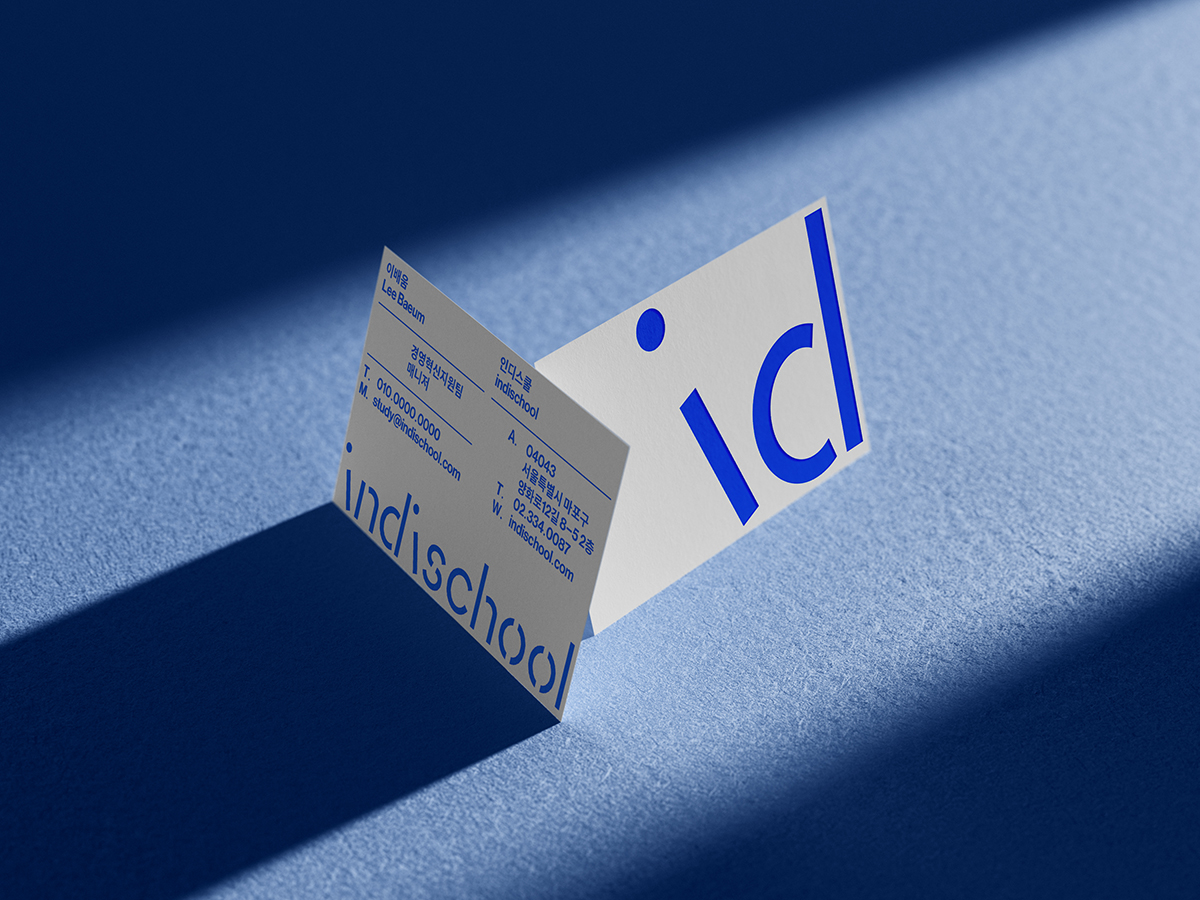
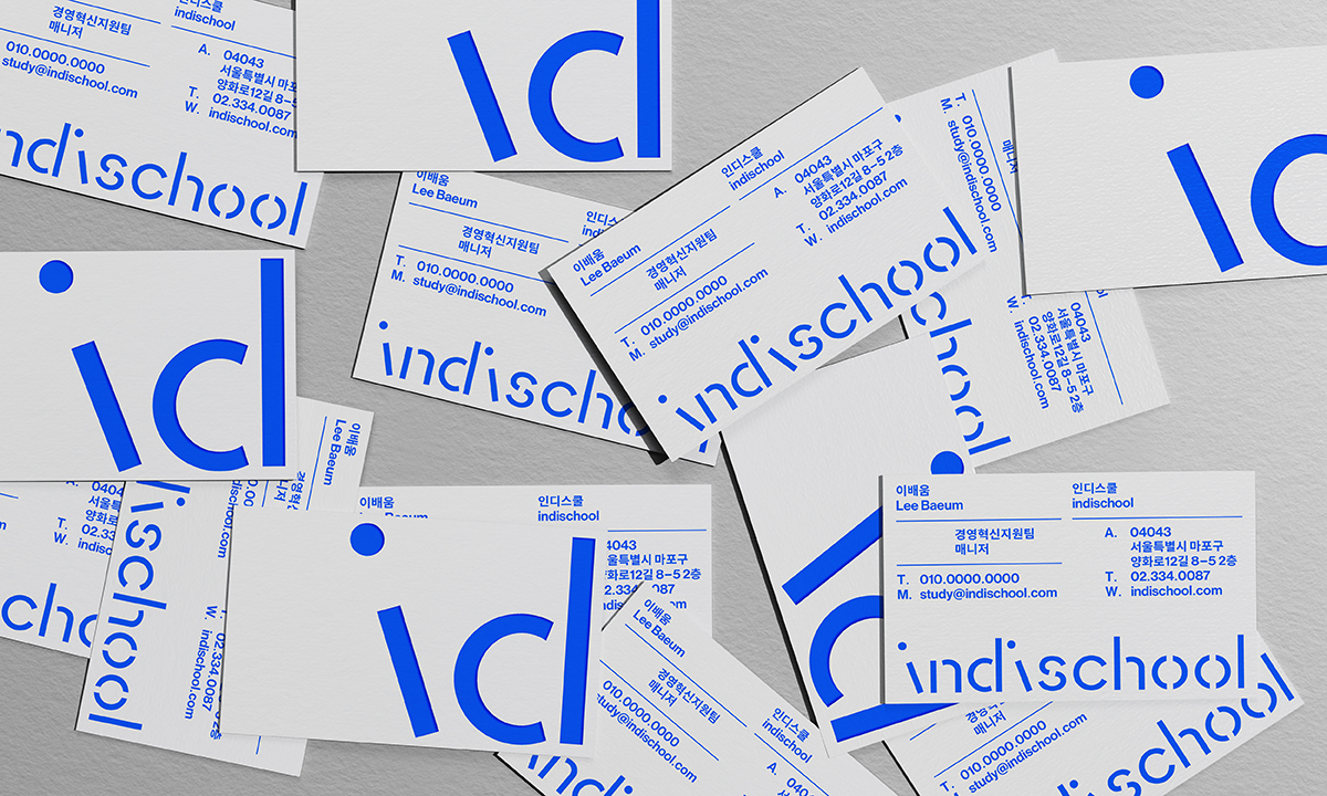
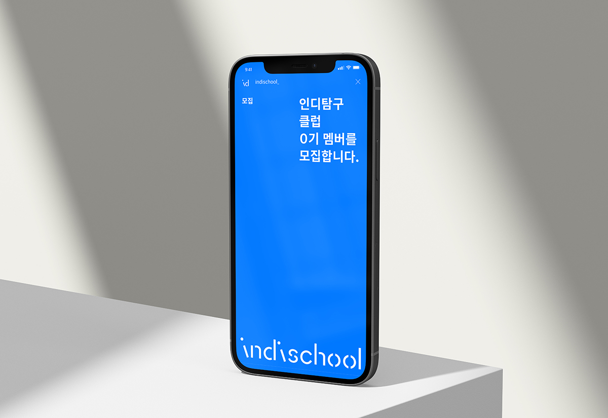
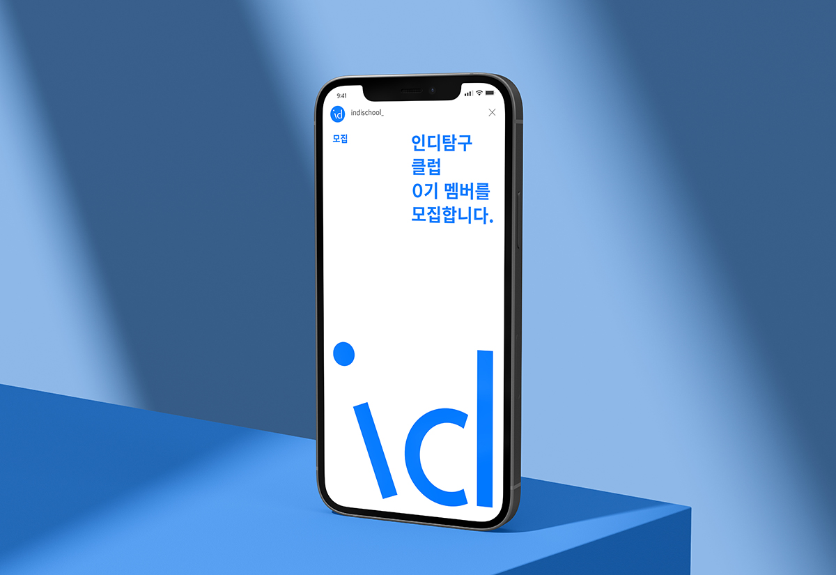
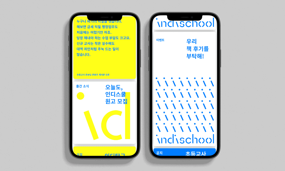
일상의실천은 ‘초등교육 자료실’이라는 이미지를 넘어 끊임없는 나눔과 소통이 일어나는 초등교사들의 소중한 공간/공동체라는 의미를 시각화하기 위해 노력했습니다. 인디스쿨의 로고는 i를 사선으로 기울임으로써 이야기와 지식이 담긴 커뮤니티의 의미를 강조하고 있습니다. 또한 그래픽 모티프는 i로 만든 패턴을 통해 개인의 긍정적인 노력이 사회의 선한 영향력을 미치는 커뮤니티의 성격을 담고있습니다. 패턴은 유연하게 사용함으로써 다양한 매체와 판형에 아이덴티티를 유지할 수 있습니다.
디자인 디렉션. 권준호
디자인. 김주애
클라이언트. 인디스쿨
The elementary school teacher community indischool&is a non-profit organization that operates the largest teacher community in Korea. Indischool, which marks its 21st anniversary this year, has opened a platform to share knowledge and experiences in the elementary education field to create a “knowledge sharing place beyond the limits of space.” In indischool, materials and educational methods used in actual classrooms are shared through voluntary participation of members. Many members participate in the indisschool community with a shared mind, even if there is no financial reward.
Beyond the image of an elementary education archive, we tried to visualize the meaning of a precious space/community for elementary teachers who constantly share and communicate. The logo emphasizes the meaning of the community with stories and knowledge by tilting the letter i diagonally. And graphic motifs contain the character of a community in which individual positive efforts have a good influence on society through patterns made of i.
Design Direction. Joonho Kwon
Design. Juae Kim
Client. 인디스쿨