


SQUARE 아이덴티티 & 웹사이트
Identity & Website for SQUARE
2022
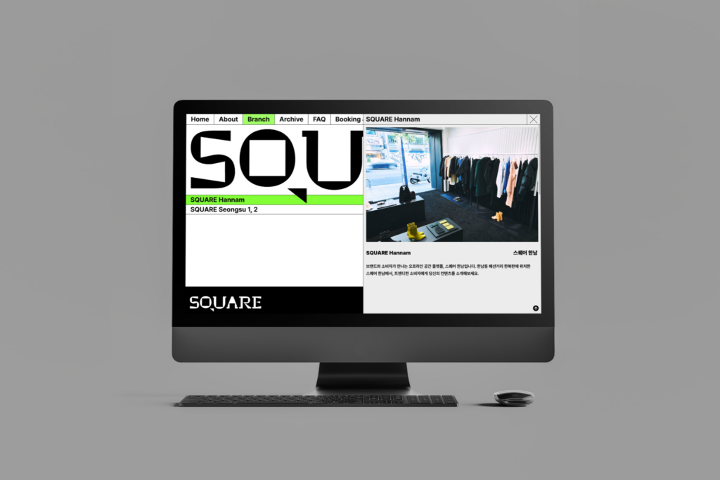
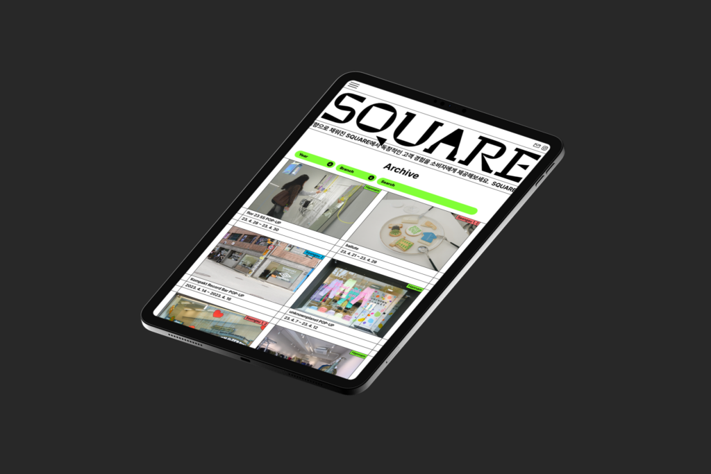
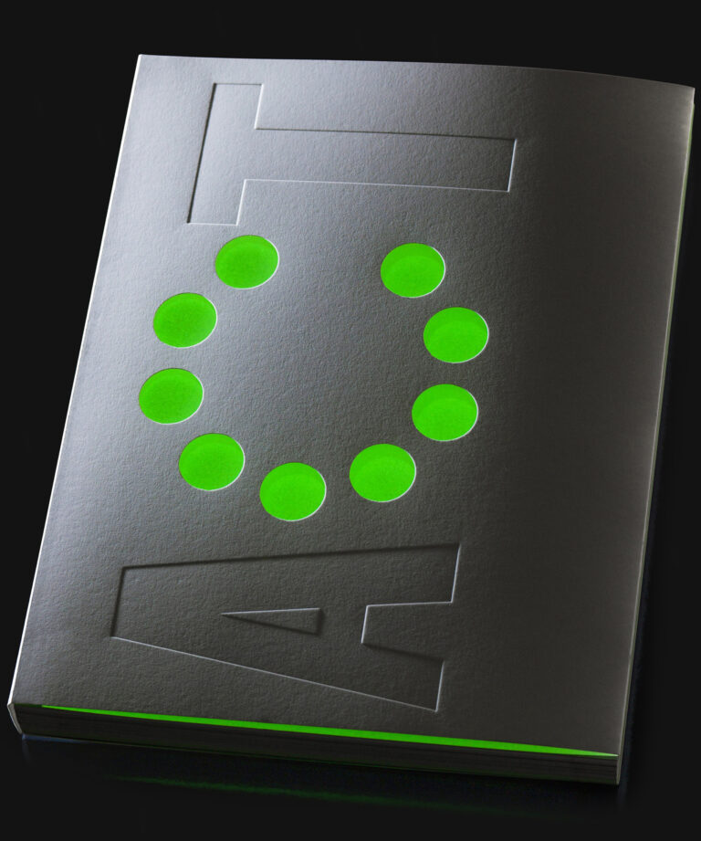
SQUARE는 무신사가 선보이는 팝업 공간으로 브랜드의 스토리와 경험을 제공하는 오프라인 플랫폼입니다. SQUARE는 한남점을 시작으로, 성수 1,2호 점으로 확장되어 다양한 지역과 형식으로 브랜드 경험을 소비자에게 제공합니다. 일상의실천은 일상의 단면을 캡처하고 담아내는 프레임으로서의 SQUARE를 시각화하기 위해, 정사각형과 원의 형태를 차용하여, SQUARE를 이루는 프레임의 골격을 디자인했습니다. 아이덴티티를 적극적으로 활용한 웹사이트는 네온 그린 컬러를 키 컬러로 적용하여 정보의 위계를 구분하고 가시성을 확보했습니다. 또한 페이지 간의 이동을 최소화 한 레이아웃을 구성하여 웹사이트의 접근성을 높이기 위해 노력했습니다.
아이덴티티 & 웹사이트 디자인. 권준호
개발 디렉션. 김경철
개발. 임현지
모션. 안지효
클라이언트. 주식회사 무신사
SQUARE is a pop-up space presented by MUSINSA and is an offline platform that provides stories and experiences of brands. Starting with Hannam branch, SQUARE expands to Seongsu 1st and 2nd stores to provide consumers with brand experiences in various regions and formats. To visualize SQUARE as a frame that captures everyday cross-sections, we have designed a framework of frames that form SQUARE, borrowing the shapes of squares and circles. The website that actively utilizes identity design has applied neon green color as key color to distinguish the hierarchy of information and secure visibility. We also tried to make the website more accessible by organizing a layout that minimizes movement between pages.
Identity & Website design. Joonho Kwon
Development Direction. Kyungchul Kim
Development. Hyeonji Lim
Motion. Jihyo Ahn
Client. 주식회사 무신사