


어린이박물관 아이덴티티 디자인
Identity Design for Children’s Museum
2025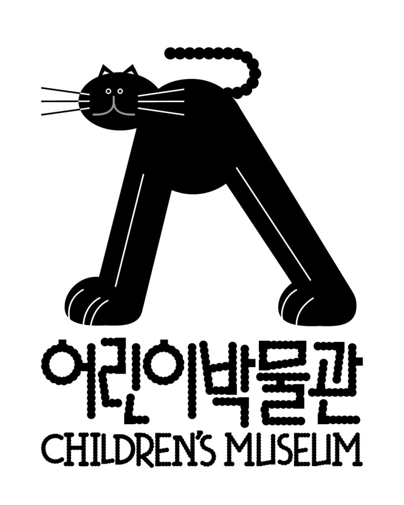
일상의실천은 새롭게 개관하는 국립조선왕조실록박물관의 어린이박물관 아이덴티티와 캐릭터를 디자인했습니다.
조선왕조실록박물관은 일제강점기 일본으로 반출되었다가 민관의 협력으로 110여 년 만에 환수된 오대산 사고본 조선왕조실록과 조선왕조의궤 원본을 직접 선보이는 전문 박물관입니다. 어린이박물관은 이 소중한 기록 유산을 어린이들도 쉽고 즐겁게 만날 수 있도록 기획되었습니다.
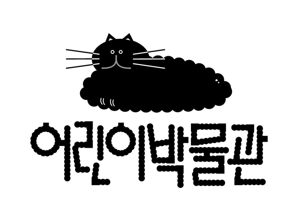
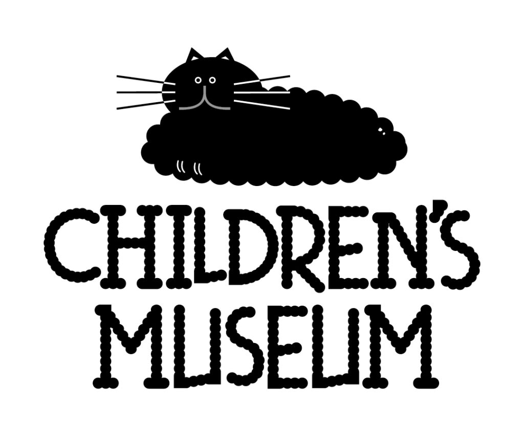
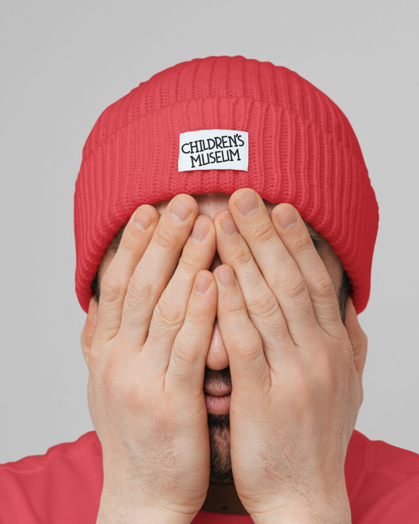
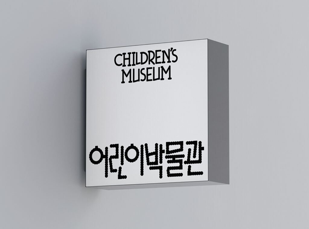
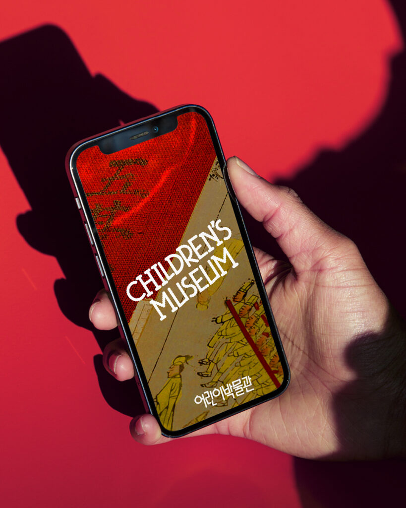
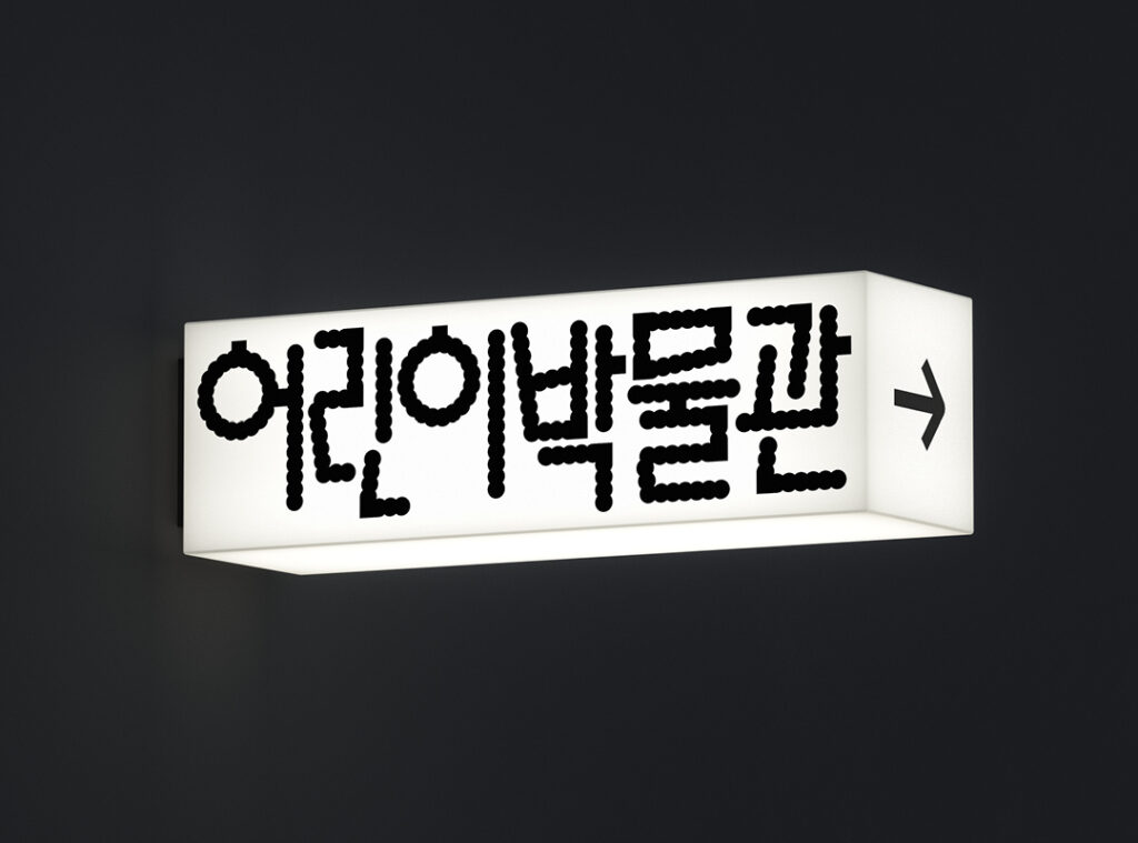
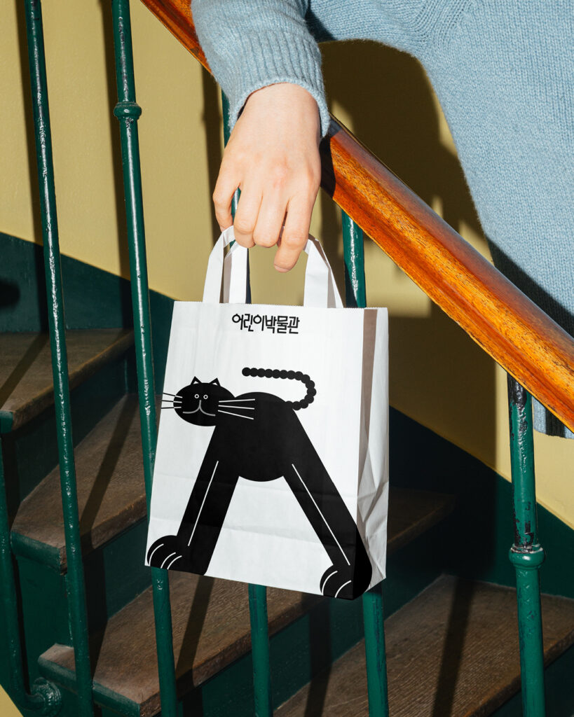
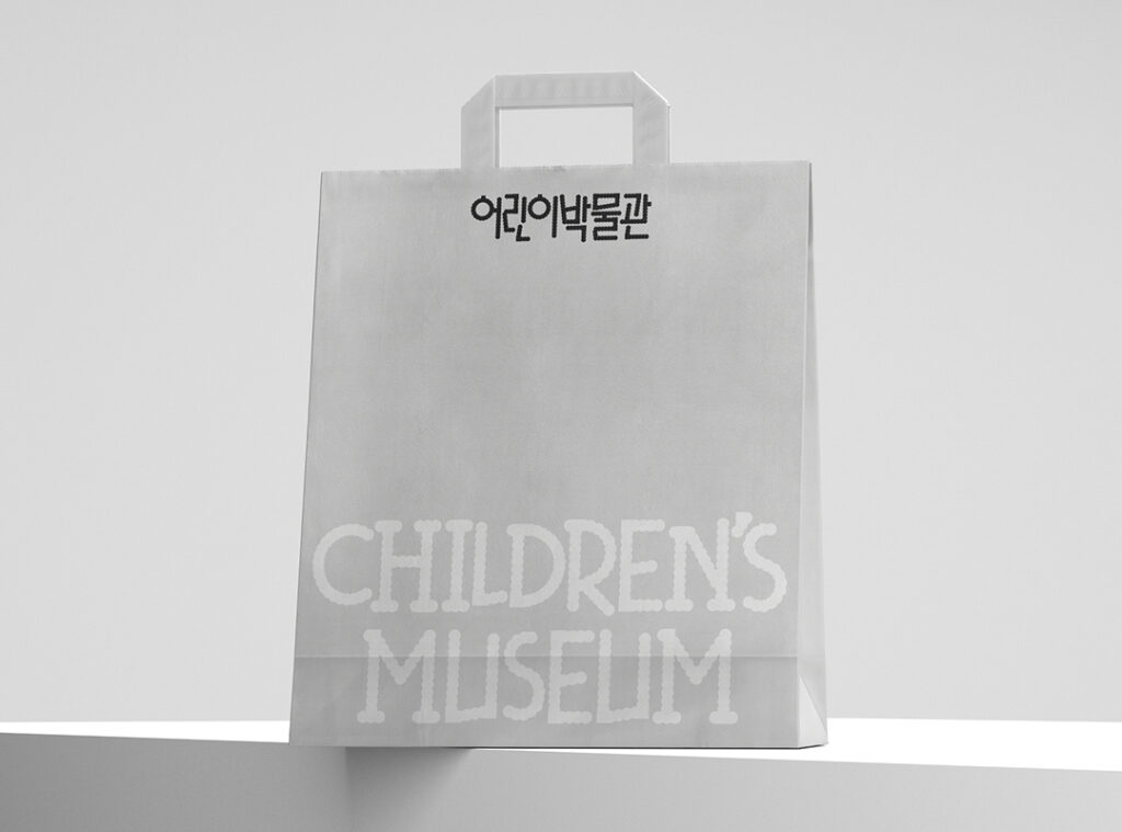
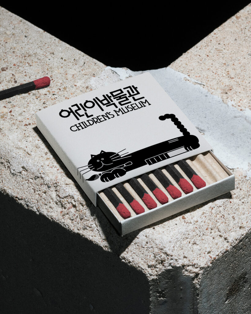
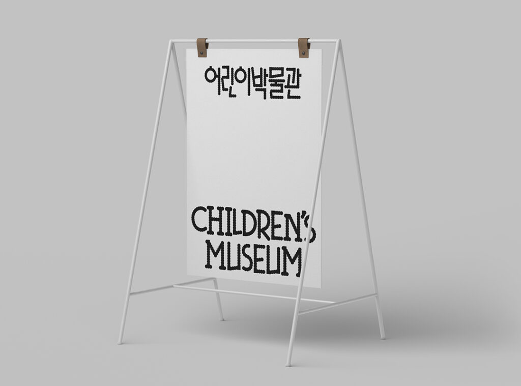
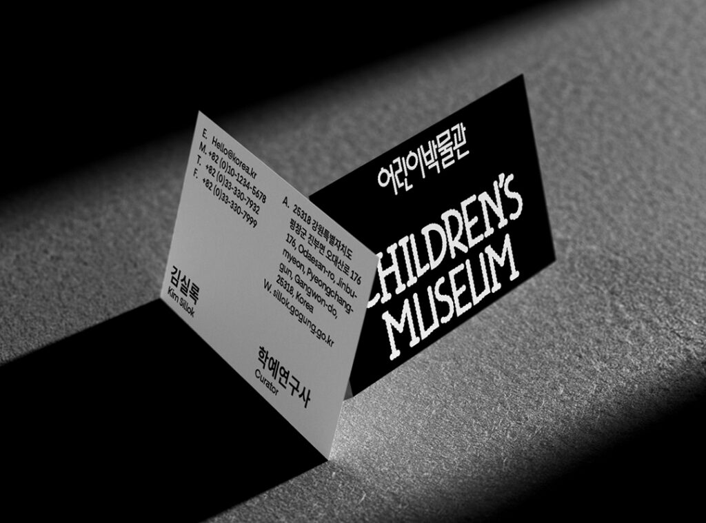
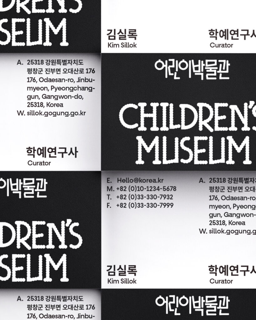
삐뚤빼뚤한 어린이의 손글씨와 기하학적 도형에서 영감을 받아, 아이 특유의 천진함과 따뜻한 정서를 아이덴티티에 시각적으로 풀어냈습니다. 로고타입은 탈네모꼴 구조를 통해 자연스럽고 생동감 있는 리듬을 표현했습니다.
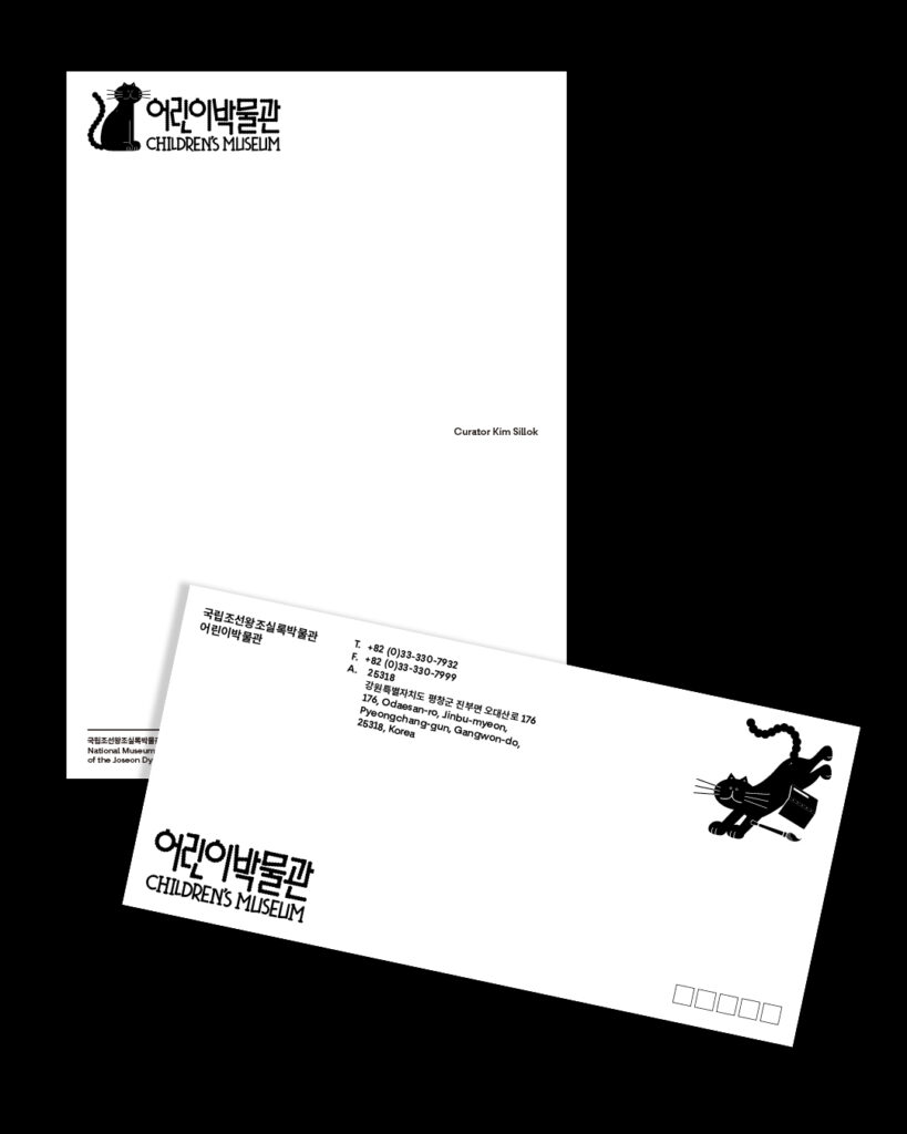
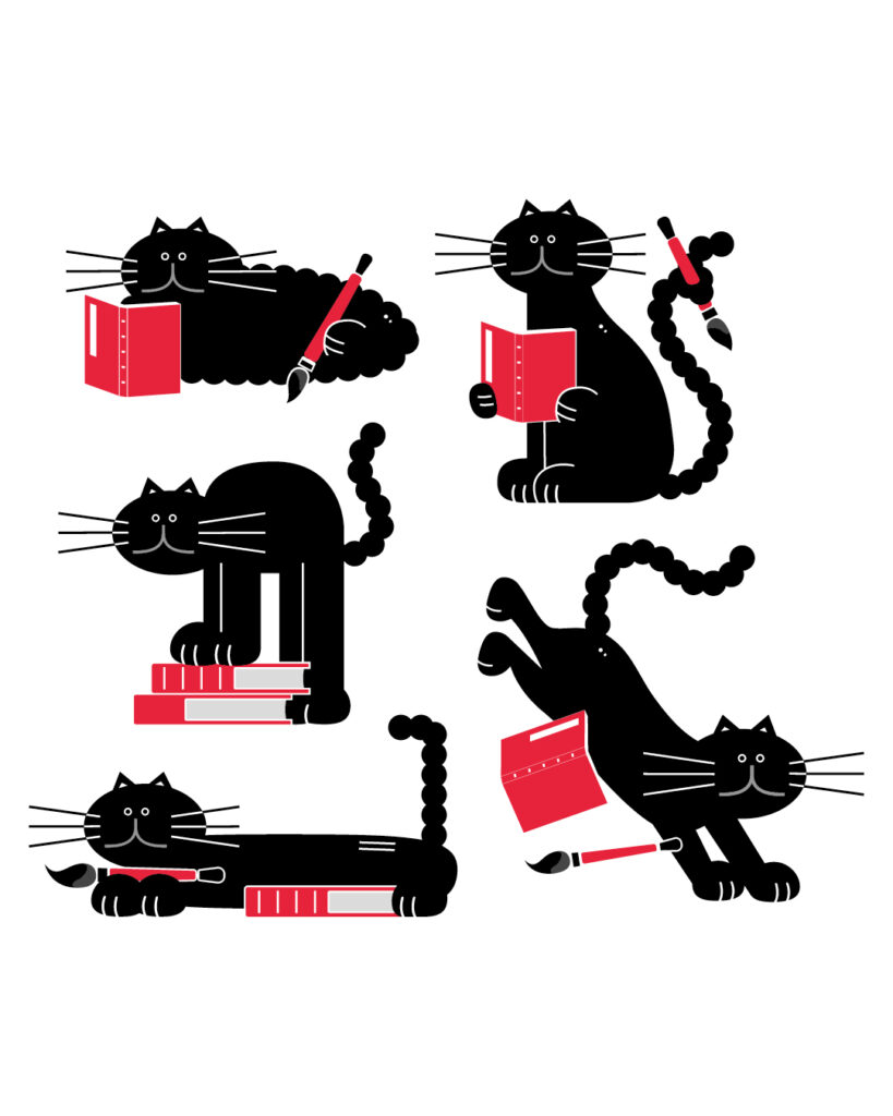
어린이박물관의 캐릭터는 조선시대 숙종이 아꼈다는 고양이 ‘금손이’에서 비롯된 설정을 바탕으로, 먹을 뒤집어쓴 까만 고양이로 시각화되었습니다. 엉뚱하고 유쾌한 형태를 통해 어린이들에게 친근하게 다가가며, 실록과 오대산 사고의 이야기를 자연스럽게 연결합니다.
디자인 디렉터. 권준호
아이덴티티 디자인. 박세희
타이틀 디자인. 박세희, 김태룡
캐릭터 디자인. 임민재
모션 그래픽. 박세희
클라이언트. 국립조선왕조실록박물관
Everyday Practice designed the identity and character for the newly opened Children’s Museum at the National Museum of the Annals of the Joseon Dynasty. The museum is a specialized institution exhibiting the original Odaesan Sagobon of the Annals of the Joseon Dynasty and the Royal Protocols, which were taken to Japan during the Japanese colonial period and repatriated after more than 110 years through public-private collaboration. The Children’s Museum was created to help young visitors engage with these invaluable historical records in an accessible and enjoyable way.
Inspired by the uneven handwriting of children and geometric shapes, the identity visually expresses the innocence and warmth unique to childhood. The logotype features an irregular rectangular form that conveys a natural and dynamic rhythm.
The Children’s Museum character is based on ‘Geumson,’ a cat said to have been beloved by King Sukjong during the Joseon Dynasty. Reimagined as a playful black cat with ink splattered on its fur—referencing the ink used in the Annals—this quirky and charming figure connects naturally with children and helps bring the stories of the Annals and the Odaesan Sagobon to life.
Project Director: Junho Kwon
Identity Design: Sehee Park
Title Design. Sehee Park, Taeryong Kim
Character Design: Minjae Lim
Motion graphics. Sehee Park
Client. 국립조선왕조실록박물관