[Creator+] 디자인 스튜디오 일상의실천: 주어진 일에 그치지 않는 디자이너의 태도를 말하다
[Creator+] Design Studio Everyday Practice: Talking about the attitude of a designer who does not stop at the given task
Press
2024
디자인플러스
3
[Creator+] 일상의실천의 A to Z: <디자인플러스>부터 <2024 올해의 프로젝트>까지
[Creator+] A to Z of Everyday Practice: From <Design Plus> to <2024 Project of the Year>
Press
2024
디자인플러스
3
Everyday Practice x Un sedicesimo
EditorialGraphicPractice
2024
Un sedicesimo
3
*c-lab 8.0 <코러스CHORUS>
*c-lab 8.0 CHORUS
EditorialGraphic
2024
코리아나미술관
4
2024 경기도자비엔날레 〈투게더_ 몽테뉴의 고양이〉
Gyeonggi Ceramics Biennale 2024 ‘TOGETHER_ Montaigne's Cat’
GraphicMotion
2024
한국도자재단
4
체공녀 연대기 1931-2011
Women in the Sky: Gender and Labor in the Making of Modern Korea
Editorial
2024
후마니타스
3
B주류경제학
B주류경제학
Editorial
2024
밀리의서재토스
3
동대문 페스티벌_이동무대
Dongdaemun Festival_Moving Stage
EditorialGraphic
2024
동대문문화재단
5
서울디자인 2024
SEOUL DESIGN 2024
GraphicMotionWebsite
2024
서울디자인재단
4
무르익다
Mureu-ikda (Ripen)
GraphicMotion
2024
국립농업박물관
3
ACT 페스티벌 2024
ACT Festival 2024
GraphicIdentityMotion
2024
ACC 국립아시아문화전당
4
서울아트가이드 Fall 2024 by 아트드렁크
Seoul Art Guide Fall 2024 by artdrunk
Editorial
2024
artdrunk
4
모두를 위한 무향
No Scents for Everyone
Graphic
2024
환경정의
3
네이버 한글한글 아름답게 캠페인
NAVER Beautiful Hangul Campaign
Website
2024
네이버 문화재단
4
LG 화학 지속가능경영보고서 2023 
RE:ACT TO ZERO
LG CHEM SUSTAINABILITY REPORT 2023 RE:ACT TO ZERO
Editorial
2024
LG화학
3
경기도자미술관 소장품 상설전 《현대도예-오디세이》 도록
Odyssey of Contemporary Ceramic Art Exhibition Catalogue
Editorial
2024
경기도자미술관
5
세종문화회관 모든누구나
Sejong Center ‘Anyone for Everyone’
GraphicIdentity
2024
세종문화회관
3
권민호 개인전 《축원의 가루》
Minho Kwon’s Solo Exhibition, Powder of Blessing
Graphic
2024
권민호
4
집덕후들의 커뮤니티, 라이프집
Identity & Website design for Life.zip
IdentityWebsite
2024
라이프집
4
세종문화회관세종썸머페스티벌 2024
2024 Sejong Summer Festival
Graphic
2024
세종문화회관
4

가나출판사 아이덴티티 디자인 리뉴얼

GANA Identity Design Renewal

2020
EditorialIdentity

Gana_1

Gana_12

Gana_13

Gana_14

Gana_111

Gana_15

Gana_16

Gana_17

Gana_18

Gana_19

Gana_110

가나는 ‘삶의 기본 가치와 지식의 즐거움을 전달한다’는 비전으로 출판사를 비롯한 교육, 아동, 문화콘텐츠 사업 영역에서 다양한 활동을 하고 있습니다. 가나 아이덴티티 디자인 리뉴얼은 기존 가나의 아이덴티티가 갖고 있는 불규칙한 조형과 공간을 조정하고, 회사의 비전을 선명하게 담을 수 있는 모티프를 지속가능한 시스템으로 활용하는 방향이 핵심입니다.
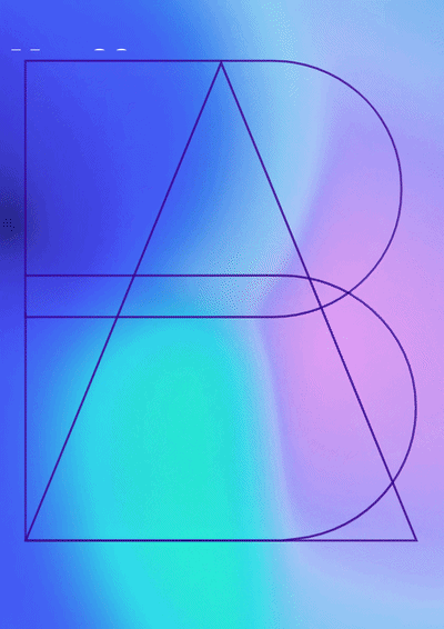
일상의실천은 한글의 우수한 형태를 바탕으로, 가나의 한글 자음 ’ㄱ(기역)’과 ’ㄴ(니은)’ 그리고 모음 ‘ㅏ(아)’의 형태를 정사각형 모듈 안에서 유사한 방식으로 재구성했습니다. 균일한 사이 공간과 획의 길이를 적용하고 기존 아이덴티티 컬러를 유지해 가나의 비전을 구현했습니다. 유사한 형태로 이루어진 한글 자음 ’ㄱ(기역)’과 ’ㄴ(니은)’의 사이를 연결해 ‘가나를 통한 새로운 가치의 틀(Frame)’의 의미를 그래픽모티프로 개발했습니다. 대칭으로 이루어진 그래픽모티프는 내용을 담는 영역으로 글의 분량에 맞춰 변형과 확장이 가능합니다.

디자인. 김어진

클라이언트. 가나출판사

GANA is a publisher with a vision of ‘spreading the basic values of life and the enjoyment of knowledge.’ GANA is engaged in various activities in the areas of education, children and cultural content business. The GANA Identity Design Renewal has redesigned the irregular construction and space of the existing identity. It is also designed to use graphic motifs that can clearly capture the publisher’s vision as a sustainable system.
Based on the excellent form of Hangeul, we reconstructed the Korean consonants ‘ㄱ(Giyeok)’ and ‘ㄴ(Nieun)’ in Ghana and the vowel ‘ㅏ(A)’ in a square module. We applied the length of space and stroke uniformly and maintained the existing identity color to visualize Ghana’s vision. We have also developed a graphic motif for the meaning of the new value frame through GANA. The symmetrical graphic form is an area that contains contents and is designed to be modified and expanded according to the volume of the text.

Design. Eojin Kim

Client. 가나출판사