공공디자인 합니다
Do, Public Design
2025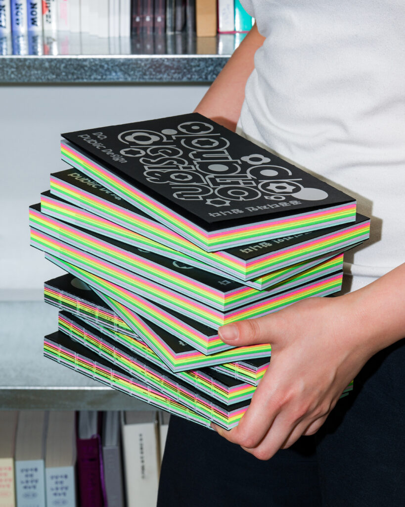
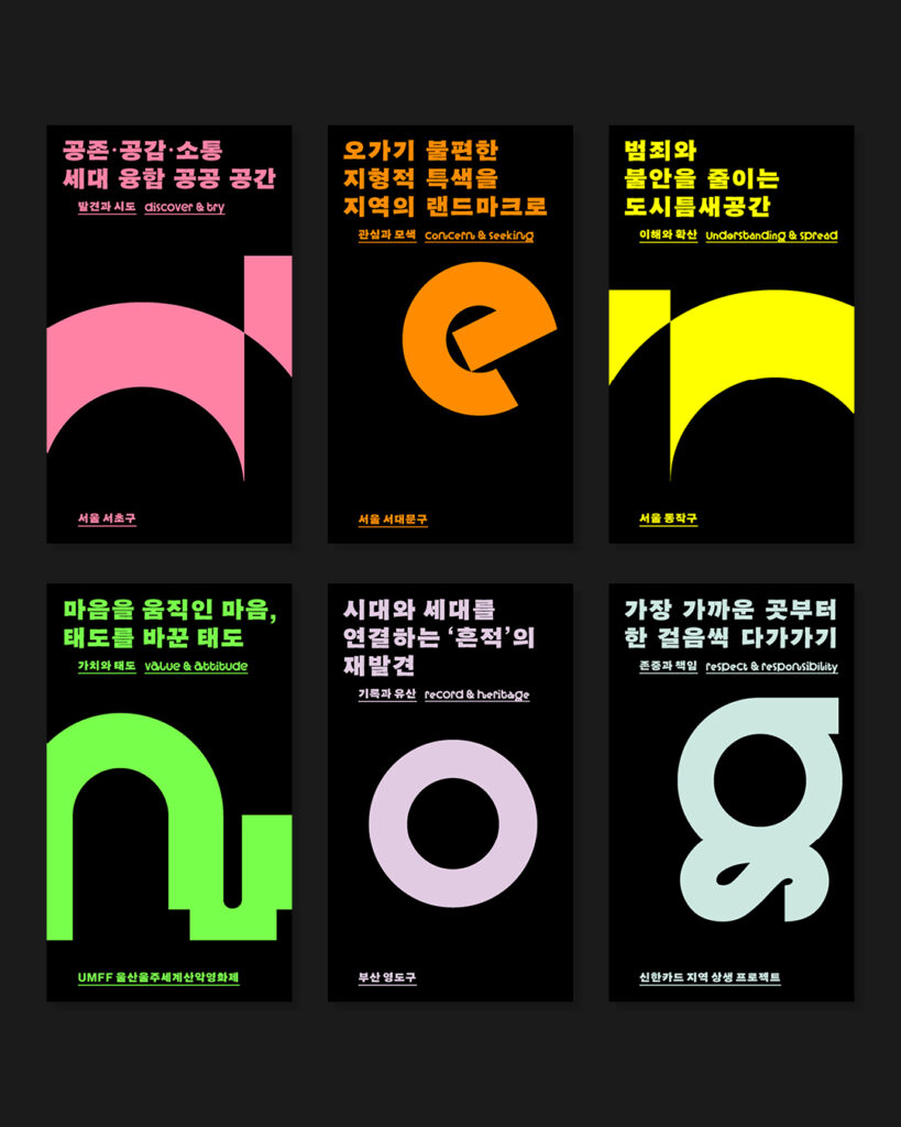
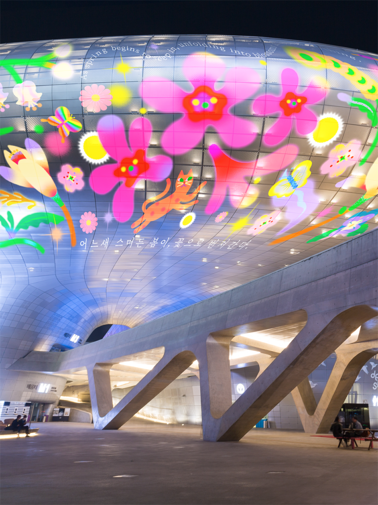
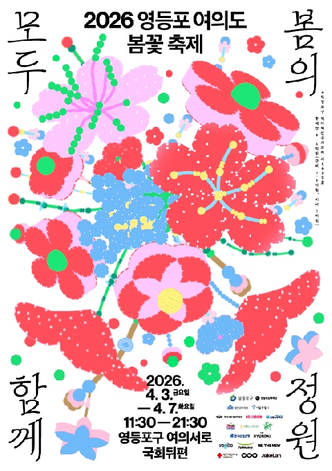
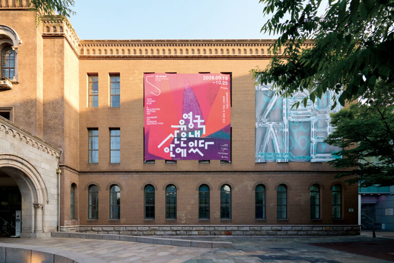
한국공예·디자인문화진흥원(KCDF)에서 발행한〈공공디자인 합니다〉는 공공디자인 실무자의 이해를 돕기 위해 다양한 성격의 성공적인 공공디자인 프로젝트를 심층적으로 다룬 출판물입니다.
실무자들과의 심층 인터뷰를 중심으로 각 사업이 어떤 문제의식에서 출발했는지, 어떤 과정을 거쳐 현재의 성과에 이르렀는지를 구체적으로 살펴보며, 공공디자인의 현실과 가능성을 생생한 경험과 통찰을 통해 조명합니다.
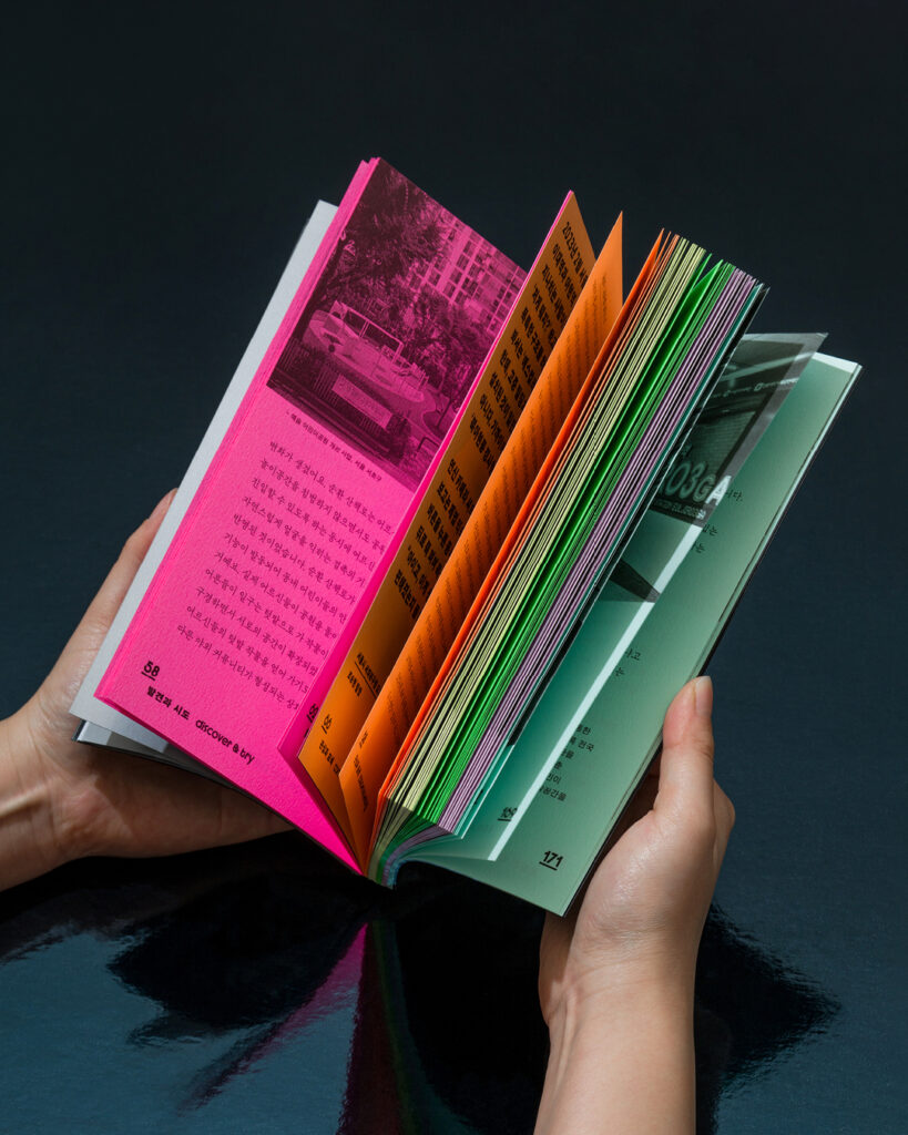
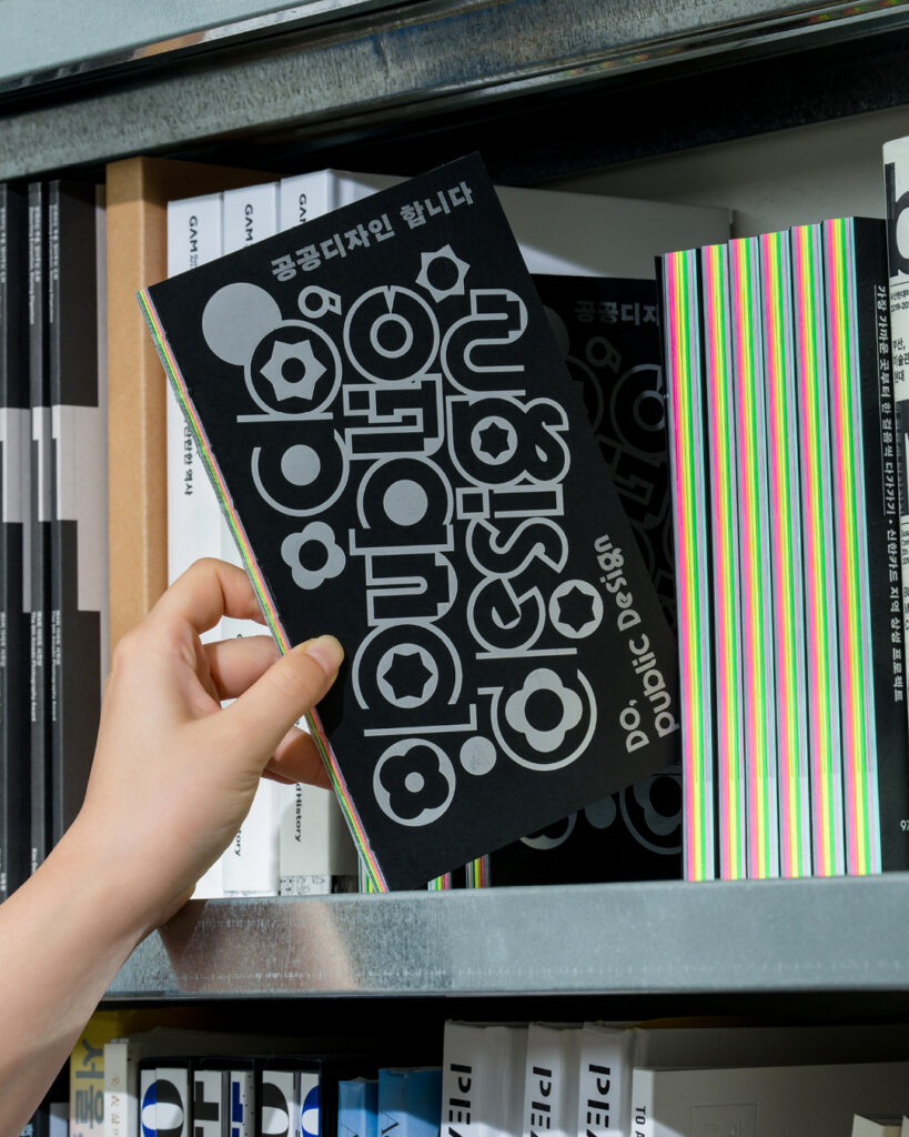
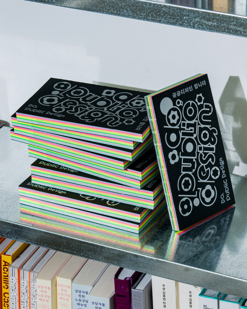
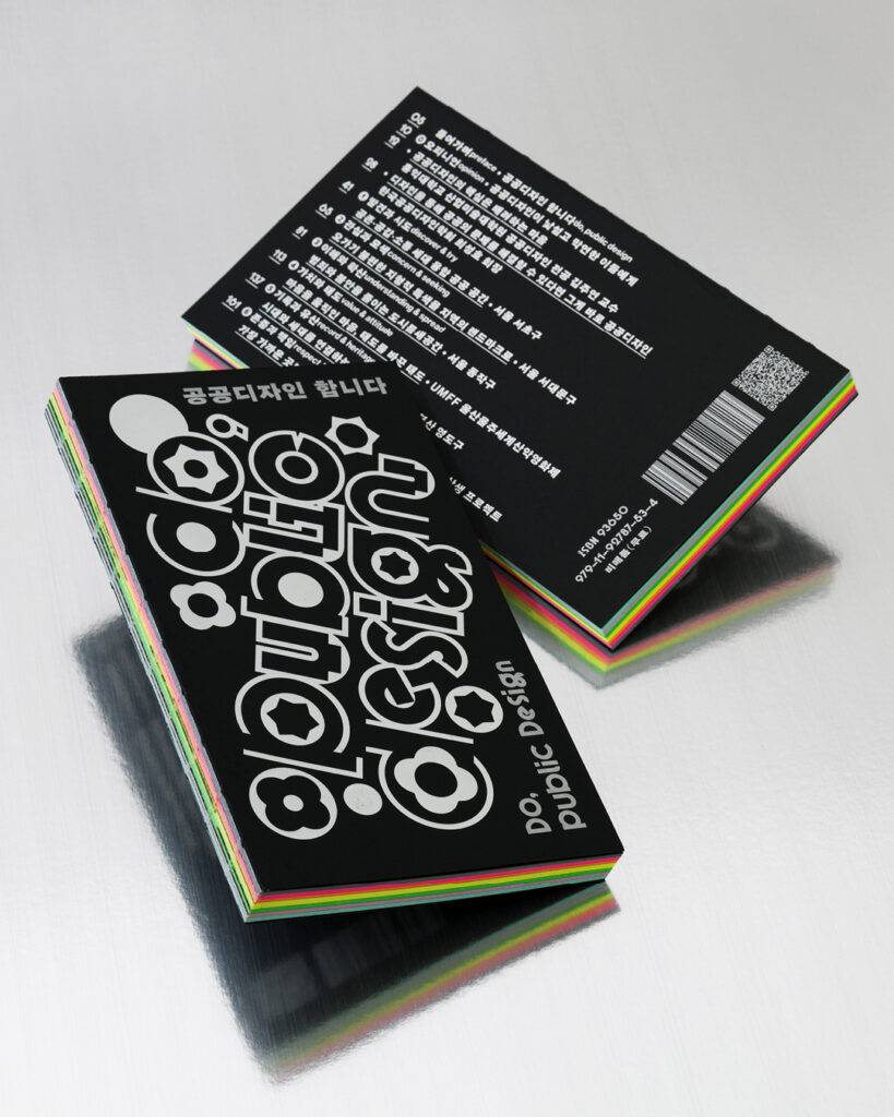
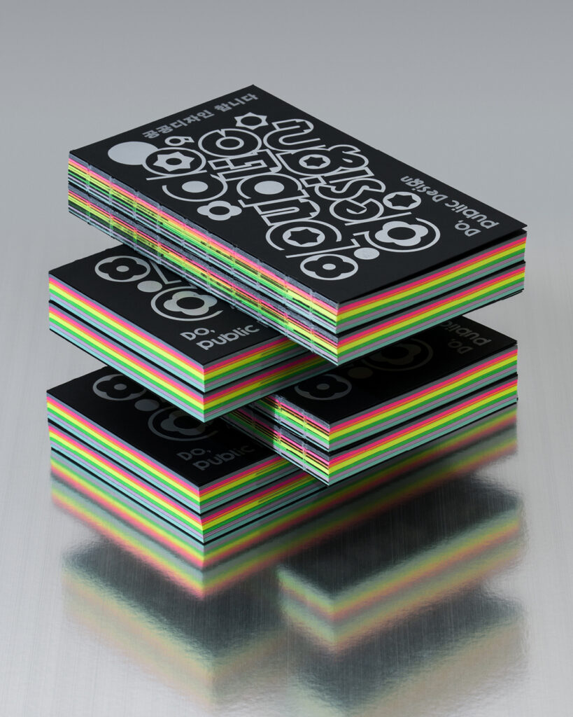
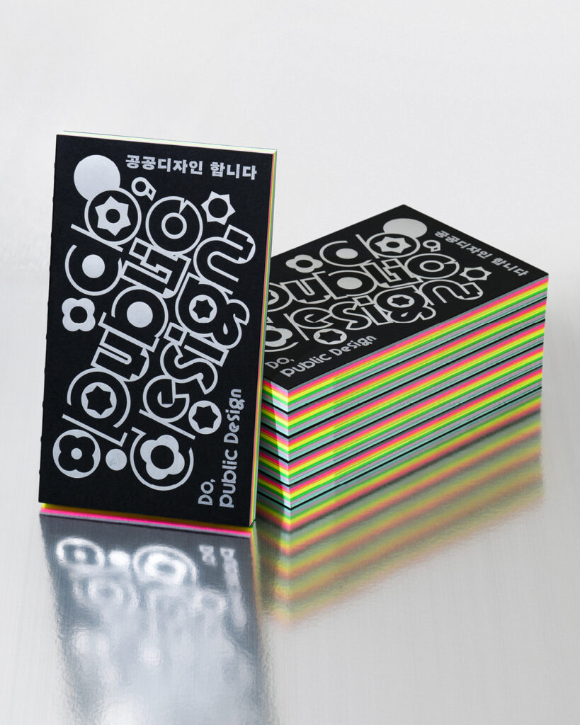
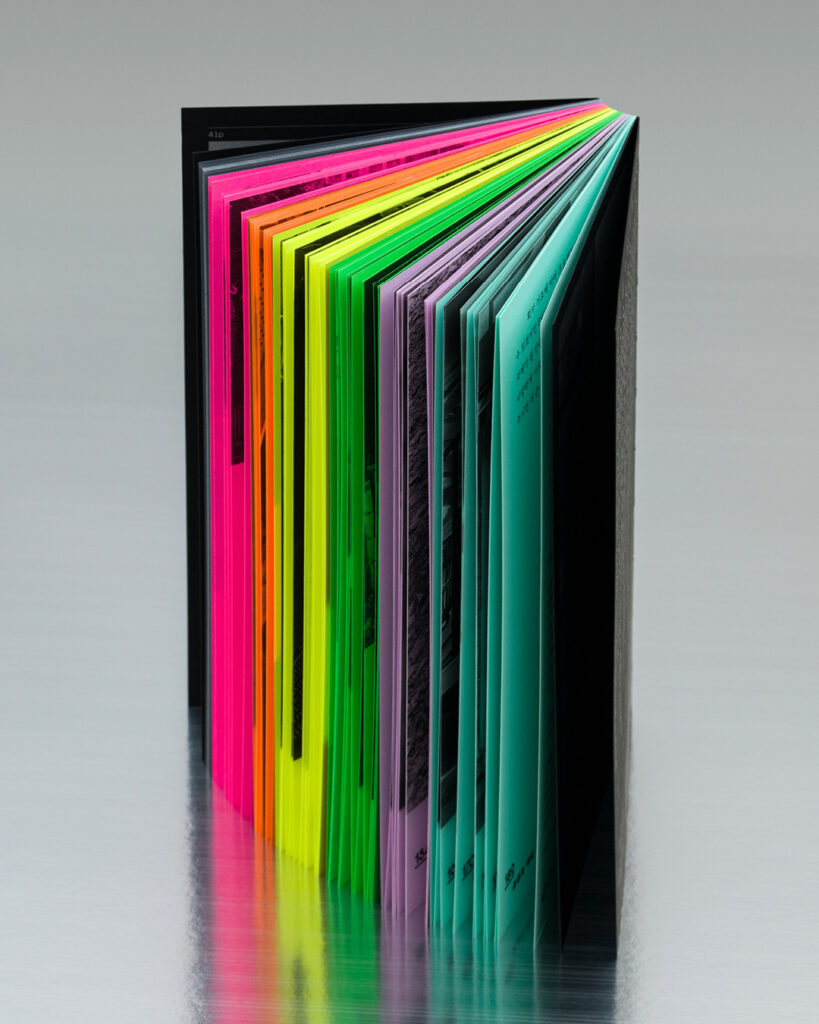
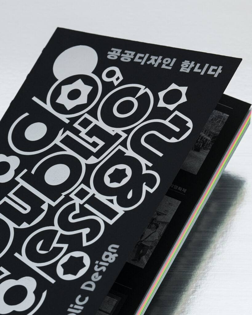
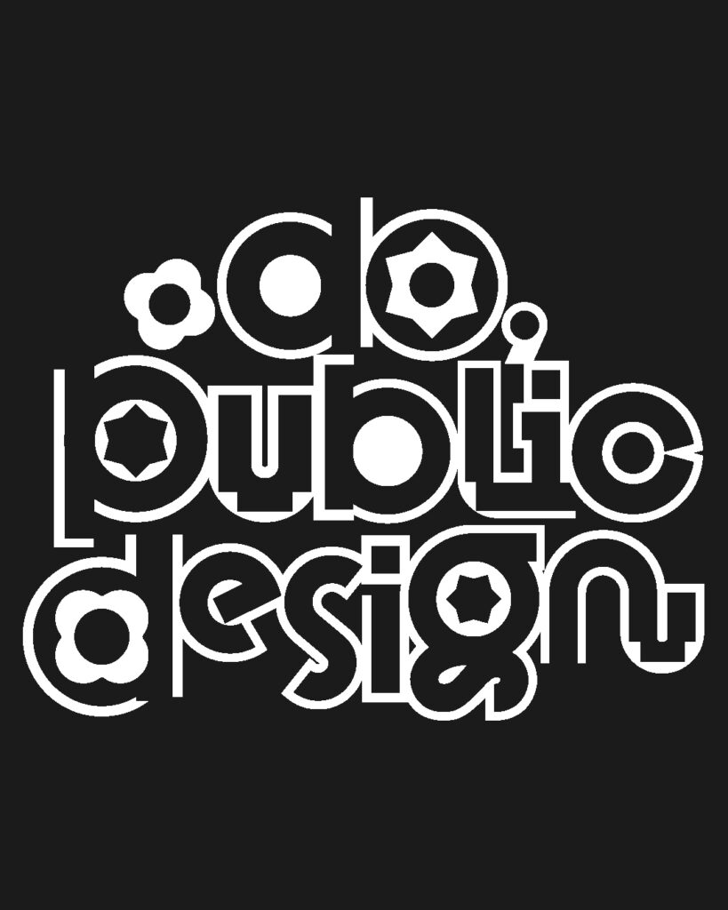
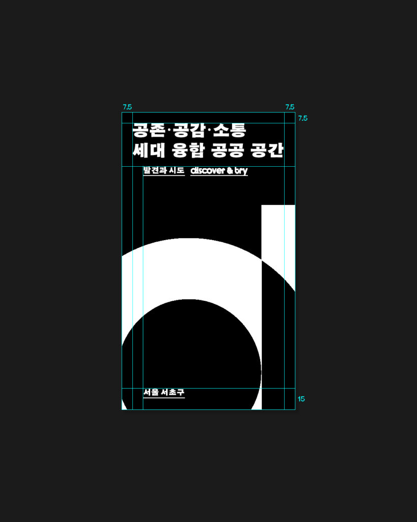
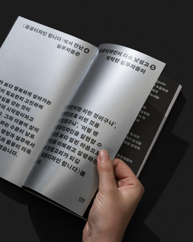
공공디자인이 사회에 전하는 따뜻한 가치와 긍정의 에너지를 시각적으로 표현하기 위해 발랄한 인상의 영문 타이포그래피를 사용했고, 각 사례의 개성과 다양성을 드러내기 위해 챕터마다 다른 색지를 적용해 구분성을 높였습니다. 실무자들의 목소리가 고유한 온도로 전달될 수 있도록 명조체와 손글씨 기반의 서체를 챕터별로 달리 사용했으며, 표지의 그래픽 모티브와 타이포그래피 시스템을 책 전반으로 확장해 일관된 시각적 체계를 구축했습니다.
프로젝트 디렉터. 권준호
디자인. 박세희
클라이언트. 한국공예·디자인문화진흥원
Do, Public Design is a publication that explores a range of successful public design projects to deepen practitioners’ understanding of the field.
Through in-depth interviews with designers and project leaders, the book examines how each project began, the challenges encountered along the way, and how those processes shaped the outcomes — shedding light on the realities and potential of public design through firsthand insights and experiences.
Everyday Practice visualized the warm values and positive energy that public design brings to society. Lively and friendly English typography conveys the book’s optimistic tone, while different colored papers for each chapter emphasize the individuality and diversity of the featured cases. To reflect the distinct voices of practitioners, a combination of serif and handwritten-inspired typefaces was used, varying by chapter. The graphic motif from the cover and the typographic system extend throughout the publication, establishing a cohesive and consistent visual identity.
Project Director. Joonho Kwon
Design. Sehee Park
Client. 한국공예·디자인문화진흥원