


후마니타스《우리의노래가》표지디자인
《Our Song》 Cover Design — Humanitas
2026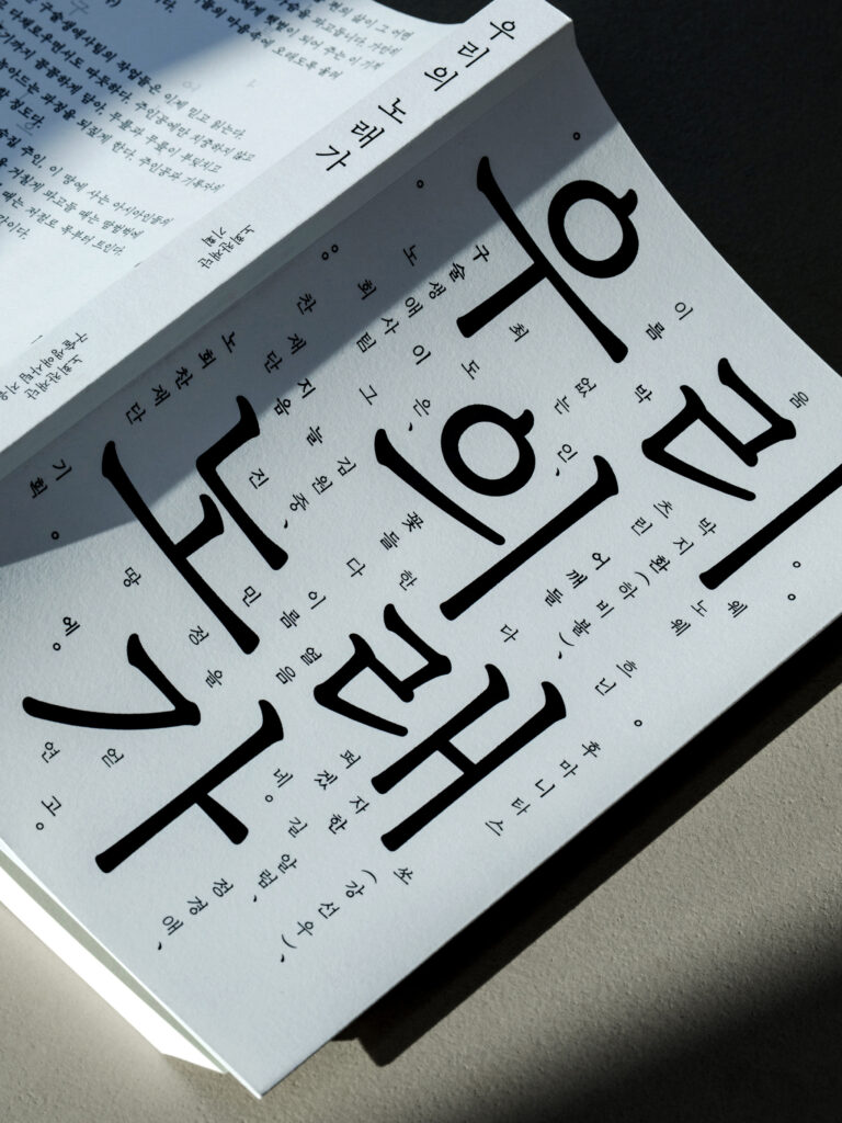
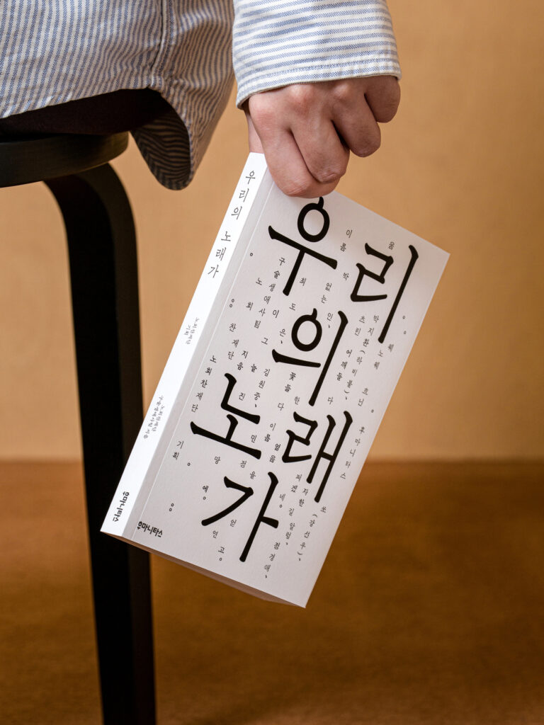
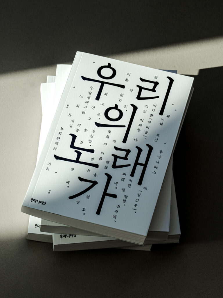
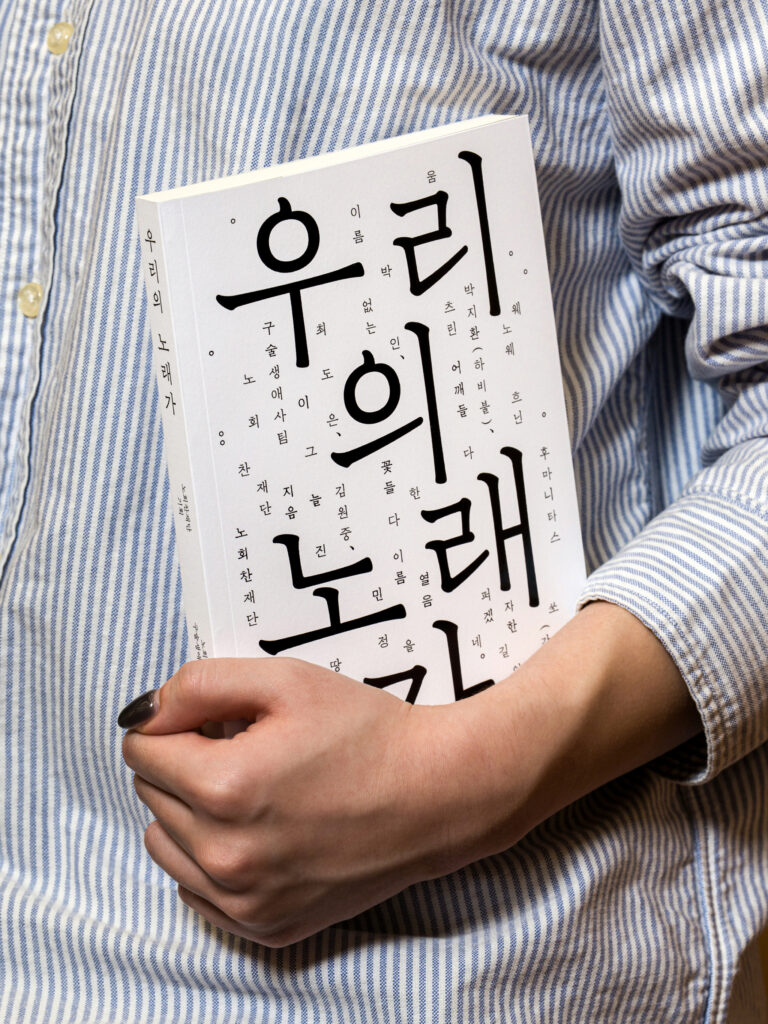
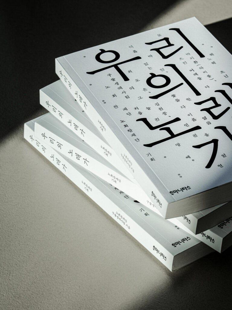
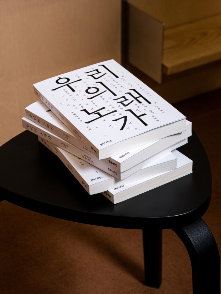
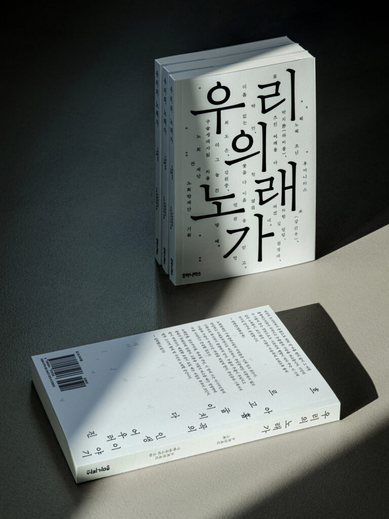
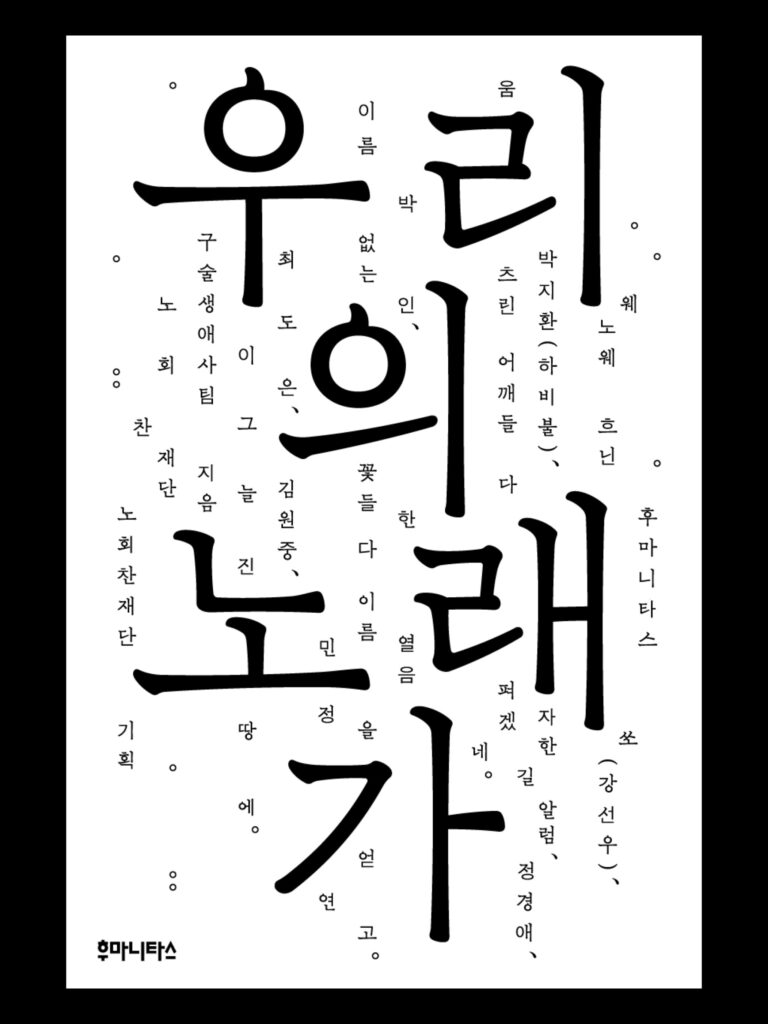
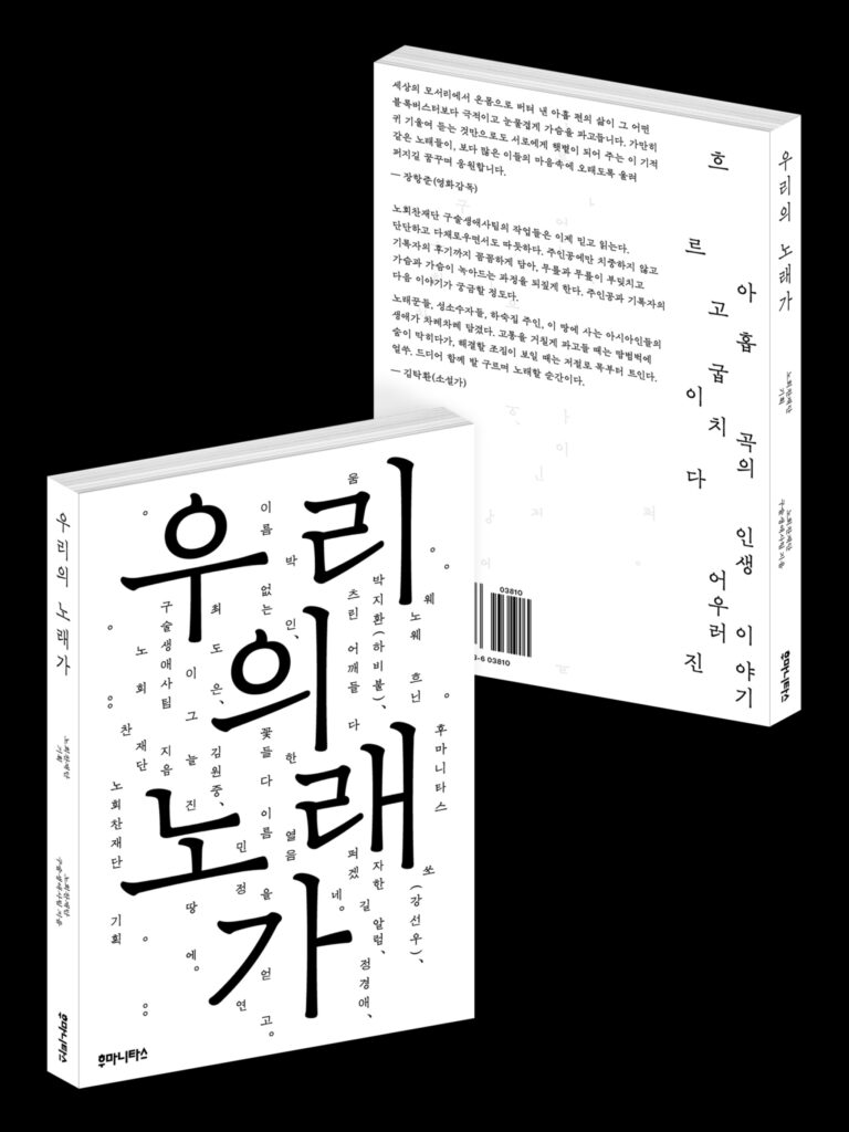
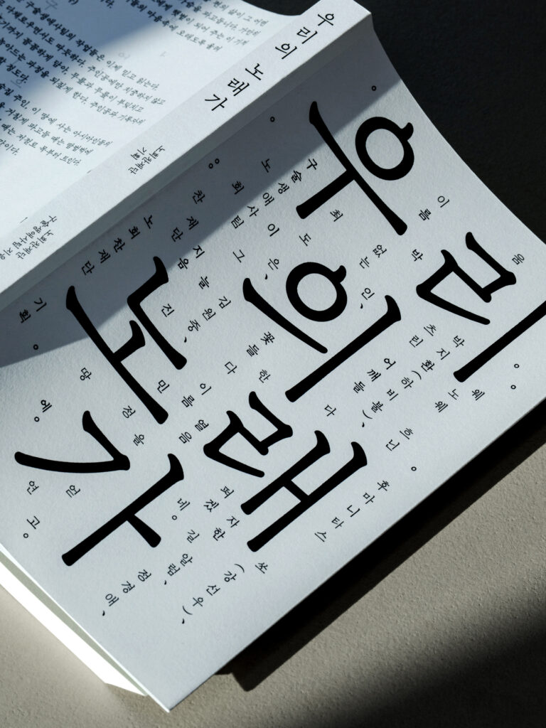
후마니타스에서 출간한 《우리의 노래가》는 민중음악으로 시대를 건너온 사람들, 차별에 맞서 자신의 삶을 지켜온 사람들, 낯선 곳에서 삶을 일구어 온 사람들의 이야기를 아홉 편의 생애사로 엮었습니다.
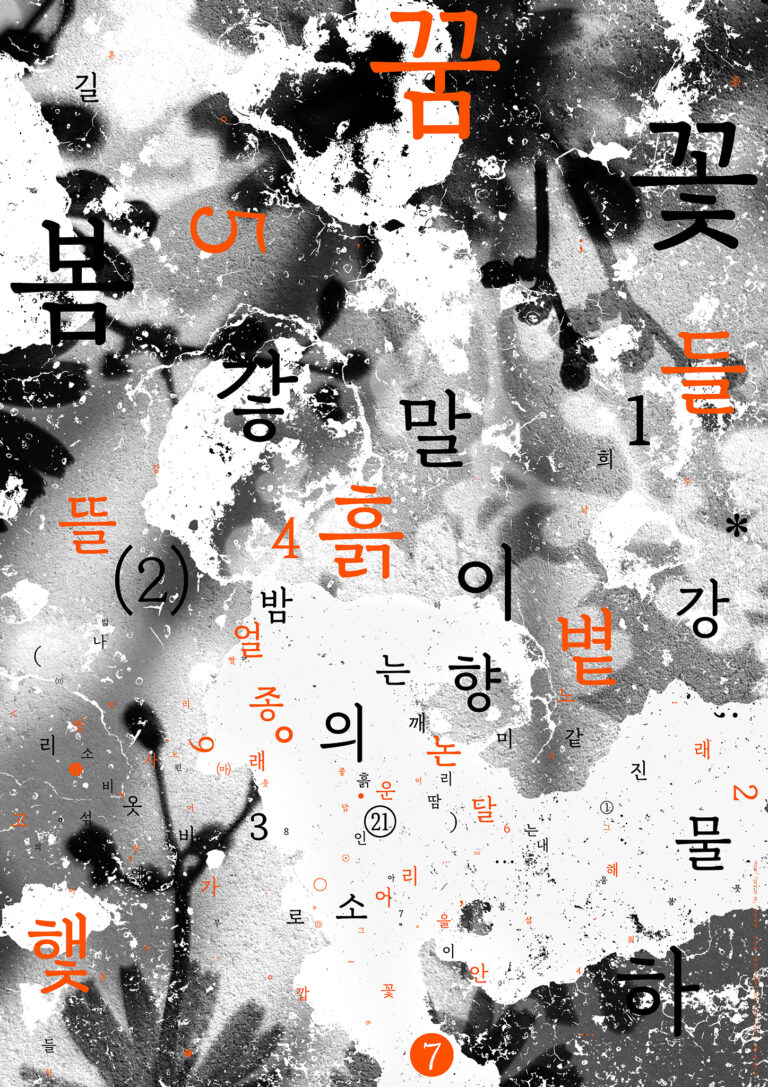
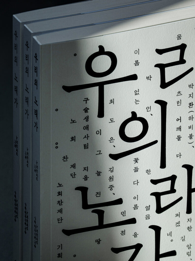
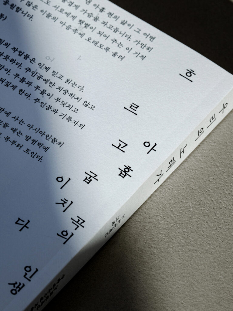
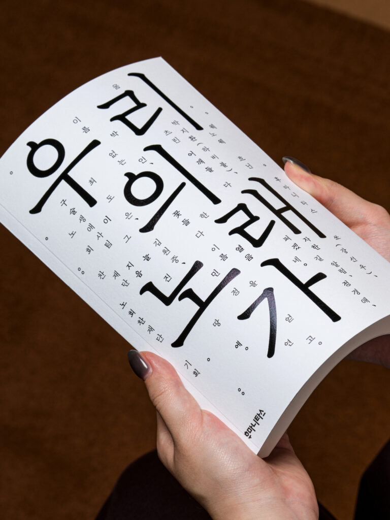
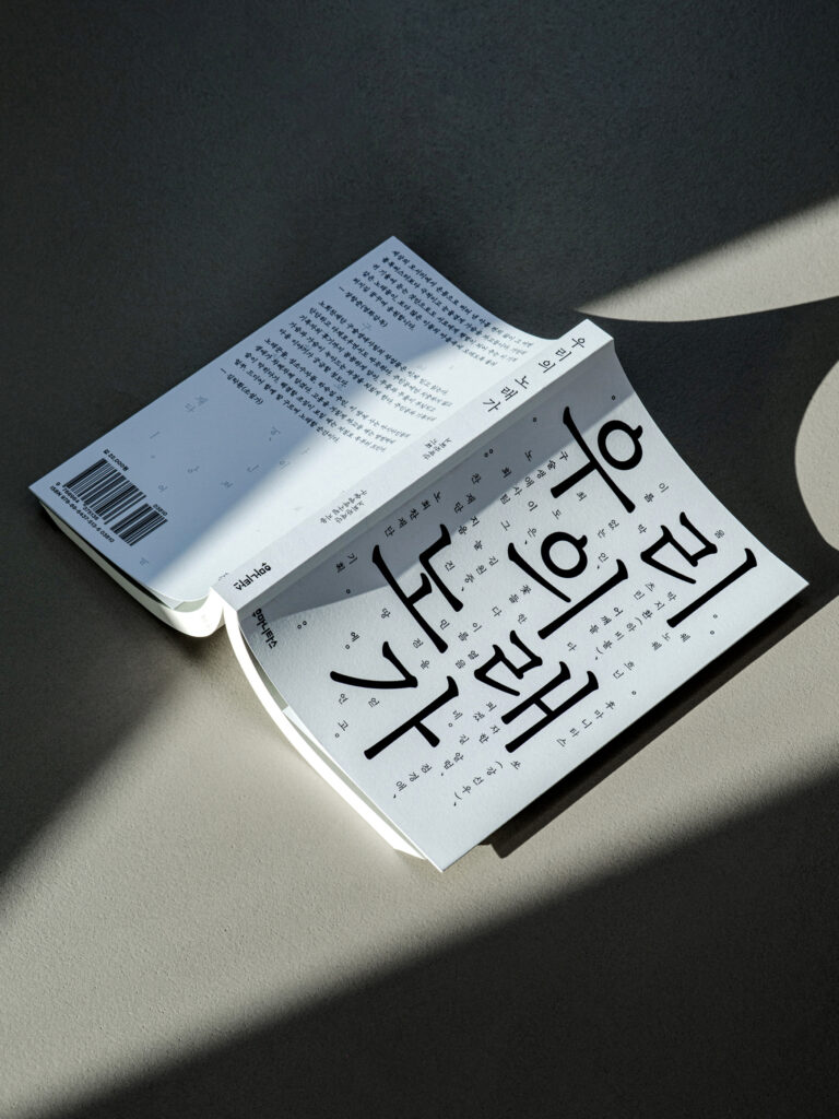
일상의실천은 책 제목과 챕터명, 저자명을 활용한 타이포그래피 중심의 표지를 디자인했습니다. 명조체와 고딕체를 혼합하고 한글 자소를 재조합하여 서로 다른 삶과 이야기의 개성을 표현했습니다.
명조체는 김태룡 글자 디자이너의 ‘산잔(Sanjan Regular)’을 사용하여 한글의 조형적 아름다움과 친근한 인상을 강조했습니다.
제목 ‘우리의 노래가’를 중심으로 크고 작은 글자를 리듬감 있게 배치하고, 주변으로 흩어지는 텍스트를 통해 글자 자체가 하나의 이미지로 읽히도록 구성했습니다. 흑백의 간결한 화면 안에서 글자의 크기와 굵기, 간격의 대비를 활용해 한글의 조형적 아름다움과 공간감을 강조하고자했습니다.
크리에이티브 디렉터. 권준호
디자인. 안지효
클라이언트. 후마니타스
사진. 김진솔 (@jskstudio_official)
산잔(Sanjan Regular). 김태룡
클라이언트. 후마니타스
Published by Humanitas, 《Our Song》 brings together nine oral life histories of people who have lived through changing times with protest music, stood against discrimination, and built their lives in unfamiliar places.
Everyday Practice designed a typography-driven book cover using the title, chapter headings, and authors’ names. By combining traditional Korean serif (Myeongjo) and sans-serif (Gothic) typefaces and rearranging Hangul letterforms, we expressed the distinct character of each life and story.
For the Myeongjo typeface, we used Sanjan Regular by type designer Taeryong Kim to highlight the structural beauty of Hangul and convey a warm, approachable character.
Centered around the title, letters of varying sizes are arranged rhythmically, while scattered text transforms typography into a visual composition. The contrast in letter size, weight, and spacing against a minimal black-and-white background highlights the structural beauty of Hangul and creates a sense of spatial depth.
Creative Director. Joonho Kwon
Design. Jihyo Ahn
Client. Humanitas
Photography. @jskstudio_official
Sanjan Regular).@taeryong.kim
Client. 후마니타스