
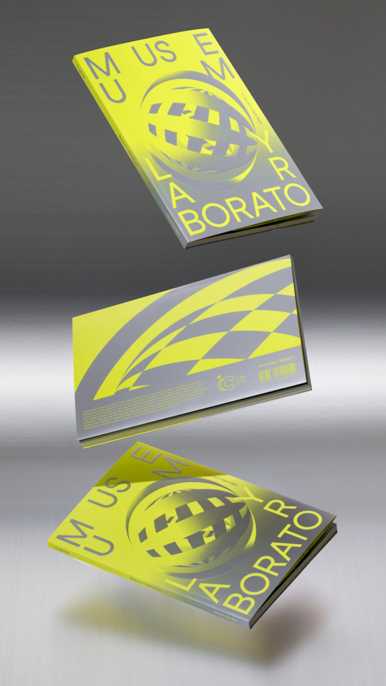
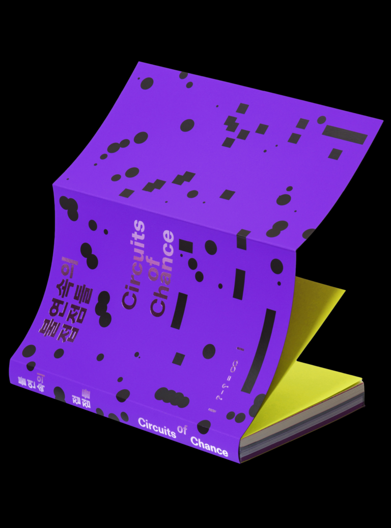

《불연속의 접점들》 도록
Circuits of Chance: Exhibition Catalogue
Editorial
2026
백남준아트센터
5
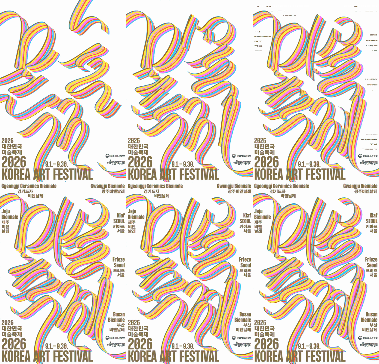
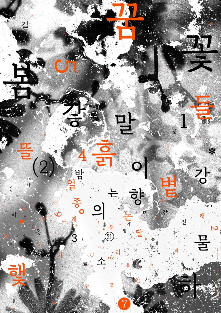
꽃길 포스터
Kkotgil Poster
Graphic
2026
Self-initiated Project
4
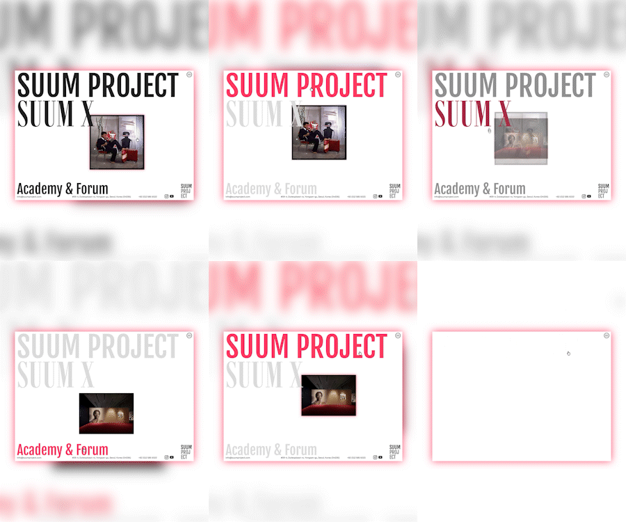
숨 프로젝트 웹사이트
SUUM PROJECT Website
Website
2026
숨프로젝트
2
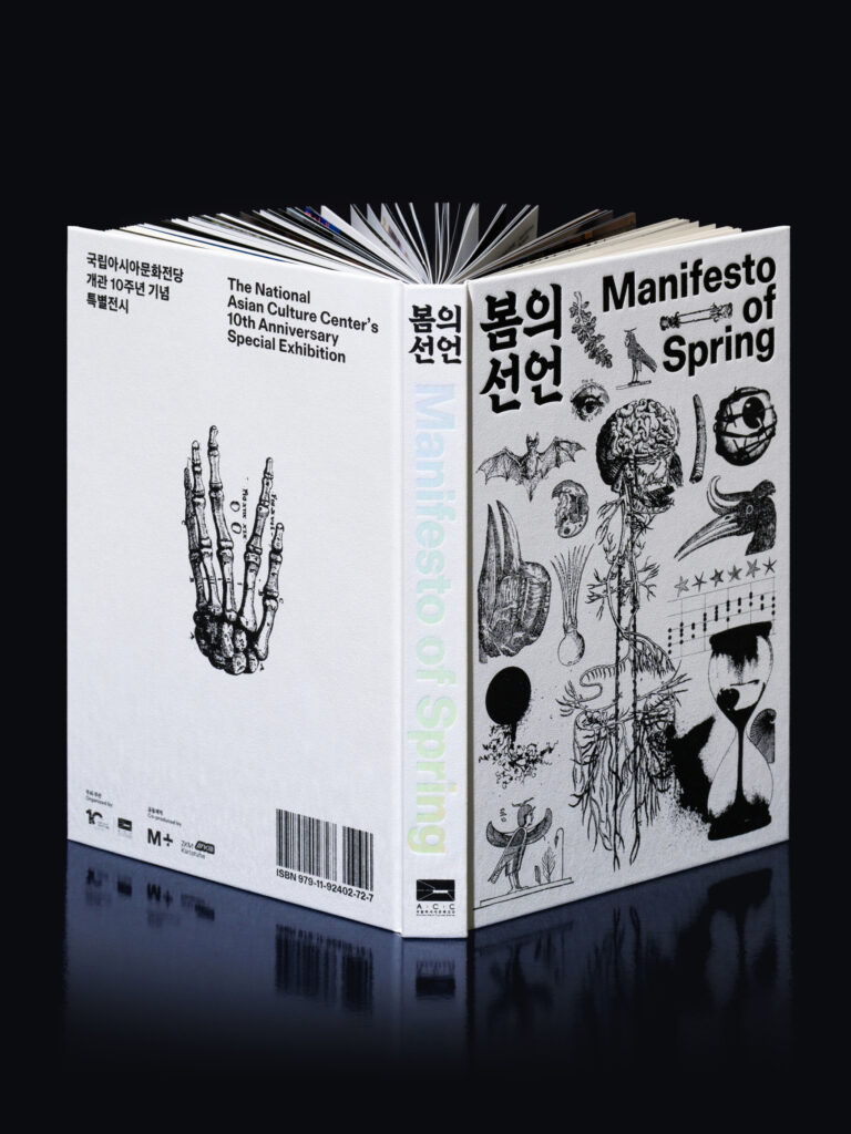
《봄의 선언》 도록
Manifesto of Spring: Exhibition Catalogue
Editorial
2026
ACC 국립아시아문화전당
5
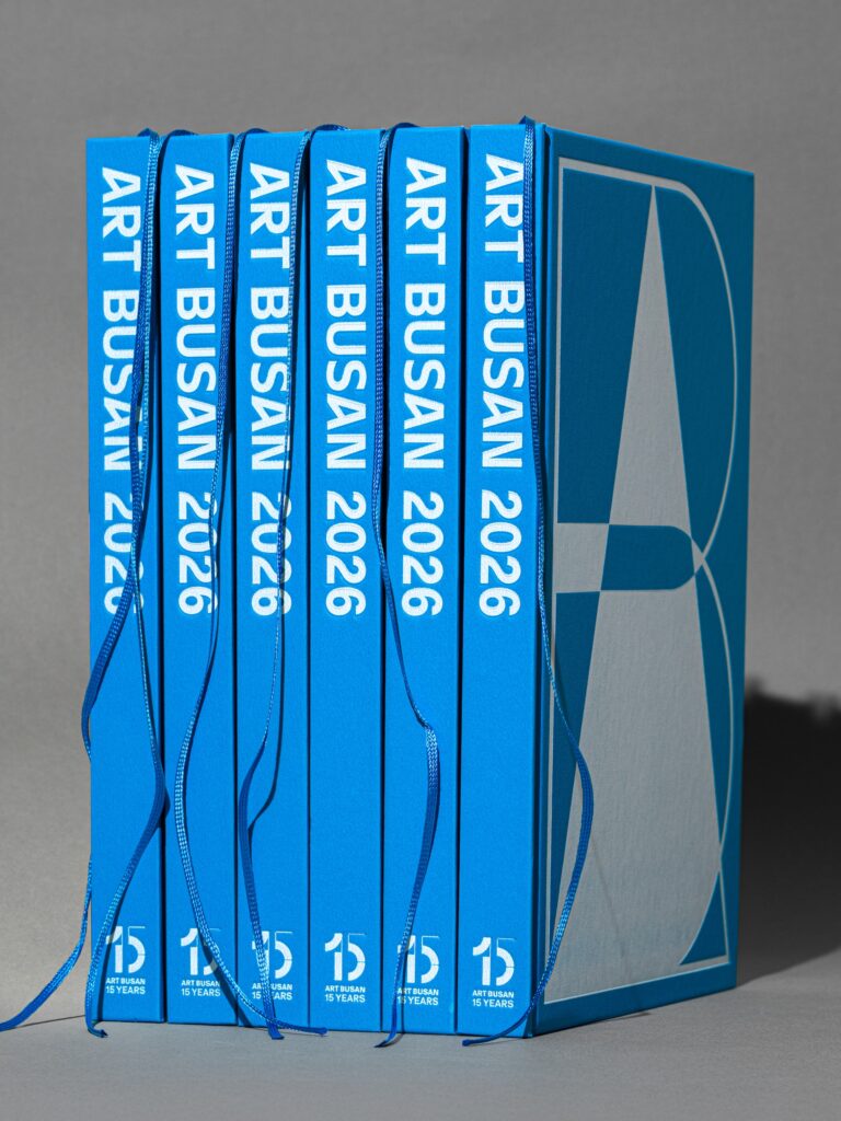
아트부산2026 도록
Art Busan 2026 Catalogue
EditorialGraphic
2026
아트부산
3
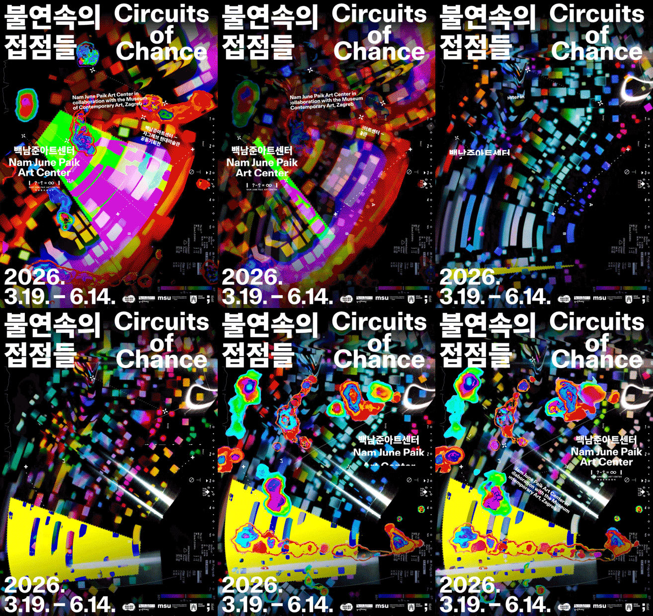
불연속의 접점들
Circuits of Chance
GraphicMotionSpace
2026
백남준아트센터
4
서울미래인재재단 아이덴티티 & 키비주얼 디자인
Seoul Future Foundation Identity & Keyvisual Design

GraphicIdentityMotion
2026
서울미래인재재단
4
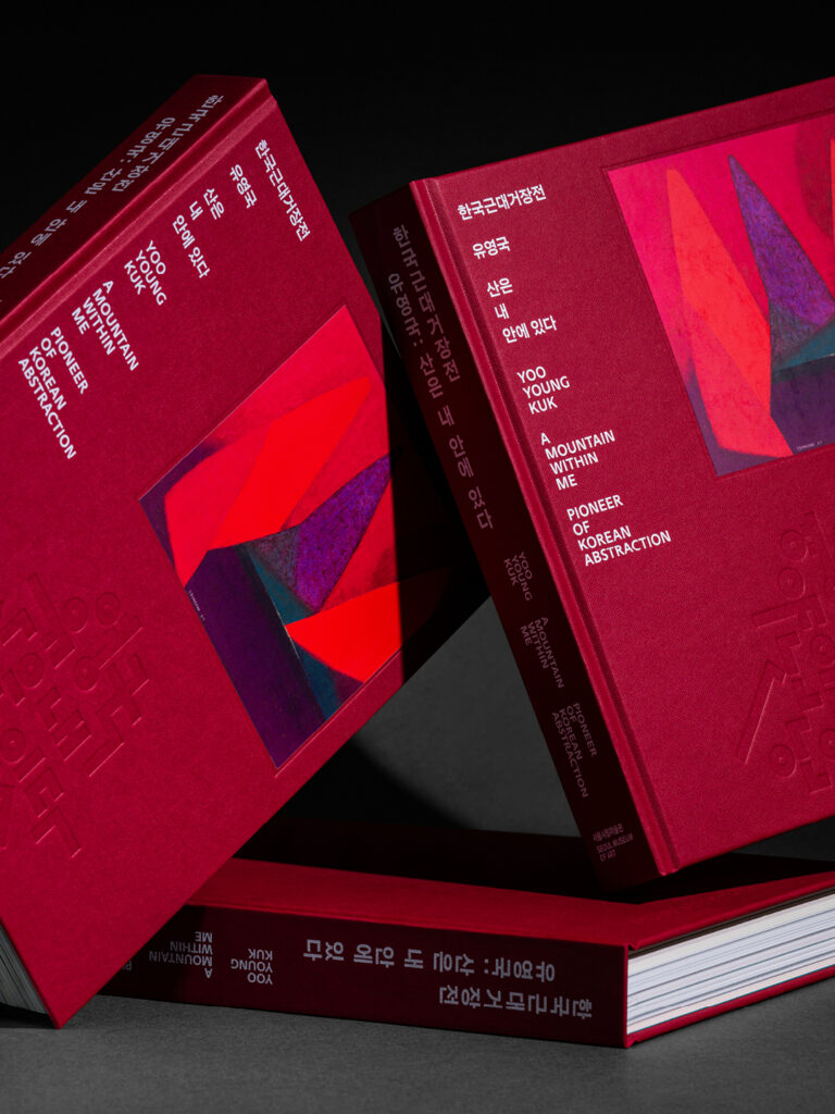
《유영국: 산은 내 안에 있다》 전시 도록
Yoo Youngkuk: A Mountain Within Me catalogue
Editorial
2026
서울시립미술관
5
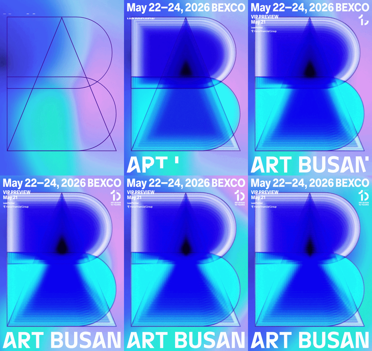
아트부산 2026 비주얼 아이덴티티 디자인
Art Busan 2026 Visual Identity Design
EditorialGraphicIdentityMotion
2026
아트부산
4
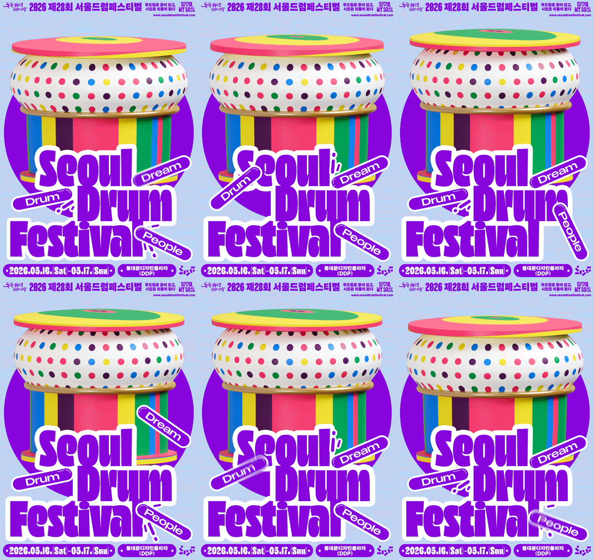
2026 서울드럼페스티벌
2026 Seoul Drum Festival
GraphicIdentityMotionWebsite
2026
서울드럼페스티벌
4
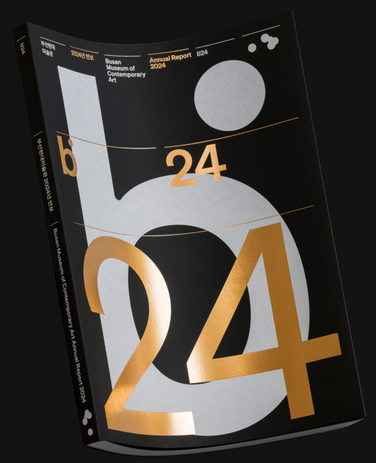
부산현대미술관연례보고서
Busan Museum of Contemporary Art Annual Report <b24>
Editorial
2026
부산현대미술관
3
꿈의 예술단, 꿈의 스튜디오 아이덴티티 디자인
Dream Arts Ensemble & Dream Studio Identity Design
IdentityMotion
2025
한국문화예술교육진흥원
4
묻힌 그릇들은 아직 끝나지 않았다
Where Things Linger
EditorialGraphicSpace
2026
한양대학교박물관
4
《유영국: 산은 내 안에 있다》 굿즈 디자인
《Yoo Youngkuk: A Mountain Within Me》 Merchandise Design
GraphicIdentity
2026
서울시립미술관조선일보문화사업단
4
DDP 시즌 그래픽 — Spring
DDP Season Graphic — Spring
GraphicMotion
2026
서울디자인재단
3
2026 영등포 여의도 봄꽃축제
2026 Yeongdeungpo Yeouido Spring Flower Festival
Graphic
2026
영등포문화재단
3
〈시라트(Sirāt)〉 스페셜 포스터
〈Sirāt〉 Special Poster
Graphic
2025
찬란
3
《유영국: 산은 내 안에 있다》 전시 디자인
《Yoo Youngkuk: A Mountain Within Me》 Exhibition Design
GraphicMotion
2026
서울시립미술관
6
<기다림이 끝나는 날에도> 전시 도록
Even on the day when waiting ends Exhibition catalog
Editorial
2026
경기도미술관
3
POSEUTEO POSTER 한국포스터, Victionary
POSEUTEO POSTER, Victionary
Press
2026
3

2018 부산비엔날레 디자인 어플리케이션

2018 Busan Biennale Design Application

2018
Graphic

BB_graphic_3

BB_graphic_2

BB_graphic_6

BB_graphic_7

BB_graphic_5

BB_graphic_4

BB_graphic_1

일상의실천에서 2018부산비엔날레 디자인 어플리케이션을 진행했습니다. 전시의 주제 ‘비록 떨어져 있어도(Divided We Stand)’를 상징적으로 반영한 타이포그래피와 컬러의 대비를 인쇄, 공간, 굿즈 등 다양한 어플리케이션 디자인에 적용했습니다. 일상의실천은 강렬한 보색을 포스터의 상하단에 배치하여 전시의 핵심개념인 ‘분리’를 직관적으로 표현하고, 전 세계에 존재하고 있는 다양한 층위의 대립과 갈등을 포괄적으로 시각화하기 위해 다양한 인종과 성별의 분절된 이미지를 적용하여 봉합되지 않은 ‘불편한 충돌’을 극대화하기 위해 노력했습니다. 포스터에 적용된 분절되고 뒤틀린 로고타입 아이덴티티와 이미지, 색상의 대비는 물리적현상에 기저하고 있는 심리적 분리에 대해 정면으로 응시하고자 하는 이번 2018부산비엔날레의 주제의식을 관통하기 위한 시각적 장치입니다.

디자인. 권준호
로고타입 레터링. 양장점
공간디자인 및 설치. 제로랩

클라이언트. 부산비엔날레조직위원회

We designed various applications for the 2018 Busan Biennale. A typography and color contrast symbolically reflecting the theme of the exhibition ‘Divided We Stand’ are applied to a variety of application designs, including printing, space, and products. We designed the strong color at the top and bottom of the poster to express the core concept of the exhibition, ‘separation’, and applied different layers of conflict and conflict that exist around the world to comprehensively visualize each other. The fragmented and twisted logotype identity, images and color contrast applied to the poster are intended to penetrate the theme of the 2018 Busan Biennale theme.

Design. Joonho Kwon
Logotype Design. Yang-Jang
Space Design & Installation. Zerolab

Client. 부산비엔날레조직위원회