


漆, 아시아를 칠하다
Ottchil, the Coated Splendor of Asian Lacquerwares
2021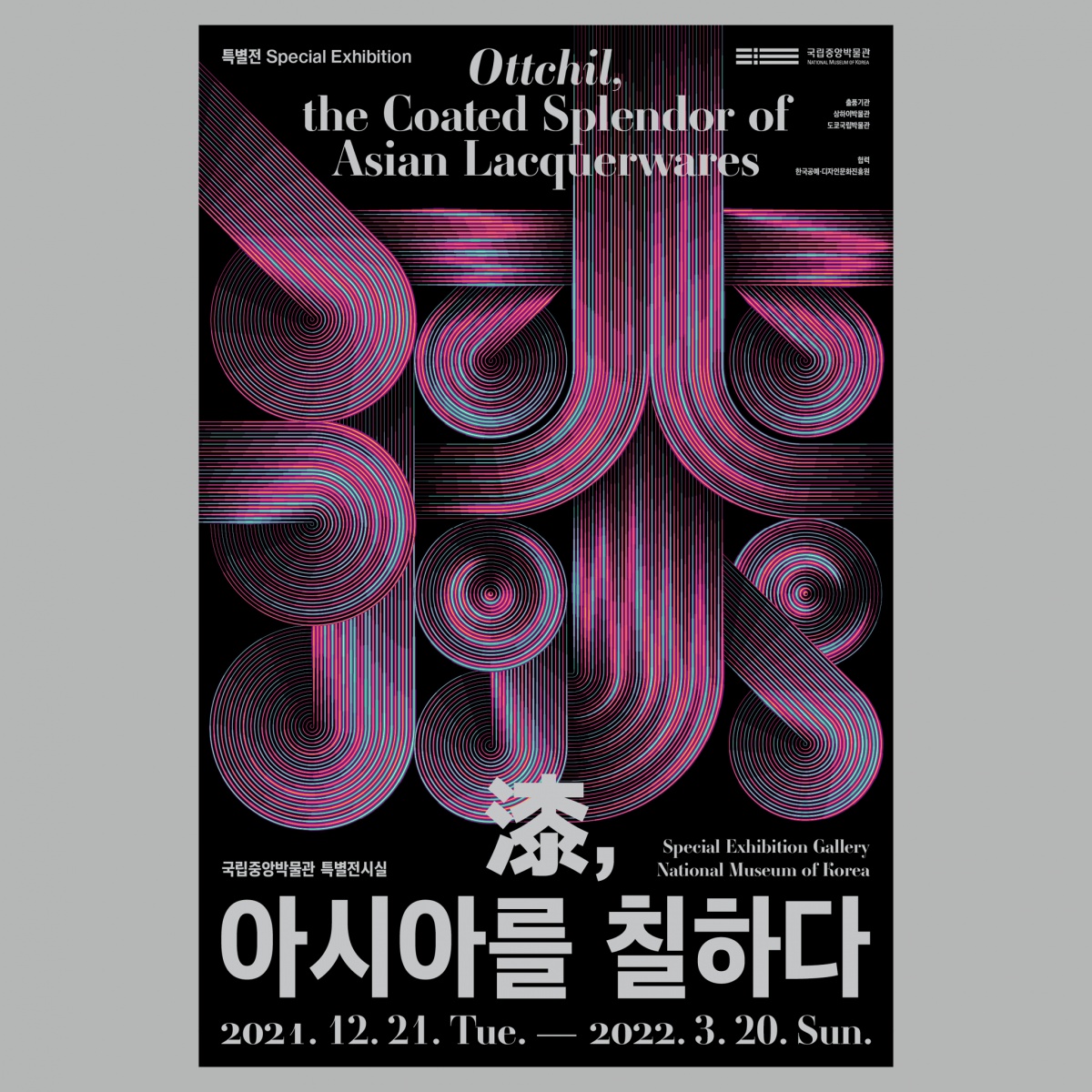
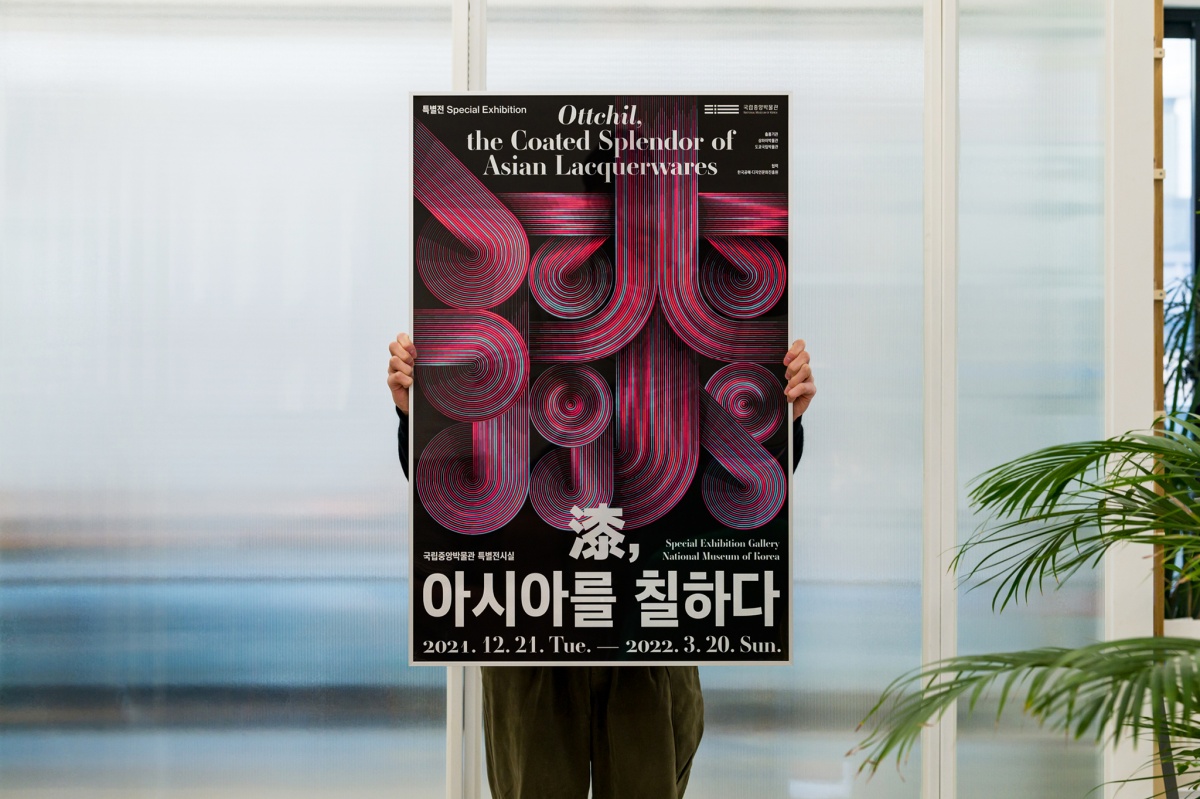
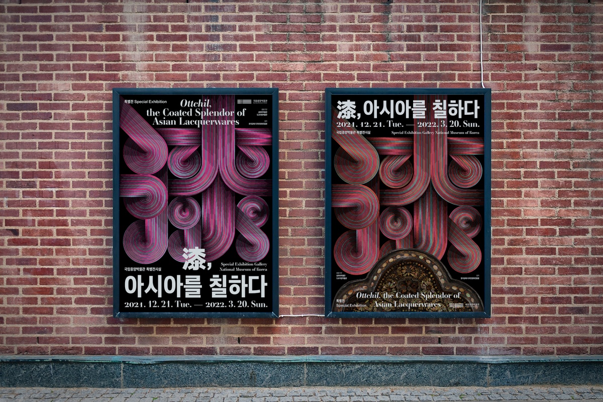
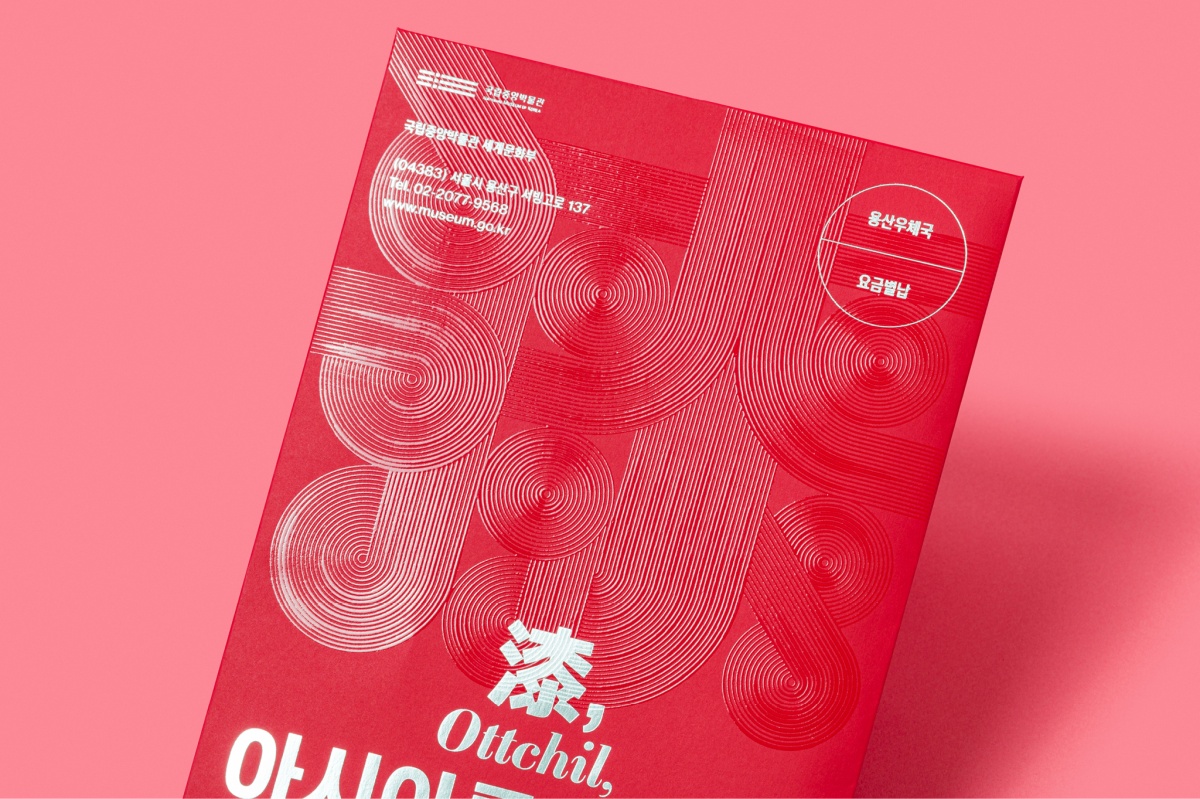
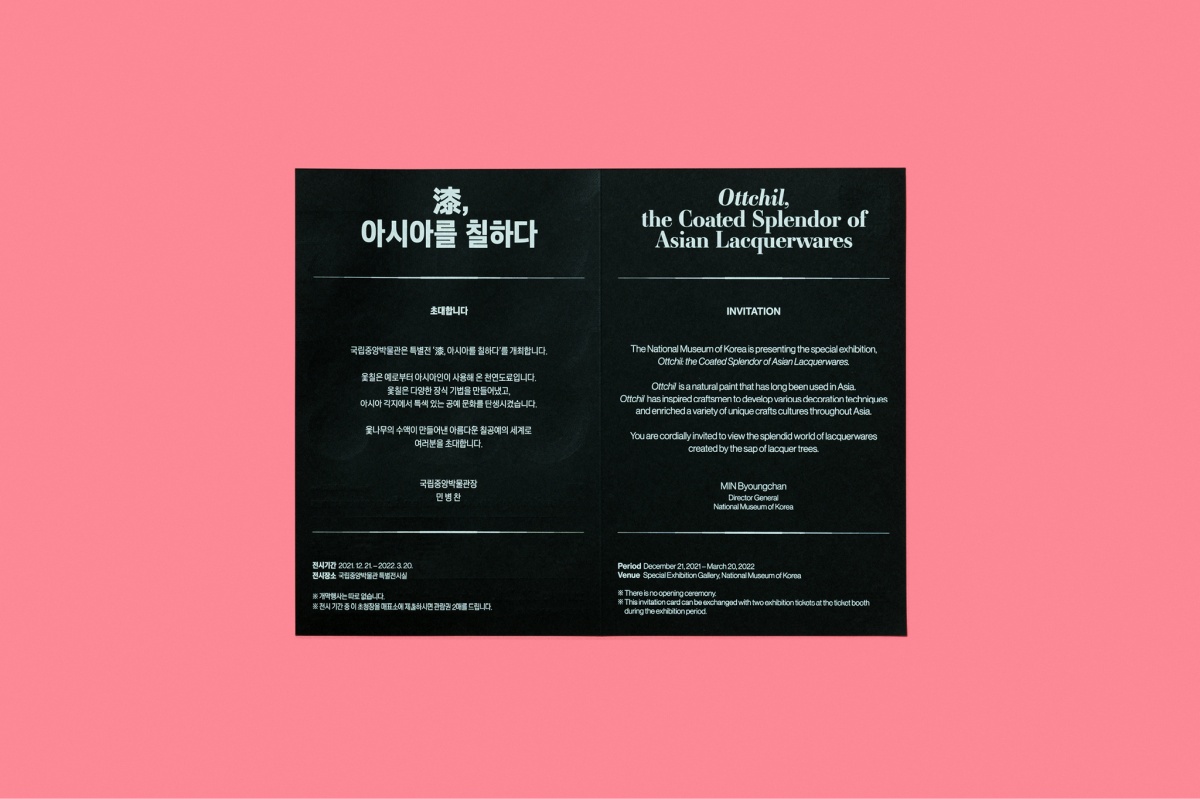


일상의실천이 국립중앙박물관에서 주최하는 특별전 漆, 아시아를 칠하다를 위한 그래픽디자인을 진행했습니다. 漆, 아시아를 칠하다는 아시아 고유의 천연 도료인 옻을 바탕으로 아시아 곳곳에 발전한 다양한 칠공예 문화를 조명하는 전시입니다.
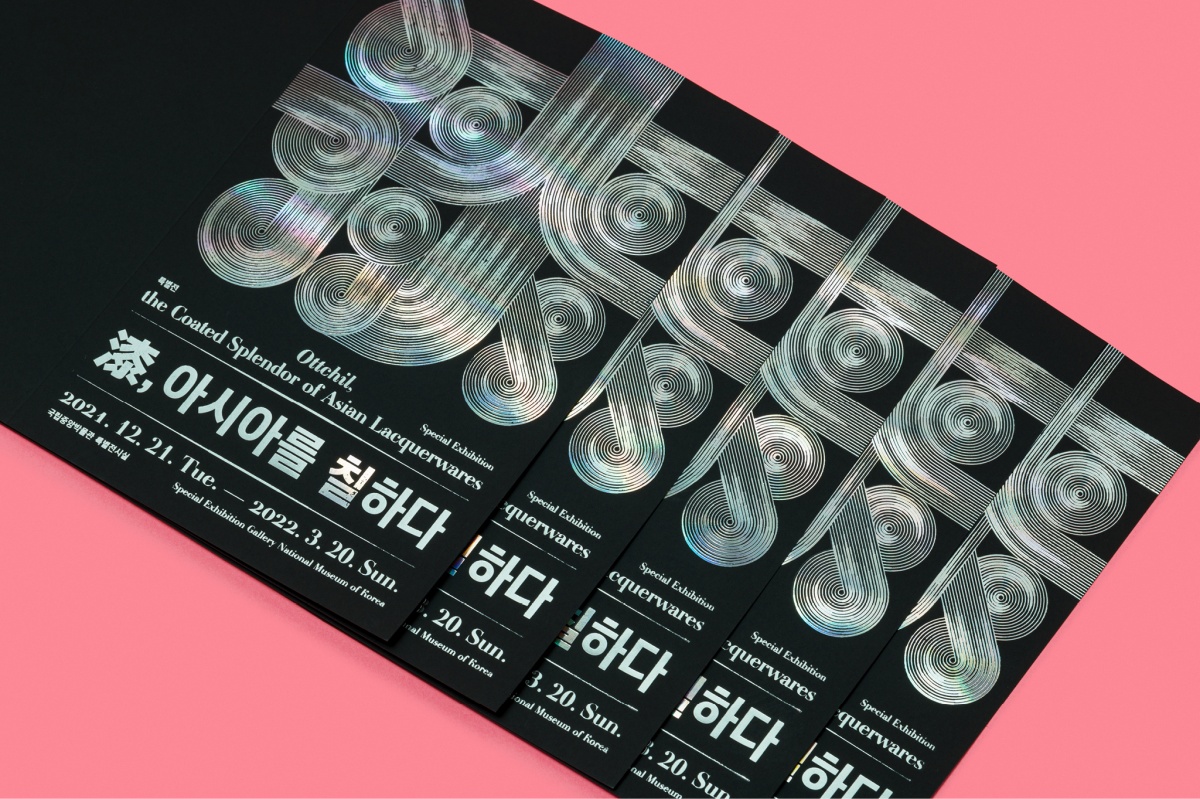
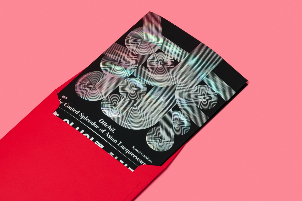
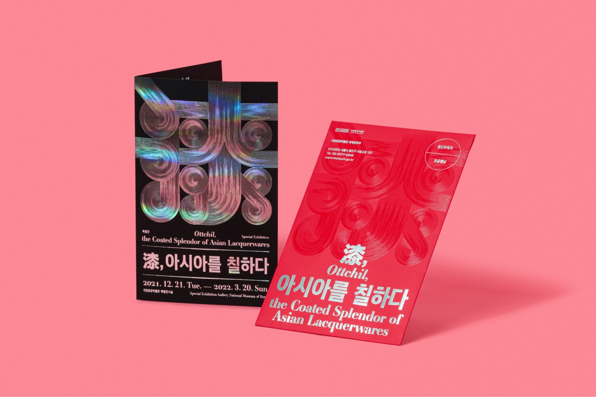
칠공예는 시간의 예술이기도 합니다. 옻나무에서 옻 수액을 채취하고 정제하여 도료로 만드는 것과 물건에 옻을 칠하는 것은 모두 반복되는 인내의 시간이 필요합니다. 일상의실천은 하나의 칠공예 작품이 만들어지는 과정 속 장인정신을 상징하는 반복되는 선과, 덧바를수록 색이 변화하는 옻의 질감을 현대적으로 재해석한 그래픽을 활용해 한자 “漆”을 표현하여 전시의 주제를 시각화했습니다. 또한 명조체와 고딕체가 섞인 타이포그래피를 통해 전통과 현대를 가로지르는 칠공예가 가진 기나긴 역사성을 표현하고자 노력했습니다.
디자인 디렉션. 김어진
디자인. 이윤호
모션 그래픽. 브이코드
클라이언트. 국립중앙박물관
EverydayPractice designed a graphic materials for the special exhibition “Ottchil, the Coated Splendor of Asian Lacquerwares” hosted by National Museum of Korea. “Ottchil, the Coated Splendor of Asian Lacquerwares” is an exhibition that highlights various lacquerware cultures developed throughout Asia. These are the cultures that based on lacquer, a natural Asia’s unique paint.
Lacquer craft is also an art of time. Making a paint by collecting and refining lacquer sap from lacquer trees, and lacquering objects all require repeated patience. EverydayPractice visualized the theme of the exhibition by using repeated lines that symbolize craftsmanship in the process of making a piece of lacquerware, and by utilizing a graphic that reinterprets the texture of lacquer that changes color as you apply it. In addition, this graphic is derived from a Chinese character for lacquer painting. Furthermore, we tried to convey the long history of lacquer craft, encompassing tradition and modern era, by combining serif and sans-serif fonts.
Design Direction. Eojin Kim
Graphic Design. Yoonho Lee
Motion Graphic. V Code
Client. 국립중앙박물관